I could get quite in depth about this but I’m going to assume most people have a fair amount of experience with this subject. Some examples to keep in mind so you have context for my point are Discord (new mobile app and changes to its’ featureset over the years), Reddit (old.reddit compared to new), LessWrong (discussions feature).
Crux of my question is this: separate from enshittification due to capitalistic forces (changes made to attempt to please investors, create endless growth, make more money generally), are changes to apps and websites worse on-average in some clear and obvious way than their previous versions, or is the evident outrage for changes to the UI and concept of these platforms from a general ‘fear or dislike of change’ present in humans?
For example, let’s point to things like logo and brand typeface changes. This is a change that has the least amount of actual effect on the average user of a platform, the usability of Reddit doesn’t change at all between Logo A and Logo B (the new logo is on the right).
But a precursory search shows that the reaction is mostly negative.

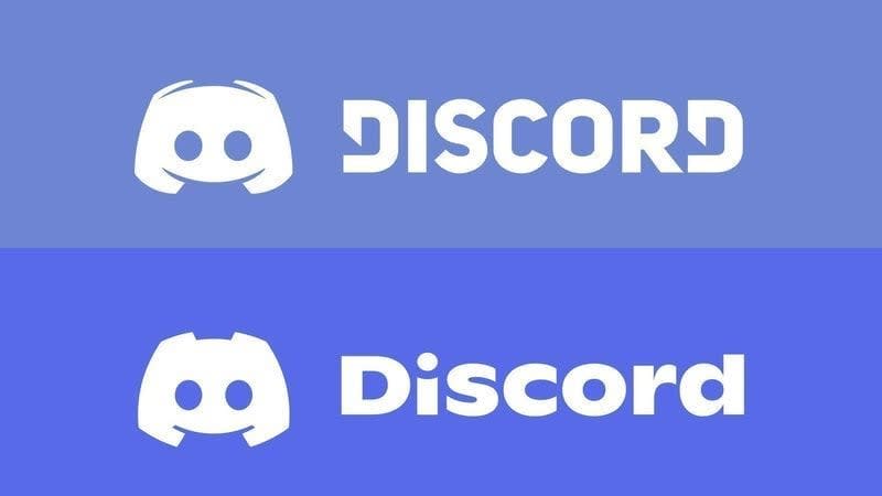
This was true for Discord as well (new logo below.) When the logo and typeface changes for Discord were announced, the reaction was overwhelmingly negative.
Last example here, this is the Patreon logo’s recent change. People are so opposed to this change it’s kind of hilarious. It’s used as an indicator that the brand identity of corporations is trending towards amorphous blobs lacking any personality or identity. It’s hard to find anyone who claims that the new Patreon logo is any good at all.
To be clear about the previous section: I don’t think it’s valuable to wonder whether the logos are better or worse. I think the previous logos are more striking and artistically interesting, but that’s the purpose of my question. My intent is to point to the fact that the public response to these logo changes is almost always negative.
It’s pretty easy to tell that when a company’s logo changes, on average, people don’t like it. I could go on by posting the logo changes of Pepsi, Coke, Burger King, facebook (oh, I mean F A C E B O O K), etc… if anyone can point out a case where a logo changed and received a positive response, I’d love to hear about it, but it’s more or less besides the point.
My main question is whether the logo change outrage is indicative of the larger effect of people identifying with an app, website or brand and then feeling betrayed when that identity changes, or if the changes are actually negative on the whole, and their criticisms are valid.
And if the changes are actually just bad by and large (I’m inclined to agree with the above infographic about Reddit) then why do websites get worse, rather than better, over time? Is it entirely the previously mentioned enshittification and related to ‘market forces’, or is it something else? Is it just really hard to improve a public-facing service that’s already good by making incremental changes? Do UI/UX designers lack some understanding of good design, generally? That seems unlikely to me. Maybe they just often lack the context of actually using the given app regularly.
I’m a little worried that this is a pointless or meandering question. I’m just hoping to get some good discussion going and update my ideas about this sort of thing somewhat. Thanks for reading!


I think this post brought up some interesting discussion and I’m glad I made it. Not sure if it’s ‘best of 2023’ material but I liked the comments/responses quite a bit and found them enlightening.