Thanks to Drake Thomas for feedback.
I.
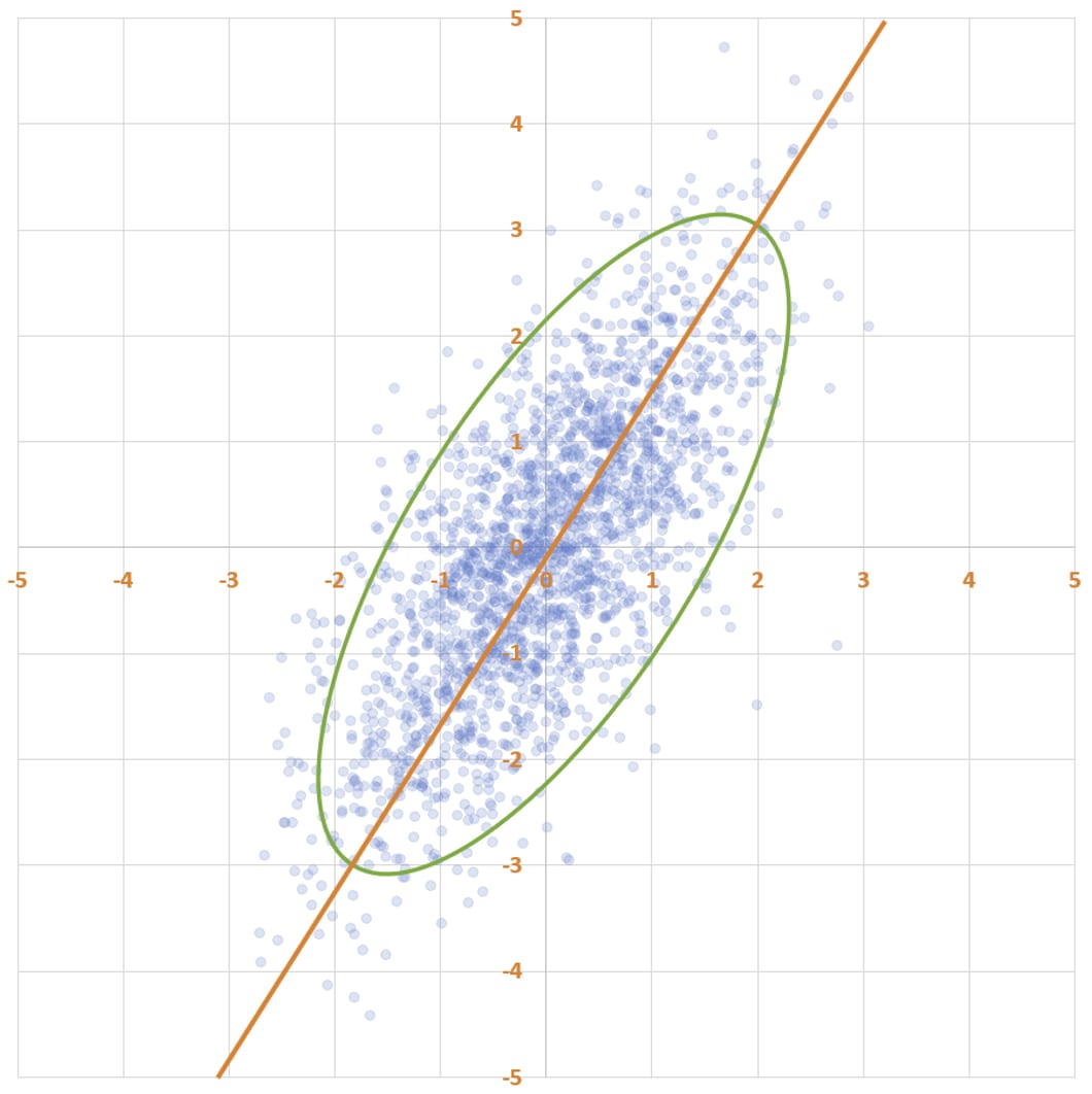
Here’s a fun scatter plot. It has two thousand points, which I generated as follows: first, I drew two thousand x-values from a normal distribution with mean 0 and standard deviation 1. Then, I chose the y-value of each point by taking the x-value and then adding noise to it. The noise is also normally distributed, with mean 0 and standard deviation 1.
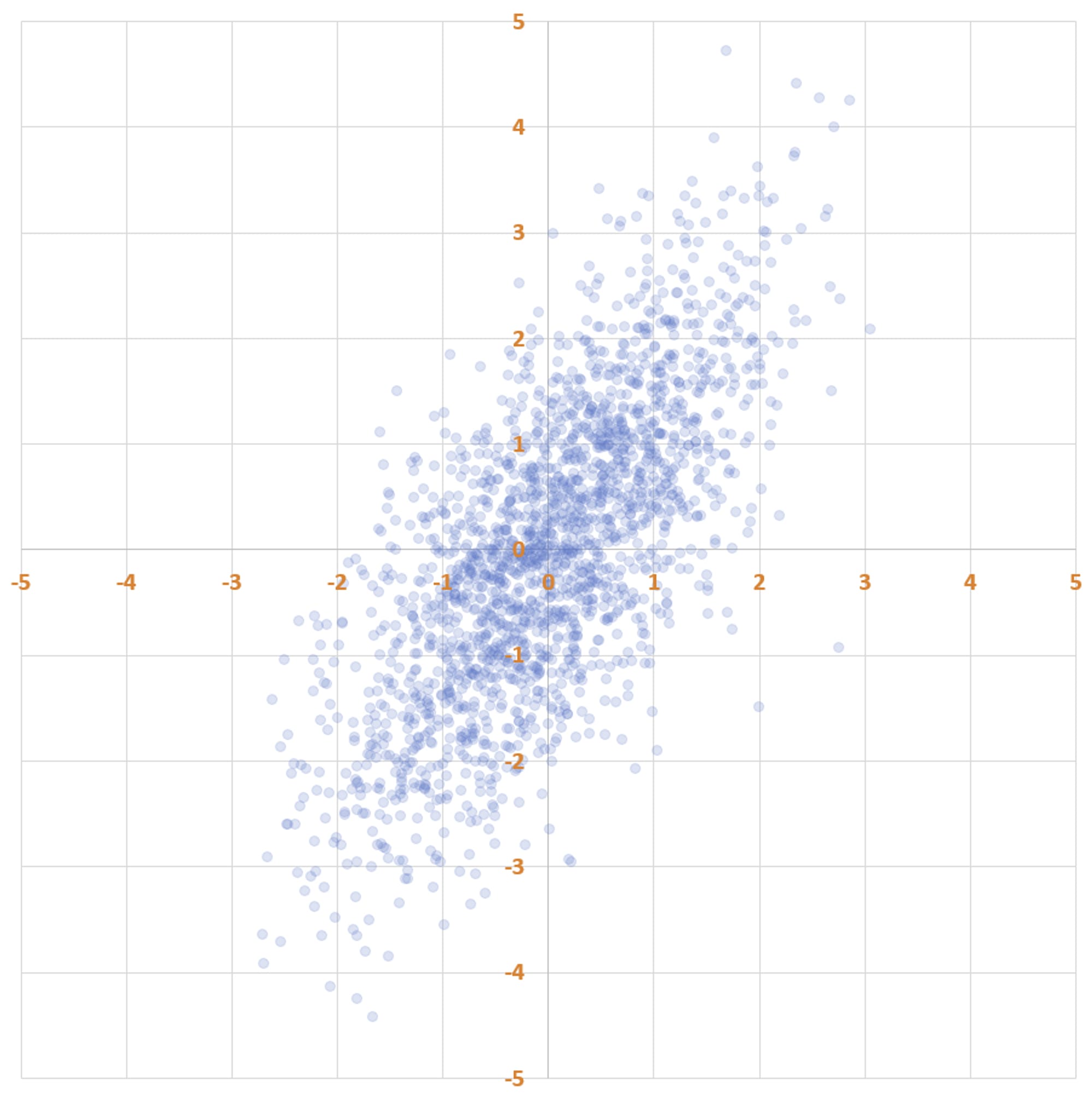
Notice that there’s more spread along the y-axis than along the x-axis. That’s because each y-coordinate is a sum of two independently drawn numbers from the standard normal distribution. Because variances add, the y-values have variance 2 (standard deviation 1.41), not 1.
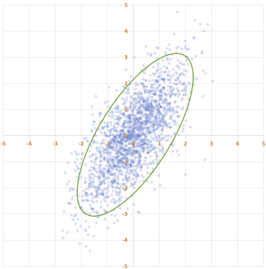
Statisticians often talk about data forming an “elliptical cloud”. You can see how the data forms into an elliptical shape. To put a finer point on it:
Why an ellipse — what’s the mathematical significance of this shape? The answer pops out if you look at a plot of how likely different points on the plane are to be selected by the random generation procedure that I used.
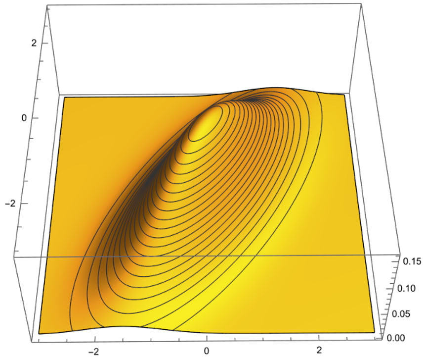
The highest density of points is near (0, 0), and as you get farther from the origin the density decreases. The green ellipse on the scatter plot is a level set of equal probability: if you were to select a datapoint using my procedure, you’d be more likely to land in any square millimeter inside the ellipse than in any square millimeter outside the ellipse — and you’d be equally likely to land in any location on the ellipse as on any other location on the ellipse.
The line of best fit is a statistical tool for answering the following question: given an x-value, what is your best guess about the y-value?
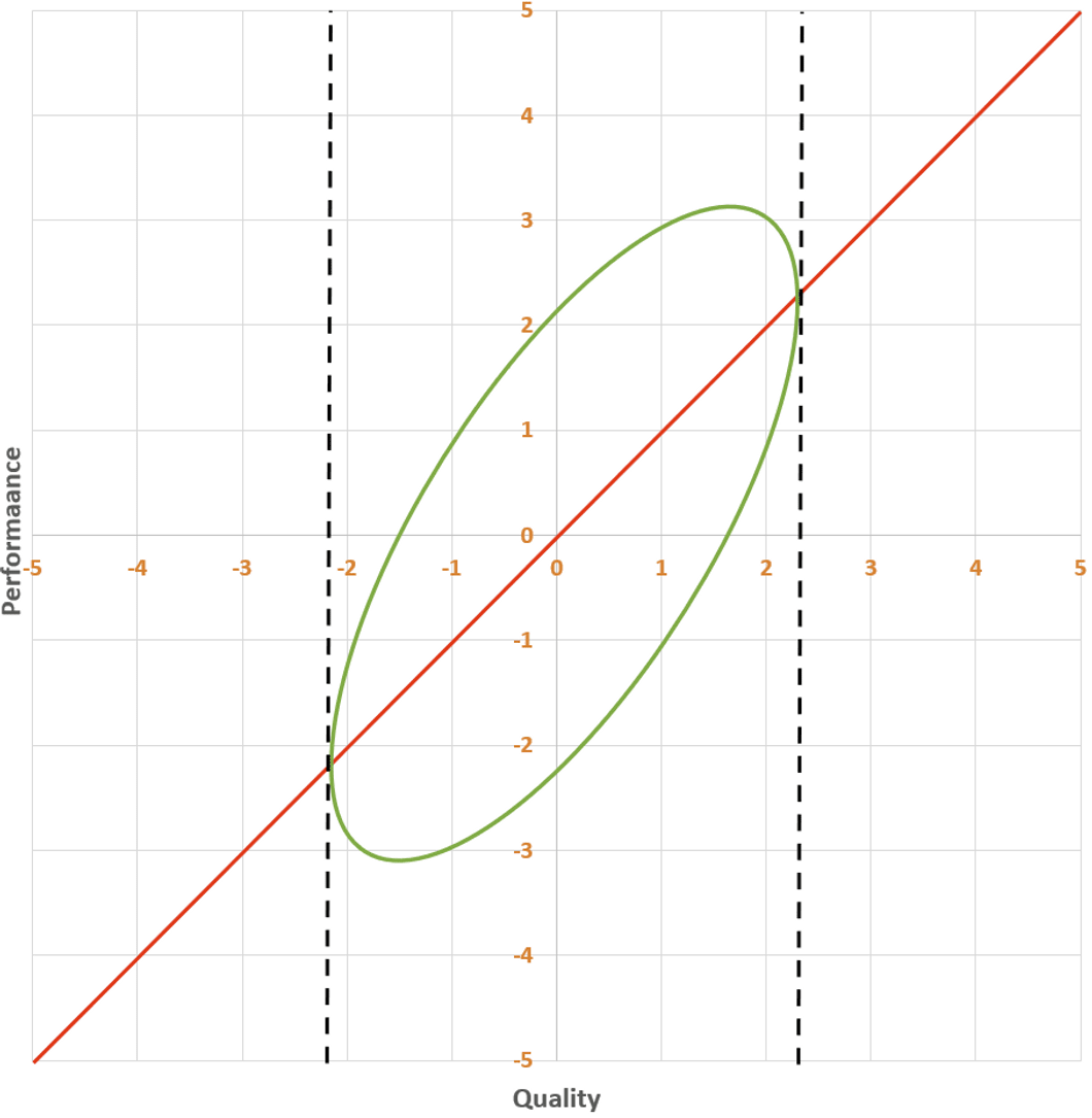
What is the line of best fit for this data? Here’s one line of reasoning: since the y-values were generated by taking the x-values and adding random noise, our best guess for y should just be x. So the line of best fit is y = x.
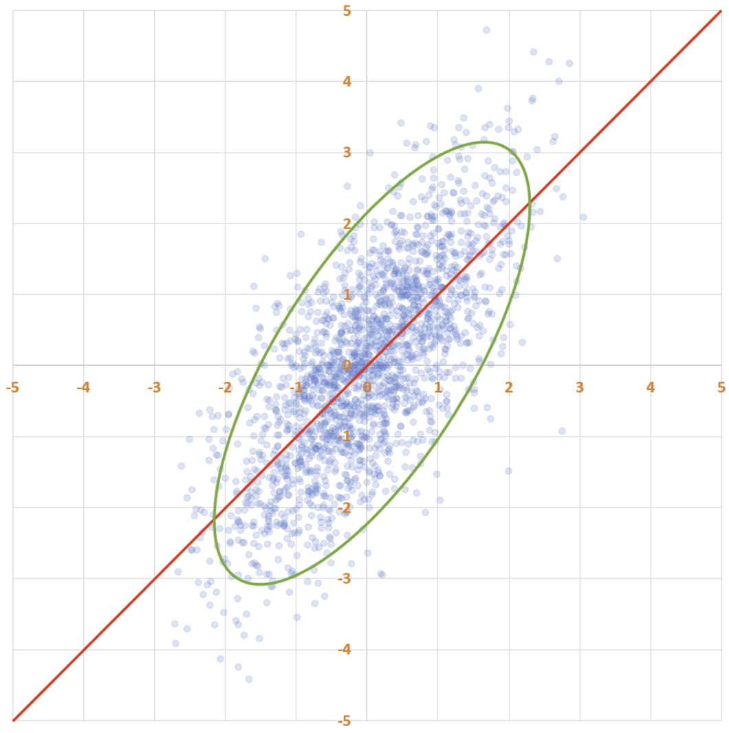
Huh, weird… this line is weirdly “askew” of the ellipse, and it doesn’t reflect the fact that the y-values are more dispersed than the x-values. Maybe the line of best fit instead passes from the bottom-left to the top-right of the ellipse, along its major axis. It sure looks like the points are on average closer to this line than to the previous one.
Which line is the line of best fit, and what’s wrong with the other line? I recommend pondering this for a bit before reading on.
The answer is that the first line, y = x, is the line of best fit. The problem with the second line is that it doesn’t try to predict y given x. I mean, scroll back up and take a look at how low the line is at x = −2: it’s way below almost all of the points whose x-value is near −2! This line is instead doing a different, important thing: it indicates the axis of maximum variation of the data. It’s the line with the property that, if you project the data onto the line, the data will be maximally dispersed. This line is called the first principal component of the data, but it is not the line of best fit.
Instead of going from the bottom-left to the top-right of the ellipse, the line of best fit goes from the left of the ellipse to the right. This is the line that has as much of the ellipse above it as below it, at every x-coordinate. This is what you want, because you want it the true y-value to be below your prediction as often as it is above your prediction.[1]
(Huh, what a weird asymmetry! I wonder why the line doesn’t instead go from the bottom of the ellipse to the top…)
II.
You are the director of a giant government research program that’s conducting randomized controlled trials (RCTs) on two thousand health interventions, so that you can pick out the most cost-effective ones and promote them among the general population.
The quality of the two thousand interventions follows a normal distribution, centered at zero (no harm or benefit) and with standard deviation 1. (Pick whatever units you like — maybe one quality-adjusted life-year per ten thousand dollars of spending, or something in that ballpark.)
Unfortunately, you don’t know exactly how good each intervention is — after all, then you wouldn’t be doing this job. All you can do is get a noisy measurement of intervention quality using an RCT. We’ll call this measurement the intervention’s performance in your RCT.
You’re really good at your job, so your RCTs are unbiased: if an intervention has quality 0.7 and you were to repeat your RCT a million times, on average the intervention’s performance will be 0.7. But because you can’t run your RCTs on large populations, they are noisy: if an intervention has quality Q, its performance will be drawn from a normal distribution with mean Q and standard deviation 1.
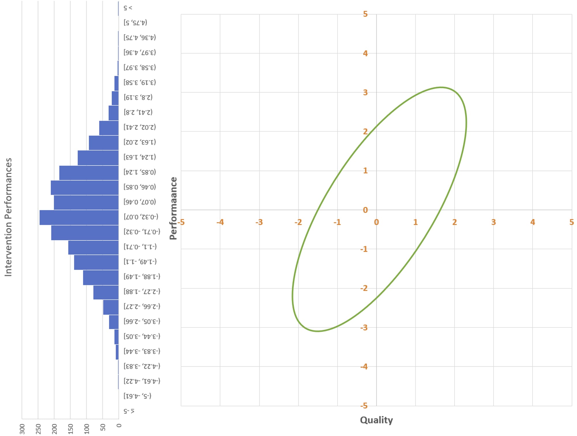
After many years of hard work, your team has conducted all two thousand RCTs. As you expected, the performance numbers you got back are normally distributed, with variance 2 (1 coming from the difference in intervention qualities, and 1 coming from the noise in your RCTs).
I have two questions for you:
True or false: the intervention with the highest expected quality, given the information you have from your RCTs, is the intervention with the highest performance.
True or false: the expected quality of an intervention with performance P is equal to P.
Consider these questions before reading on.
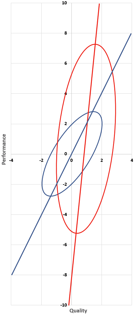
Secretly, the two thousand data points in the scatter plots above represent the quality (x) and performance (y) of your interventions. And I do mean secretly, because you do not know the quality of any intervention, only its performance. So while I, the omniscient narrator, see this —
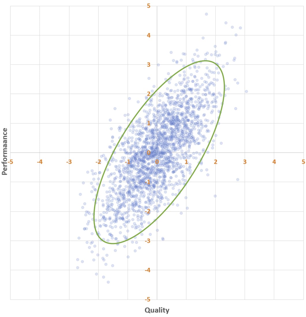
— you see this:
You know the distribution of the y-values. You even know the shape of the overall distribution of the scatter plot. You just don’t know where individual interventions fall along the x-axis. The best you can do is guess.
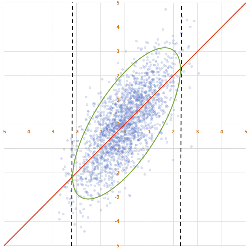
But how do you guess quality from performance? Do you use the best fit line from earlier?
This would be a mistake. The line says that the expected performance of an intervention with quality q is also q: . That would be useful if you were guessing performance based on quality. But you know performance and don’t know quality. So while this red line has the property that for every x-value, there’s as much of the ellipse above it as below it, what you want is a line with the property that for every y-value, there’s as much of the ellipse to the left of it as to the right of it.
You want this line:
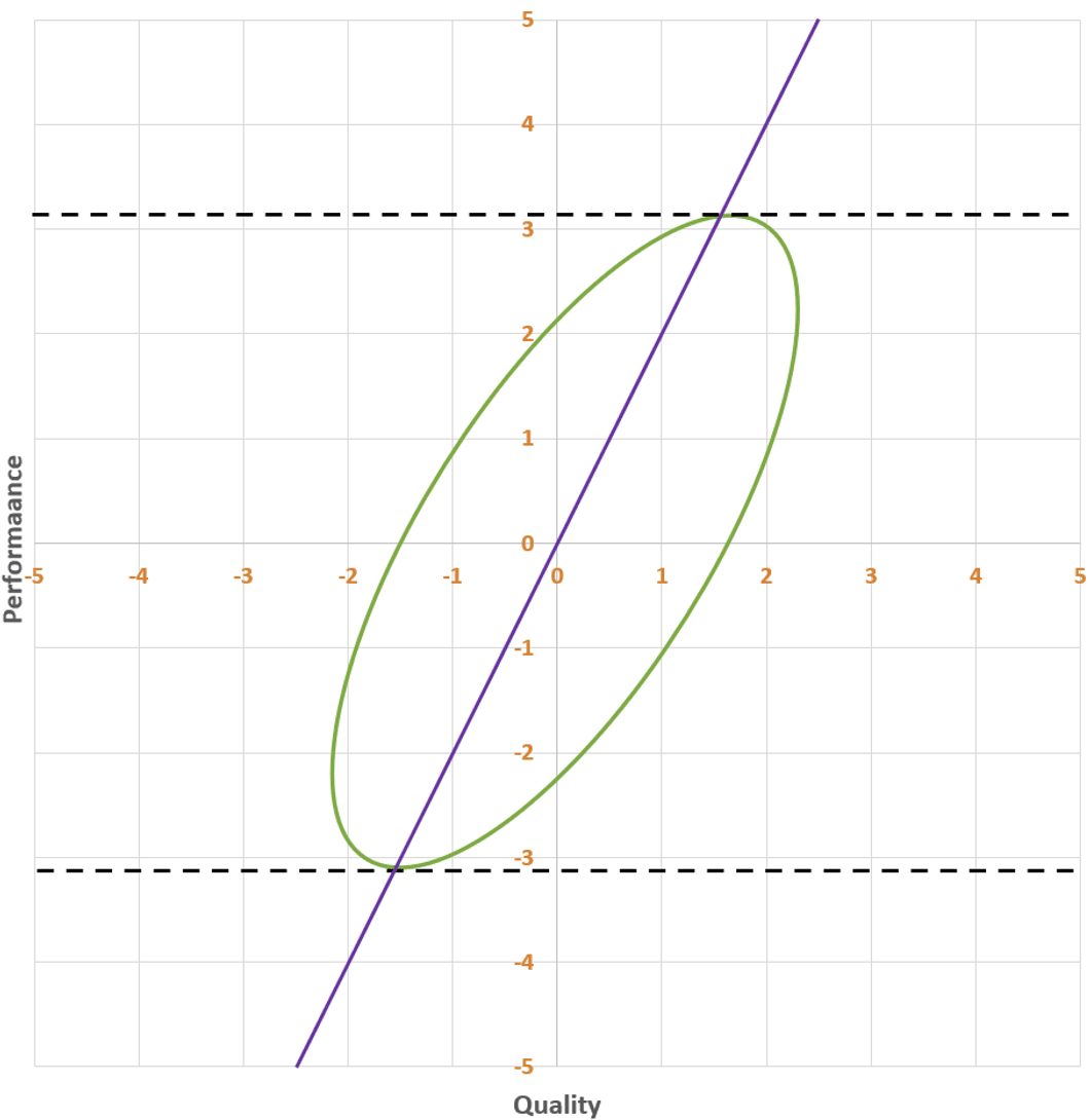
If you want, you can imagine flipping the axes, so that performance is horizontal and quality is vertical; then the line of best fit would run from the left to the right, vertically cutting the ellipse in half. If you did that, the line would have slope 0.5, not 1. The message of this line is:
(Why 0.5? Remember that performance is a sum of two random variables with standard deviation 1: the quality of the intervention and the noise of the trial. So when you see a performance number like 4, in expectation the quality of the intervention is 2 and the contribution from the noise of the trial (i.e. how lucky you got in the RCT) is also 2.)
Let’s return to our questions:
1. True or false: the intervention with the highest expected quality, given the information you have from your RCTs, is the intervention with the highest performance.
The answer to this is true. The better the performance, the better the expected quality. This is obvious, but I think some people are confused by it because the top of the ellipse isn’t in the same place as the rightmost point of the ellipse. But that doesn’t matter: if I select a point from the ellipse and tell you its y-value, then the larger the y-value is, the larger your best guess about the x-value will be (and in particular, your best guess will be based on that purple line).
2. True or false: the expected quality of an intervention with performance P is P.
This one’s false. The expected quality of an intervention with performance P is 0.5 times P.
Ponder this for a bit, and internalize it, if you haven’t already. You did an RCT. Your RCT was unbiased: for an intervention of quality Q, your methodology will on average give you an estimate (performance) of Q. And yet, when you see an intervention with performance 4, your best guess is that the quality of the intervention is only 2.
So when Xavier Becerra, the U.S. Secretary of Health and Human Services looks at your results and says “oh wow, with this intervention we can give people four healthy years of their life back for just ten thousand dollars,” you politely temper his excitement and tell him that despite the results, you only expect the intervention to give people two healthy years of their life back per ten thousand dollars spent.
As briefly mentioned earlier, this is because performance is a sum of two independent variables: quality and noise. And when you see a large number like 4, you think the intervention is good, but you also think you got lucky, in equal amounts.
(This is true for all of the studies: it’s not a consequence of bias from selecting the best studies. Though the absolute amount by which you need to discount your results — in this case, 2 — is larger for interventions with better performances.)
Hence the title of this post: “How much do you believe your results?” If the HHS Secretary asks you how much you believe the results of your RCTs, the correct answer is “fifty percent”.
III.
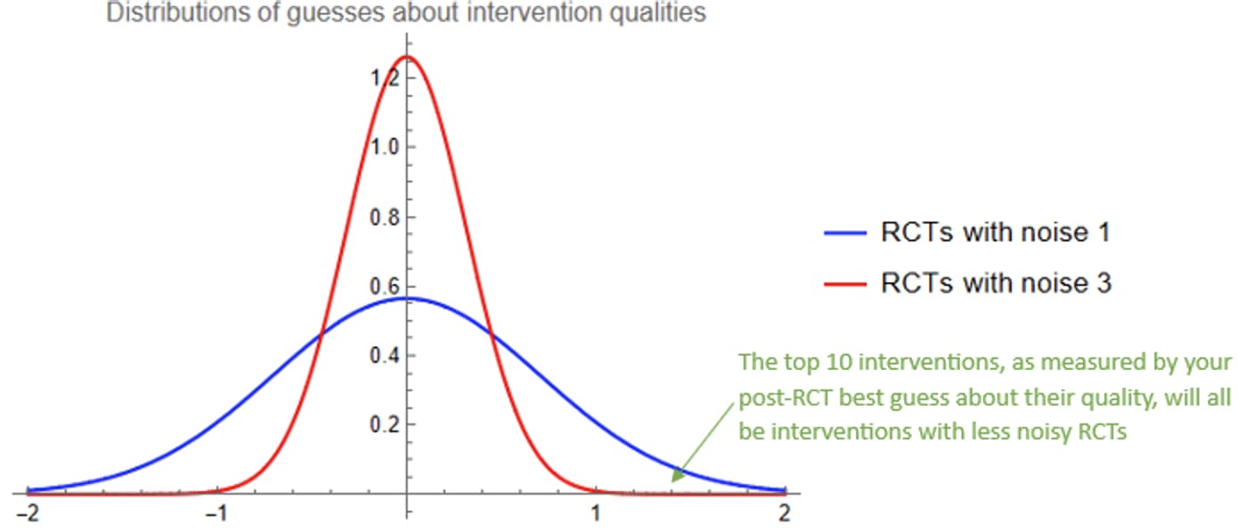
Impressed by both the quality of your trials and your honesty, Secretary Becerra appoints you to lead a new megaproject: two thousand more RCTs. This time, though, your job is trickier. While one thousand of the RCTs will be as noisy as before — normally distributed noise with standard deviation 1 — the other thousand will be much noisier. That’s because the health interventions are more involved and you won’t be able to get as large of a sample. These thousand RCTs will have noise with standard deviation 3.
As before, you do your RCTs and get back performance scores for every intervention. You don’t know the quality of any intervention, of course, but if you did, your performance versus quality scatter plot would look like this:
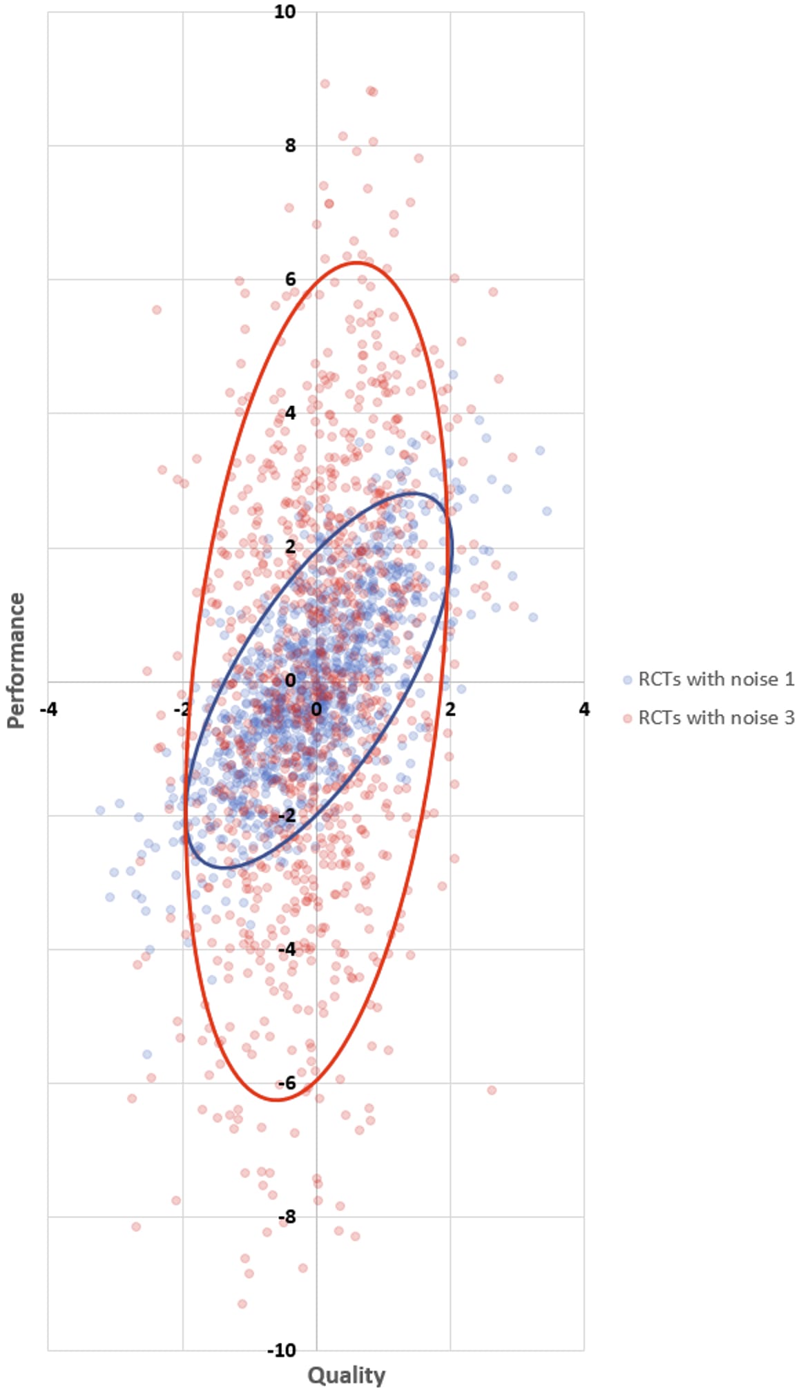
(We will call the interventions whose RCTs have noise 1 blue interventions, and will call the interventions whose RCTs have noise 3 red interventions.)
Of course all the interventions with the best performance are the red ones — you predicted that at the outset! It’s not that those interventions were systematically better or higher-variance: both sets of interventions have qualities that are normally distributed with mean 0 and standard deviation 1. It’s just that the best-performing interventions are the ones where you get lucky during the RCT, and there’s a ton of luck in the results of the noisy RCTs.
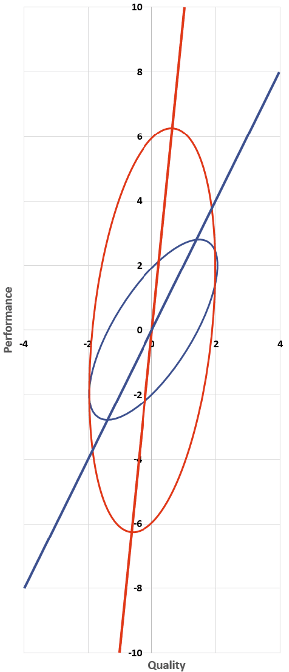
And so, the same question once more: how much do you believe your results? For the blue interventions we already have our answer: 50% — that is, the expected value of quality is 0.5 times the performance. Or in terms of that line from earlier — the one running from the bottom of the blue ellipse to the top, predicting quality from performance — its slope is 2. Every two units of performance increase correspond to one unit of increase in quality.
What about the red interventions? What’s the slope of that line?
Bear with me as we do a bit of math. We are interested in finding the constant such that . To do so, we’re going to look at the expected value of quality times performance in two different ways. Abbreviating quality as Q and performance as P, we have
On the other hand, we also have
where the 10 comes from the fact that performance is quality (variance 1) plus noise (variance 9), and variances add. Therefore, .
So, how much do you believe your noisy RCT results? The answer is: just 10 percent! The best-fit line for predicting quality from performance has slope 10. And correspondingly, a performance result of 10 — absolutely stellar! you expect just one of those in your entire study! — makes you think that the intervention is… kinda good. One standard deviation above average. 84th percentile.
You come back to Secretary Becerra to report your results. He’s impressed: there’s more than 20 interventions whose performance was more than 6 — way better than last time! You caution him that the RCTs behind those performances are noisy and that he shouldn’t believe the results very much.
Becerra thanks you for your hard work and tells you that the HHS has enough funding to promote ten interventions — and that it will be up to you to decide which ones will get promoted. The rest of the studies will be shelved, as per government policy.
You wish you had known this at the outset. Then you wouldn’t have bothered running the noisy RCTs at all! (Or at least you would have worked very hard to make them less noisy.) Here’s why:
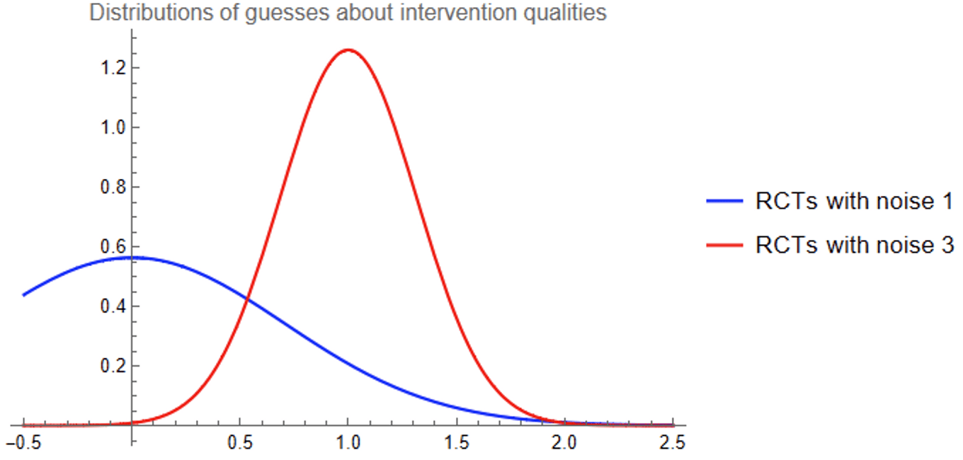
The performances of the blue interventions are normally distributed with mean 0 and standard deviation . Since expected quality is 50% of performance, your best guesses about the qualities of the blue interventions after seeing the RCT results are distributed with mean 0 and standard deviation , which is about 0.71.
The performances of the red interventions are normally distributed with mean 0 and standard deviation . Since expected quality is 10% of performance for these interventions, your best guesses for the qualities of the red interventions after seeing the RCT results are distributed with mean 0 and standard deviation , which is about 0.32.
If you draw a thousand samples from a normal distribution with mean 0 and standard deviation 0.71, and another thousand from a normal distribution with mean 0 and standard deviation 0.32, it is almost guaranteed that the top ten draws will be from the first distribution. There was essentially no chance that any of the red interventions would be in your top 10 list, after you take care to ask yourself how much you believe your results.
(On the other hand, if you were a less careful scientist who didn’t ask themself this question, your top ten list would all be red interventions, all of which would likely be much worse than you were expecting them to be.)
It gets worse. Suppose that the red interventions are systematically more effective than the blue ones, by an entire standard deviation. That is, the red interventions’ qualities are distributed with standard deviation 1 and mean 1. This means that the average red intervention is as effective as an 84th percentile blue intervention. (This seems pretty realistic, e.g. because the lowest-hanging fruit for easy-to-assess interventions has already been picked.)
Now, all red interventions’ qualities and performances are 1 unit larger than before, so the red ellipse and line from before is translated one unit up and to the right:
You still believe your results 10%, but this 10% now has a slightly different interpretation: if an intervention’s performance is better than average by some amount x, then your best guess is that this intervention’s quality is better than average by 0.1*x. Or as an equation:
Because performance is normally distributed with mean 1 and standard deviation , the overall distribution of your best guesses about the qualities of the red interventions is like before, but translated to the right by one unit:
The typical red intervention comes out looking much better than the typical blue intervention (of course), but we care about the very best interventions. Zooming in on the right tail of the graphs:
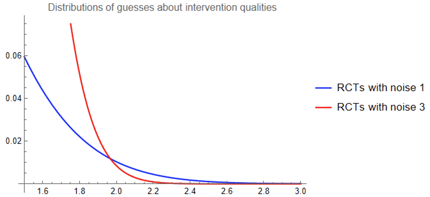
It turns out that the best-looking of a thousand blue interventions is still very likely to look better to you than the best-looking of a thousand red interventions!
IV.
You wake up from a dream. In the dream you had this really cool job as the leader of a giant megaproject of health intervention RCTs run by the HHS.
Ha, if only. You were considered for the job a decade ago, but were ultimately passed over in favor of a different academic.
You’ve been thinking about those studies recently, because the government published that second batch of RCT results — two thousand of them! (You had dreamed that government studies don’t get released, but luckily it was only a dream, if a terrifying one.) You decide to dig into the results.
It would be really nice if the studies explicitly addressed the age-old question — “How much do you believe your results?” — but of course they don’t. You only see the topline “performance” numbers and have to do the inference yourself.
If you spent a whole bunch of time on a single study, you could get some vague sense of how noisy it was. I mean, you can look at the sample size to get some sort of preliminary guess, but the real world is way more complicated than that and actually most of the noise comes from other methodological choices and real-world circumstances that might have not even made it into the papers. And there’s two thousand of them. What are you gonna do, spend the rest of your life inferring quality from performance?
Conveniently, you’ve just woken up from a dream where you learned that half the RCTs had noise 1 and the other half had noise 3. What a convenient fact to know if you want to infer quality from performance!
And so you get to work. You come up with a plan:
For each health intervention, you will take its performance P and use Bayes’ rule to figure out the probability that its RCT had noise 1 versus noise 3.
Let r be the probability that the intervention had noise 1, which you calculated in Step 1. Then with probability r, the expected quality of the intervention is 0.5*P. And with probability 1 - r, the expected quality is 0.1*P. So the overall expected quality is
How do you do Step 1 (calculate r)? Well, remember that the interventions with noise-1 RCTs have performance scores distributed normally with mean 0 and variance 2, whereas the noise-3 RCTs have performance scores distributed normally with mean 0 and variance 10. So — using the formula for a normal distribution — the probability that an intervention with performance P came from a noise-1 RCT is
You plug this into the formula for expected quality as a function of performance that you derived in Step 2, and…
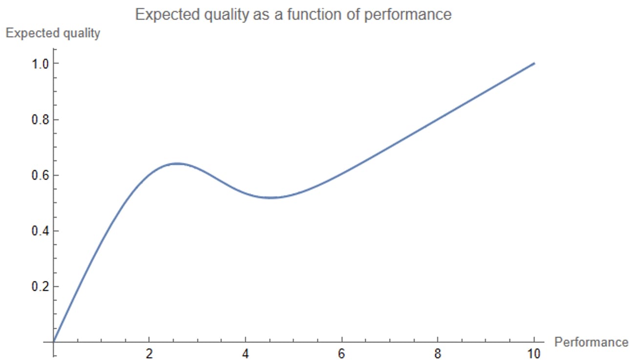
…whoa.
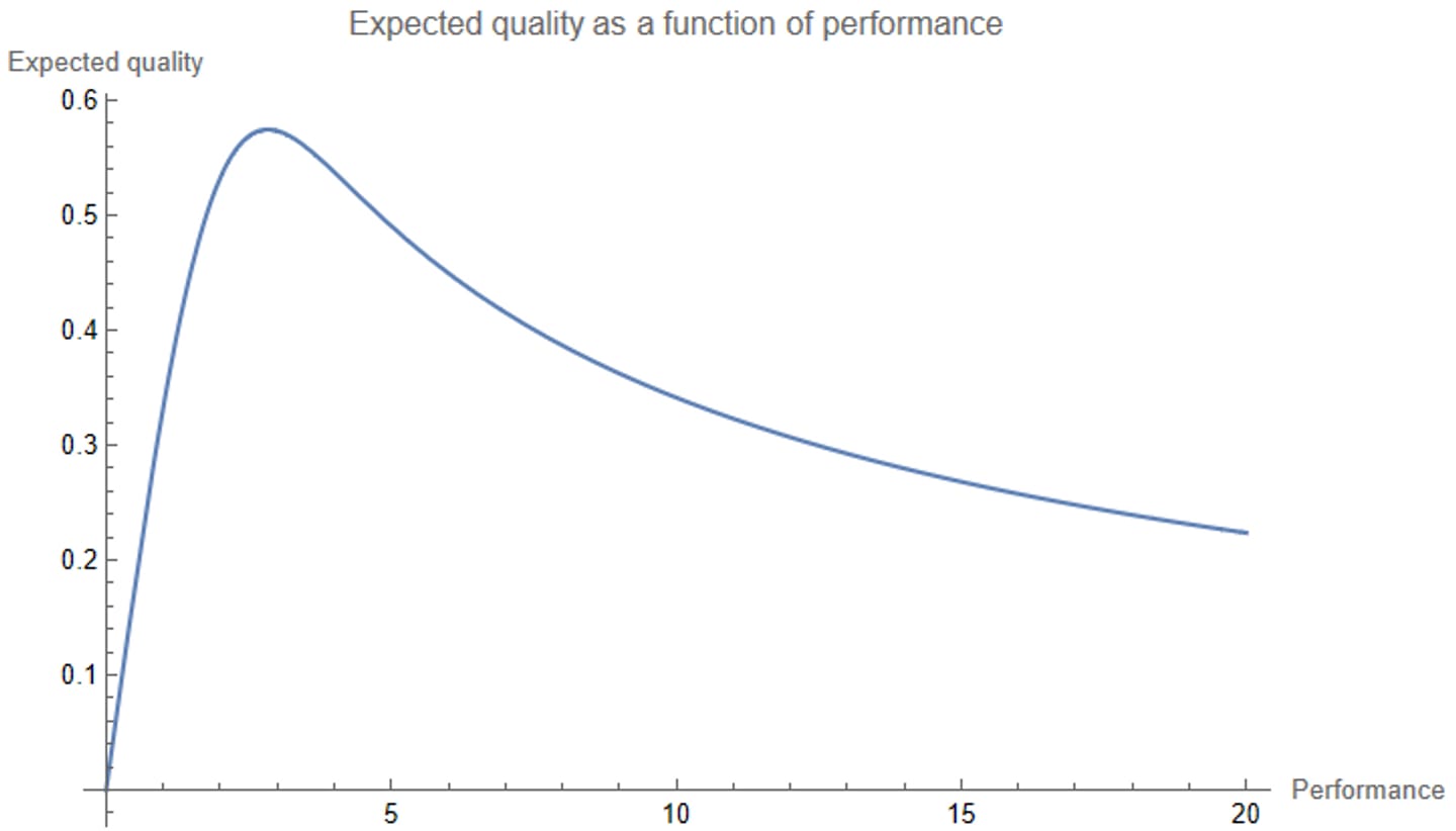
Expected quality drops in the middle of the graph, before going back up? Weird.
The above plot shows as a function of P. What if we just look at r, the probability that the intervention had an RCT with noise 1, as a function of P?
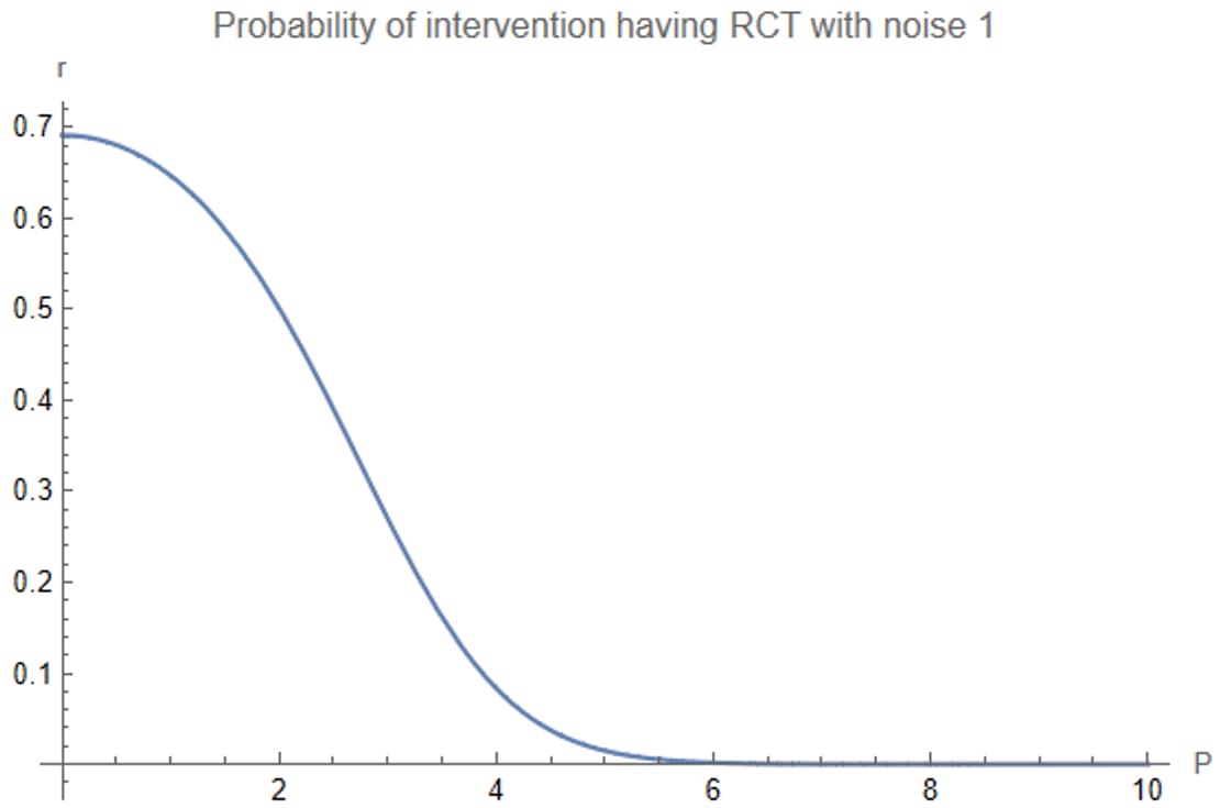
Between performance 2 and 4, the probability that the intervention came from a noise-1 RCT drops dramatically. You believe the results of the study much less if it has performance 4 than if it has performance 2, in a way that trades off against the increase in performance. This explains the drop in expected quality.
(And then things pick back up again: for performance above 6, you’re basically guaranteed that the intervention had noise 3 — but once the performance is large enough, even dividing by 10 gives an impressive result.)
(Well, not that impressive. A performance of 10 — which is about the highest number you see among all the RCTs — means an expected quality of 1, which means you guess that the study is 84th percentile or so.)
(Which is kind of depressing. They did this massive RCT, you look at it and you’re like, “oh I guess this one intervention is probably kinda good, but also if I picked seven other interventions at random probably one of them would be better”.)
(You entertain yourself by making the plot of expected quality versus performance if the noisier RCTs had had noise 10 instead of 3.
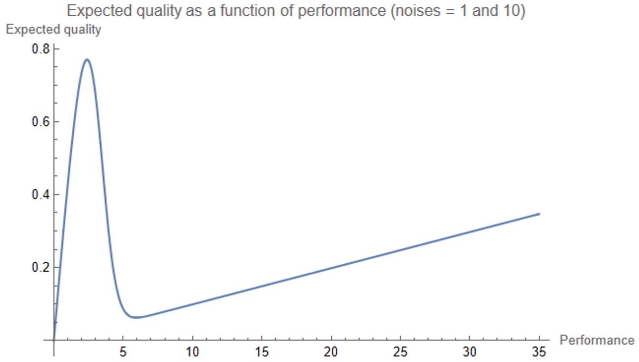
That’s a kind of ridiculous chart, but makes sense, in light of the above. The noise-10 RCTs are totally useless — the correct amount to discount the results of a noise-10 RCT is by a factor of 101 — so your assessment of the quality of an intervention is pretty much just 0.5 times its performance times the probability it had a noise-1 RCT.)
***
It’s now an hour since you woke up. You’re now a little more awake and are feeling kind-of silly for taking your dream too literally. You dreamed that the distribution over the noise of the RCTs was a 50% point mass at 1 and another 50% point mass at 3, which is pretty unrealistic.
You make a more reasonable model: each RCT has an unknown amount of noise, and you decide that your prior over the amount of noise follows a log-normal distribution. So most RCTs have noise between 1 and 3, but some have more and some have less.
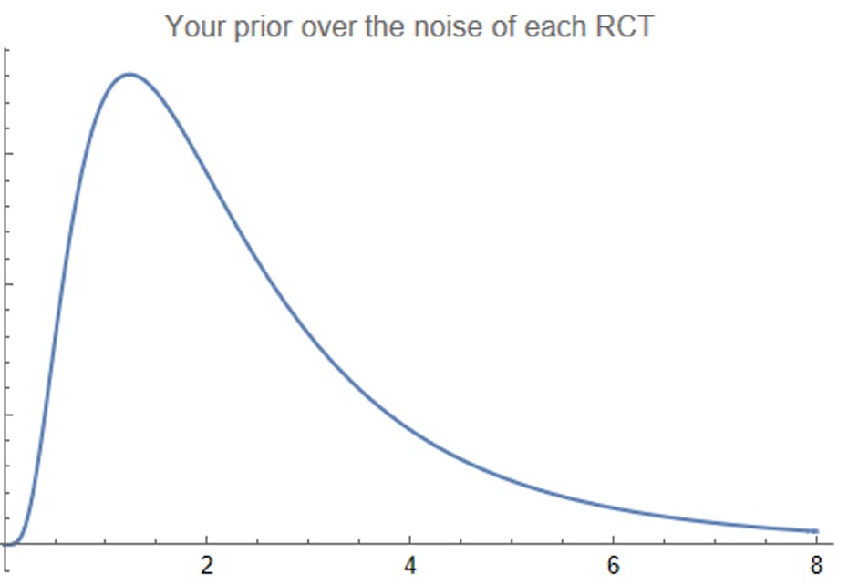
You use the same procedure as before, using Bayes’ rule to compute a posterior distribution over the noise of each RCT (i.e. posterior to updating on the RCT result), and then forming an all-things-considered expectation about the quality of each intervention. As before, you plot this all-things-considered quality estimate as a function of performance:
Wow — the graph goes down (as before), but now it doesn’t ever go back up.
This makes sense: whereas before you were assuming that no RCT could have a noise larger than 3, now seeing a ridiculously large performance number will just make you think that the RCT had a ridiculous amount of noise, and you’ll just dismiss the result. When you see a result that looks too good to be true, it probably is too good to be true.
The most convincing performance number you could see is about 2.8. If you see that number, you guess that the intervention’s quality is 0.57 — about 72nd percentile. This means that no possible RCT result number can convince you that an intervention is in the top quartile. If you try four interventions at random, one of them will probably be better than the intervention that looks best to you after looking at all of the RCT results.[2]
V.
I’ll end this post with a few takeaways, and a few questions to ponder. Here are my takeaways, roughly in order of importance:
When you encounter a study, always ask yourself how much you believe their results. In Bayesian terms, this means thinking about the correct amount for the study to update you away from your priors. For a noisy study, the answer may well be “pretty much not at all”!
You should interpret the words “encounter a study” very broadly. Informal experimental results — such as noticing that over the past month you’ve felt better on days when you ate broccoli — count as encountering a study, for this purpose.
Working hard to reduce the amount of noise in your measurements is super important for getting useful results — certainly more important than I would have naïvely guessed. Similarly, paying attention to how noisy a study is — including but not limited to its sample size — is super important and probably underrated.
If there’s only been one attempt to estimate the effectiveness of some intervention, you probably shouldn’t put much stock into it, unless it’s really well-done.
And here are some questions to ponder:
How robust are the conclusions of the previous sections to alternative modeling choices?
Except for a brief digression in Part III, I assumed that the prior over the quality of an intervention is independent of the amount of noise in the intervention’s RCT. In practice, it’s reasonable to expect them to be dependent — and in particular, for interventions whose quality you’re most uncertain about on priors to also be the interventions whose quality is the most difficult to measure precisely. What happens if you take this into account?
Effective altruists argue that intervention quality is not normally distributed — that it has much fatter tails than that. Likewise, measurement noise likely follows a distribution with fatter tails than a log-normal distribution. What happens if you modify the distributions of both quality and noise to reflect this belief?
There is a longstanding debate in the effective altruist community between allocating resources toward super well-evidenced interventions (e.g. insecticidal malaria nets) and allocating resources toward super speculative interventions with a potentially huge upside (e.g. funding a researcher to work on some strategy for aligning AI that has some small chance of working but might also inadvertently advance AI capabilities). Those advocating for more speculative interventions point to calculations suggesting that the expected value of their interventions is extremely large. What implications, if any, does the question “How much do you believe your results?” have for this debate?
In this post I’ve talked about noisy, unbiased measurements of an underlying truth: whatever the true quality of an intervention is, your measurement process will stochastically produce a measurement whose expected value is equal to the true quality. You can instead consider noiseless, partial measurements — ones that only consider some of the effects of an intervention, without considering others. (For the unmeasured effects you just stick with your priors.) Such interventions are “unbiased” in a different, more Bayesian sense: whatever your measurement is, your best guess for the quality of an intervention is equal to your measurement.
Is it possible for a measurement to be unbiased in both senses?
Are real-world measurements more like the first kind of unbiased or the second kind, or are they both noisy and partial, or does it depend?
To what extent do the lessons of this post generalize to partial measurements?
I hope to write about some of these questions soon!
I think this isn’t the sort of post that ages well or poorly, because it isn’t topical, but I think this post turned out pretty well. It gradually builds from preliminaries that most readers have probably seen before, into some pretty counterintuitive facts that aren’t widely appreciated.
At the end of the post, I listed three questions and wrote that I hope to write about some of them soon. I never did, so I figured I’d use this review to briefly give my takes.
This comment from Fabien Roger tests some of my modeling choices for robustness, and finds that the surprising results of Part IV hold up when the noise is heavier-tailed than the signal. (I’m sure there’s more to be said here, but I probably don’t have time to do more analysis by the end of the review period.,)
My basic take is that this really is a point in favor of well-evidenced interventions, but that the best-looking speculative interventions are nevertheless better. This is because I think “speculative” here mostly refers to partial measurement rather than noisy measurement. For example, maybe you can only foresee the first-order effects of an intervention, but not the second-order effects. If the first-order effect is a (known) quantity X1 and the second-order effect is an (unknown) quantity X2, then modeling the second-order effect as zero (and thus estimating the quality of the intervention as X1) isn’t a noisy measurement; it’s a partial measurement. It’s still your best guess given the information you have.
I haven’t thought this through very much. I expect good counter-arguments and counter-counter-arguments to exist here.
No—or rather, only if the measurement is guaranteed to be exactly correct. To see this, observe that the variance of a noisy, unbiased measurement is greater than the variance of the quantity you’re trying to measure (with equality only when the noise is zero), whereas the variance of a noiseless, partial measurement is less than the variance of the quantity you’re trying to measure.
Real-world measurements are absolutely partial. They are, like, mind-bogglingly partial. This point deserves a separate post, but consider for instance the action of donating $5,000 to the Against Malaria Foundation. Maybe your measured effect from the RCT is that it’ll save one life: 50 QALYs or so. But this measurement neglects the meat-eating problem: the expected-child you’ll save will grow up to eat expected-meat from factory farms, likely causing a great amount of suffering. But then you remember: actually there’s a chance that this child will have a one eight-billionth stake in determining the future of the lightcone. Oops, actually this consideration totally dominates the previous two. Does this child have better values than the average human? Again: mind-bogglingly partial!
(The measurements are also, of course, noisy! RCTs are probably about as un-noisy as it gets: for example, making your best guess about the quality of an intervention by drawing inferences from uncontrolled macroeconomic data is much more noisy. So the answer is: generally both noisy and partial, but in some sense, much more partial than noisy—though I’m not sure how much that comparison matters.)
The lessons of this post do not generalize to partial measurements at all! This post is entirely about noisy measurements. If you’ve partially measured the quality of an intervention, estimating the un-measured part using your prior will give you an estimate of intervention quality that you know is probably wrong, but the expected value of your error is zero.
It’s great to have a LessWrong post that states the relationship between expected quality and a noisy measurement of quality:
We previously had a popular post on this topic, the tails come apart post, but it actually made a subtle mistake when stating this relationship. It says:
The example under discussion in this quote is the same as the example in this post, where quality and noise have the same variance, and thus R^2=0.5. And superficially it seems to be stating the same thing: the expectation of quality is half the measurement.
But actually, this newer post is correct, and the older post is wrong. The key is that “Quality” and “Performance” in this post are not measured in standard deviations. Their standard deviations are 1 and √2, respectively. Elaborating on that: Quality has a variance, and standard deviation, of 1. The variance of Performance is the sum of the variances of Quality and noise, which is 2, and thus its standard deviation is √2. Now that we know their standard deviations, we can scale them to units of standard deviation, and obtain Quality (unchanged) and Performance/√2. The relationship between them is:
E[Quality]=1√2⋅Performance√2
That is equivalent to the relationship stated in this post.
More generally, notating the variables in units of standard deviation as Zx and Zy (since they are “z-scores”),
E[Zy]=ρ⋅Zx
where ρ is the correlation coefficient. So if your noisy measurement of quality is Zx standard deviations above its mean, then the expectation of quality is ρZx standard deviations above its mean. It is ρ2 that is variance explained, and is thus 1⁄2 when the signal and noise have the same variance. That’s why in the example in this post, we divide the raw performance by 2, rather than converting it to standard deviations and dividing by 2.
I think it’s important to understand the relationship between the expected value of an unknown and the value of a noisy measurement of it, so it’s nice to see a whole post about this relationship. I do think it’s worth explicitly stating the relationship on a standard deviation scale, which this post doesn’t do, but I’ve done that here in my comment.
I think this is a pretty good post that makes a point some people should understand better. There is, however, something I think it could’ve done better. It chooses a certain gaussian and log-normal distribution for quality and error, and the way that’s written sort of implies that those are natural and inevitable choices.
I would have preferred something like:
Interesting point, written up really really well. I don’t think this post was practically useful for me but it’s a good post regardless.