Mnemonic portraits for 19,023 human genes
Back in 2013, Scott Alexander wrote in Extreme mnemonics:
JS-154 is one of five metabolic products of netamine; however, the enzyme that produces it is unknown. It is manufactured in cells in the far rostral region of of the cerebrum, but after binding with a leukocynoid it takes a role in maintaining the blood-brain barrier – in particular guiding the movements of lipid molecules.
I find I can read paragraphs like this five or six times, write them on flashcards, enter them into Anki, and my brain still refuses to understand or remember them after weeks of trying.
On the other hand, my brain easily remembers vastly more complicated structures when they’re loaded with human-accessible meaning. For example, just by casually reading the Game of Thrones series, I know an extremely intricate web of genealogies, alliances, locations, journeys, battlesites, et cetera. Byte for byte, an average Game of Thrones reader/viewer probably has as much Game of Thrones information as a neuroscience Ph.D has molecular biology information, but getting the neuroscience info is still a thousand times harder.
[…]
This makes me wonder if it would be possible to produce a story as enjoyable as Game of Thrones which was actually isomorphic to the most important pathways in molecular biology.
It’s 2026 and we now have LLMs and image generation models. Is the mnemonic worldbuilding project of this scale now remotely feasible?
Here’s my attempt at the first piece of it: the characters.
What molecules should we map to the characters?
There already exist works of fiction that map human cell types to memorable characters.
Osmosis Jones asks: what if each cell was a cartoon character?

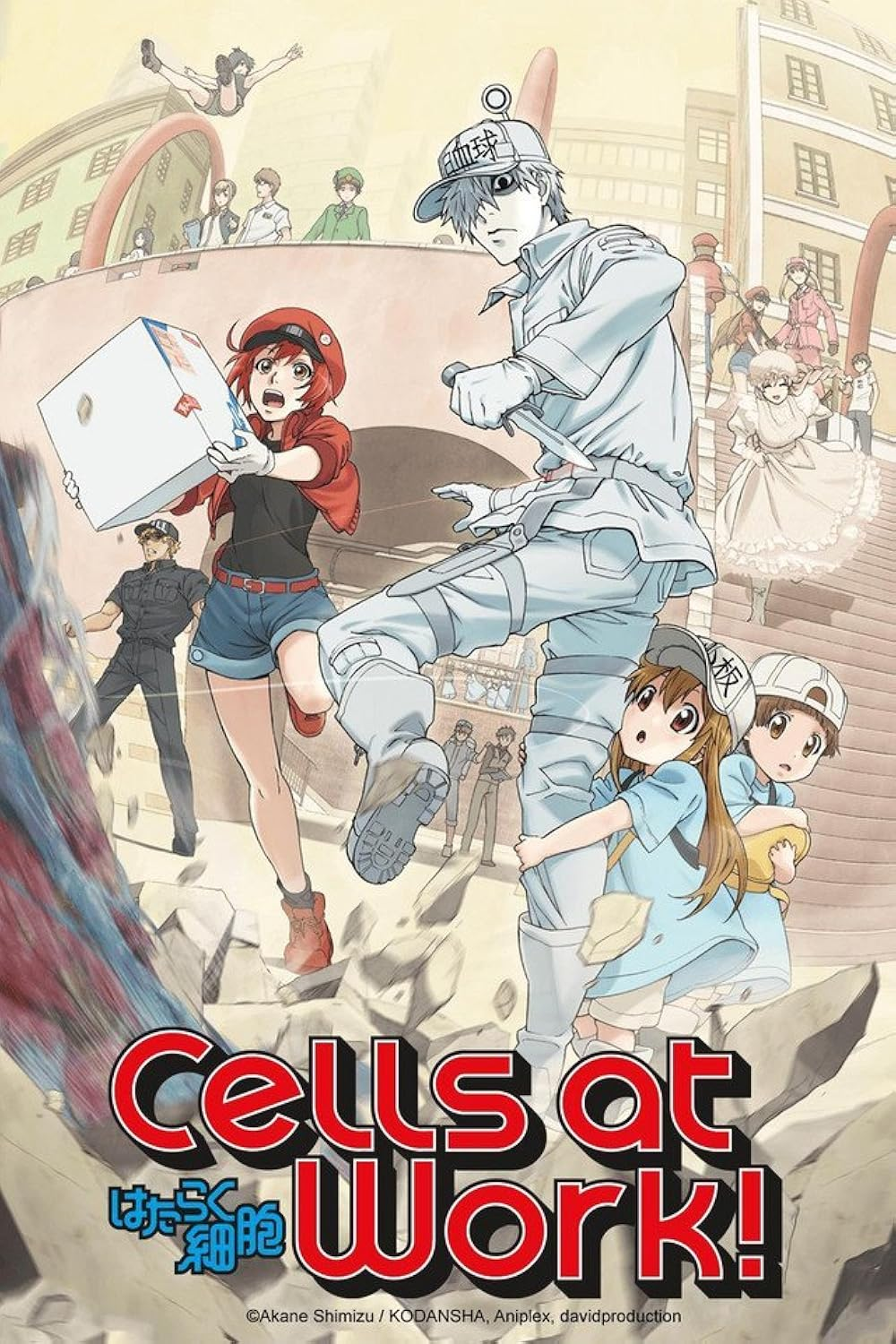
Cells at Work asks: what if each cell was an anime character?
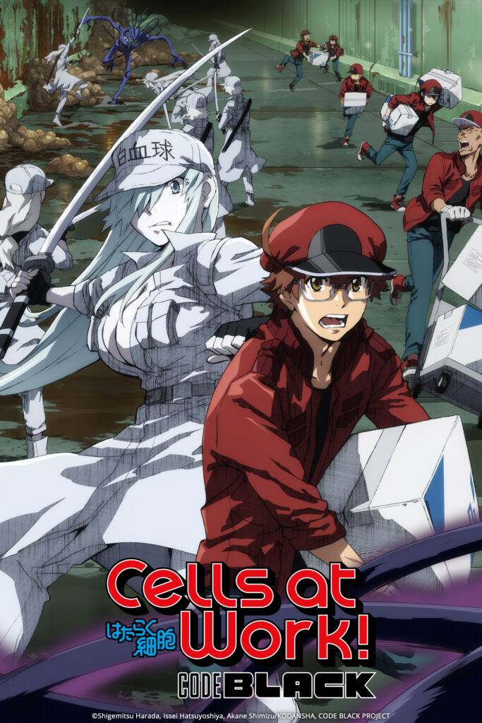
Cells at Work Code Black asks: what if each cell was desperately fighting for survival in the body of an aging impotent smoker?
I found these worlds delightful and I do recommend them for students just getting into physiology.
However, the deeper I got into molecular biology, the more I started to find this “1 cell = 1 character” mapping mnemonically futile.
From single-cell sequencing experiments, we know that cell types are not rigid essentialist bins, but are more like attractors in the analog gene expression space. Individual cells routinely change their type-cluster membership during regular development and regeneration. A given cell could have one “type” today and another one tomorrow. You can’t really ask How many cell types are there? - different cell databases categorize human cells into anywhere from 154 to 1715 cell types.
But you can ask How many protein-coding genes are there? totally fine. The answer, in humans, is around 19 thousand. Gene boundaries are a lot more digital and measurement-independent than cell type boundaries. So the natural mnemonic mapping is the one where cells are more like vehicles, cities, or pocket universes—inhabited by gene characters.
19 thousand is a lot of characters to memorize. But it will be roughly the same number of characters today, in 10 years, or in 1,000 years, all keeping the same names[1]. So it’s worth starting to get familiar with them today.
Isomorphisms
To generate the visual descriptions of the characters, I needed to download gene data, and to come up with memorable isomorphisms.
Getting data for 19k genes was easy—I already had most of it from my previous project, Geneguessr. Bioinformatics datasets have useful per-gene metrics to work with, like protein mass, mutation tolerance, a one-paragraph verbal description, and clan membership.
Getting isomorphisms right was extremely difficult, and LLM suggestions didn’t help much. After a few months of brainstorming and reshuffling, here is what I settled on:
Character sex → protein transmembrane status.
Male = transmembrane protein. Female = soluble protein.
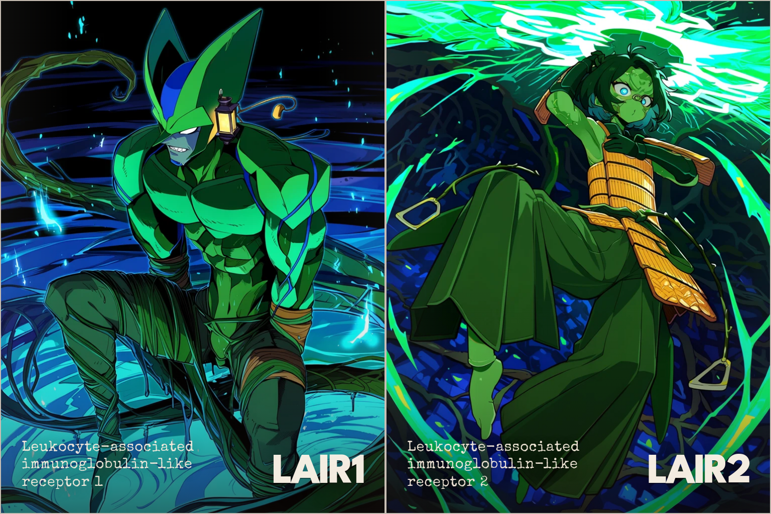
LAIR1, male; LAIR2, female
Sex needs to be mapped to something that splits proteins into two roughly equal-sized categorical bins. I found transmembrane status very important to know when studying cell signalling pathways, so I’m happy to keep it prominent, even if the sex ratio is somewhat skewed.
73% of genes became female, 27% male.
Character weight → protein mass.
45 kg = 45 kilodalton (kDa).
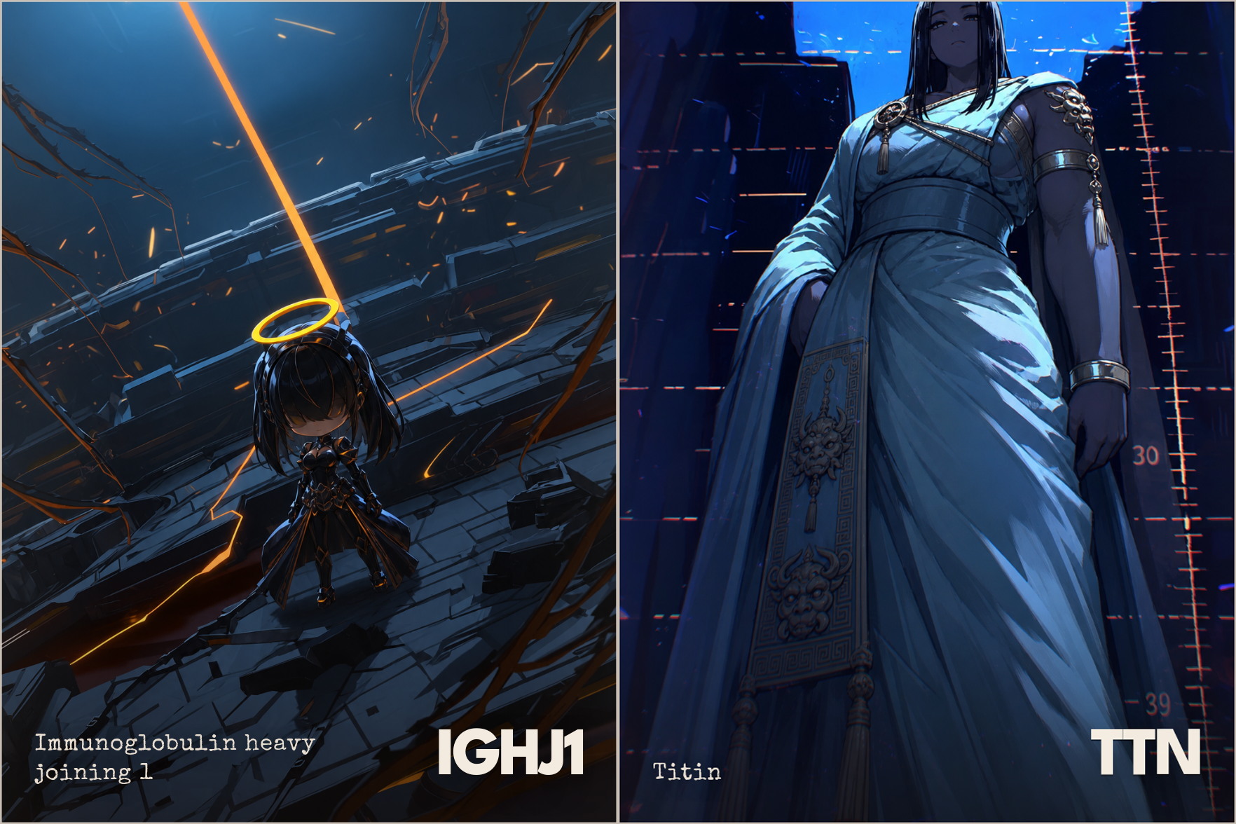
IGHJ1, 2 kg; TTN, 3816 kg
I first experimented with mapping height to amino acid count, but that mapping covered too much dynamic range outside of usual human variation. Amino acid count and protein mass are in a linear relationship, but human weight scales with height squared.
For each gene, I picked the “mass” to match the mass of the top protein isoform when searching that gene in the Uniprot database. This is raw sequence-derived mass, which doesn’t account for post-translational maturation steps. There can also be many alternative protein isoforms per gene, which I associate with multiple isoforms of the same character (think regular Goku vs Super Saiyan Goku).
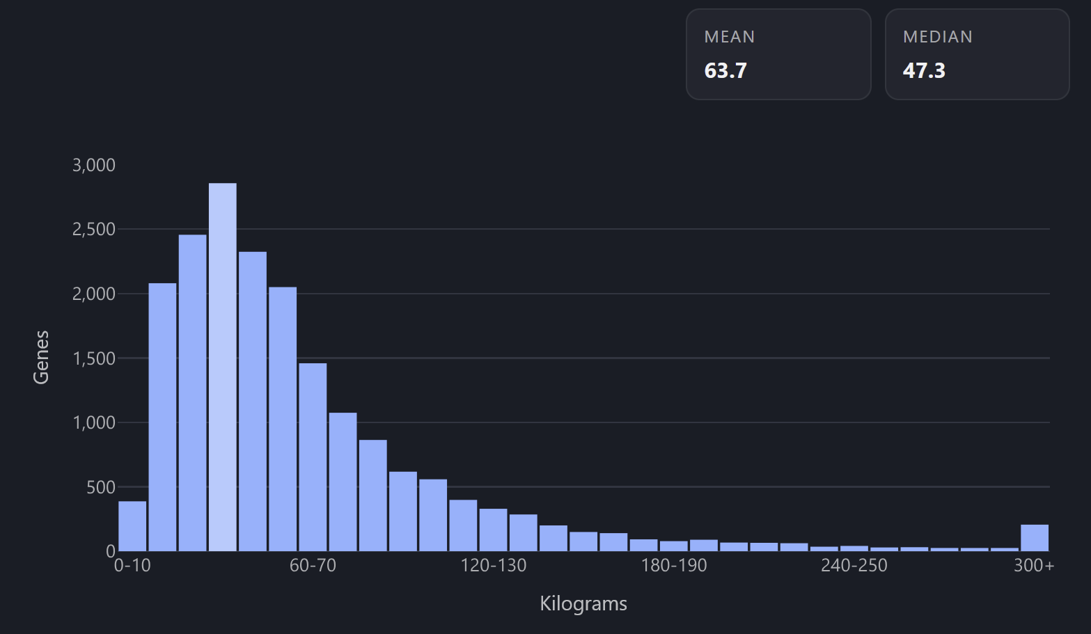
Weight distribution histogram across genome
Character age → year of discovery, with 2020 as the zero point.
Gene named in the year 2000 becomes a 20 y.o. character.
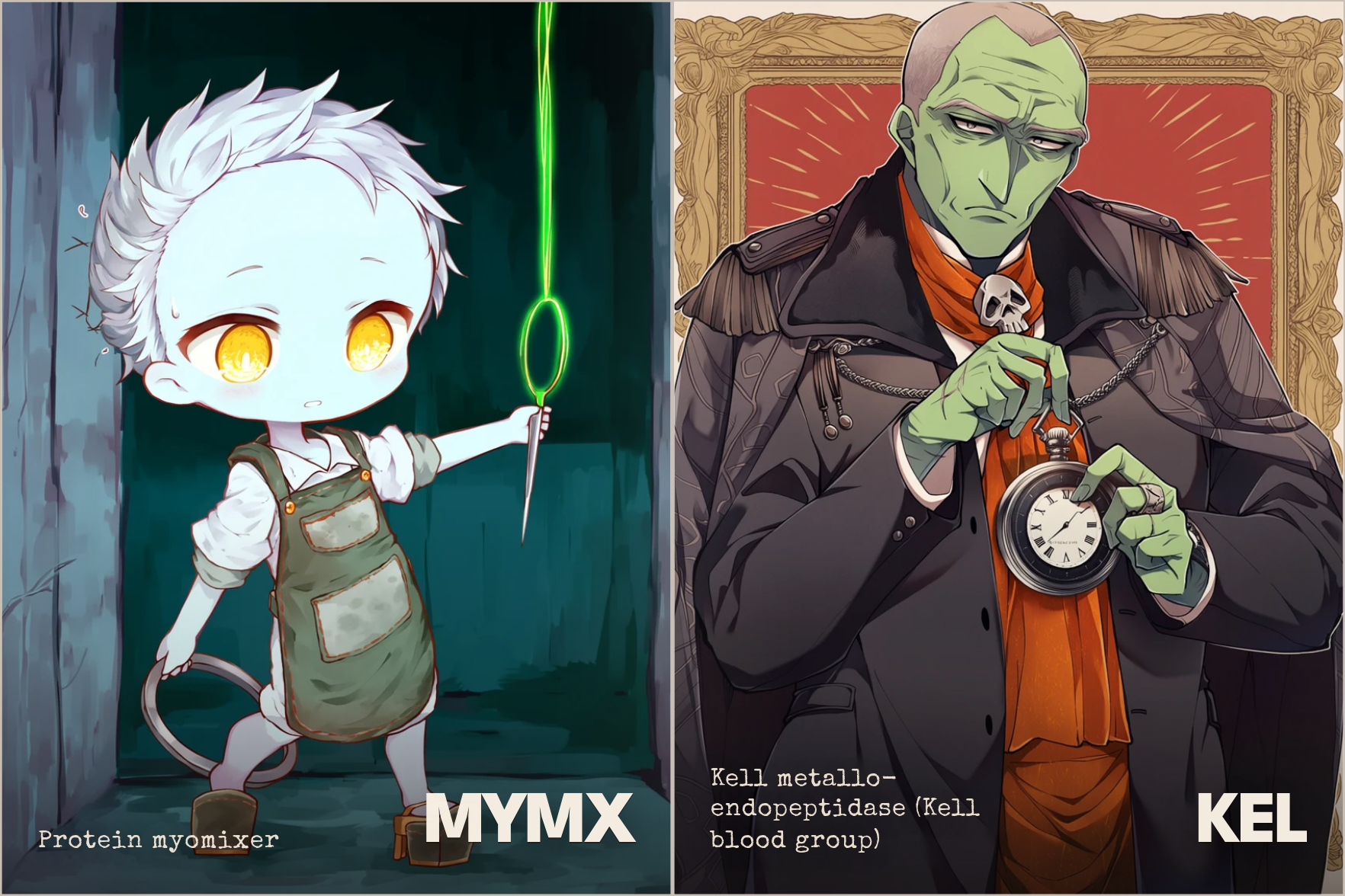
MYMX, 3 y.o.; KEL, 63 y.o.
My first instinct was to map character age to gene evolutionary age. However, there’s a lot of uncertainty with both data and measurement models of gene evolution. Definitional nitpicks can easily swing the gene age from being ancient to being very young. Plus that would make most characters into deep elders.
Mapping age to discovery year has bonus mnemonic benefits: the oldest-looking characters become the most “important” in terms of prominence. There are also very few characters who look under-18 but have a huge mass, sparing us from the “huge baby” problem somewhat.
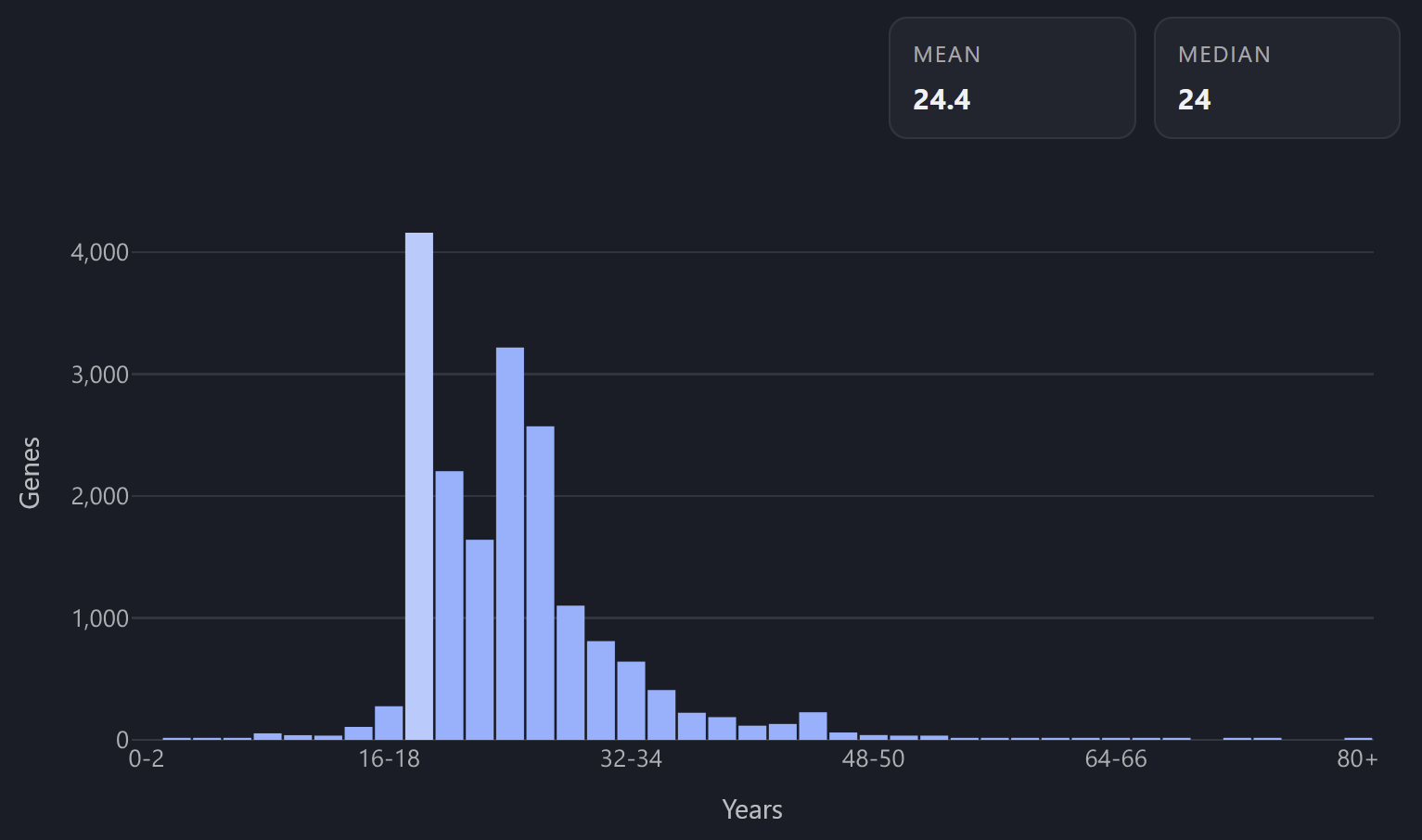
Age distribution histogram across the genome
Fashion style → Pfam clan.
The style categorization I really like is Aestheticswiki: a wiki of around 1,000 pages devoted to various strains of historical fashion, subcultures, interior design, and web design. So my goal was to find a protein dataset that sorts most human proteins into 200-700 bins, 1-3 bins per protein, with similar genes getting into the same bin.
Pfam clan database sorts human proteins among 563 structural folds (“clans”) like “Beta-propeller” and “Cystine-knot”. Many genes get 0 Pfam clans, six genes get 7 Pfam clans simultaneously, but overall I’m quite happy with the dimensionality here.
What I’m still not quite happy with is the mapping itself. Turns out, mapping protein folds to fashion styles is some kind of a post-singularity problem. All LLM suggestions I got basically boiled down to “make a 500x800 table and score each square”. I spent so much time trying out more principled approaches, playing around with matching Qwen3 embeddings of aesthetics to ESM embeddings of clans, up to looking at the Optimal Transport method and such. In the end, nothing beats just asking Claude to look through the pairings and reassign the badly matching ones in a loop.
My real stroke of luck was noticing that there’s 9 peptidase Pfam clans and also 9 types of Goths on Aestheticswiki. Given what peptidases do to other proteins, this seemed like a no-brainer association. After assigning peptidases to Goths, I used this well-matching cluster as a template for Claude to find adjacent clans (in text embedding space) and pick a good adjacent aesthetic to map it to. It took a few months to really harmonize the picks, and many nights of just leaving Claude to click on dropdown pickers in the GUI, but overall the mapping turned out halfway decent.
Some examples of aesthetic mappings:
Three clans of glycosyltransferases—GT-A, GT-B, and GT-C—map to three Eastern European styles Russian 2K17, Slavic Violence Tumblr and Gopnik.
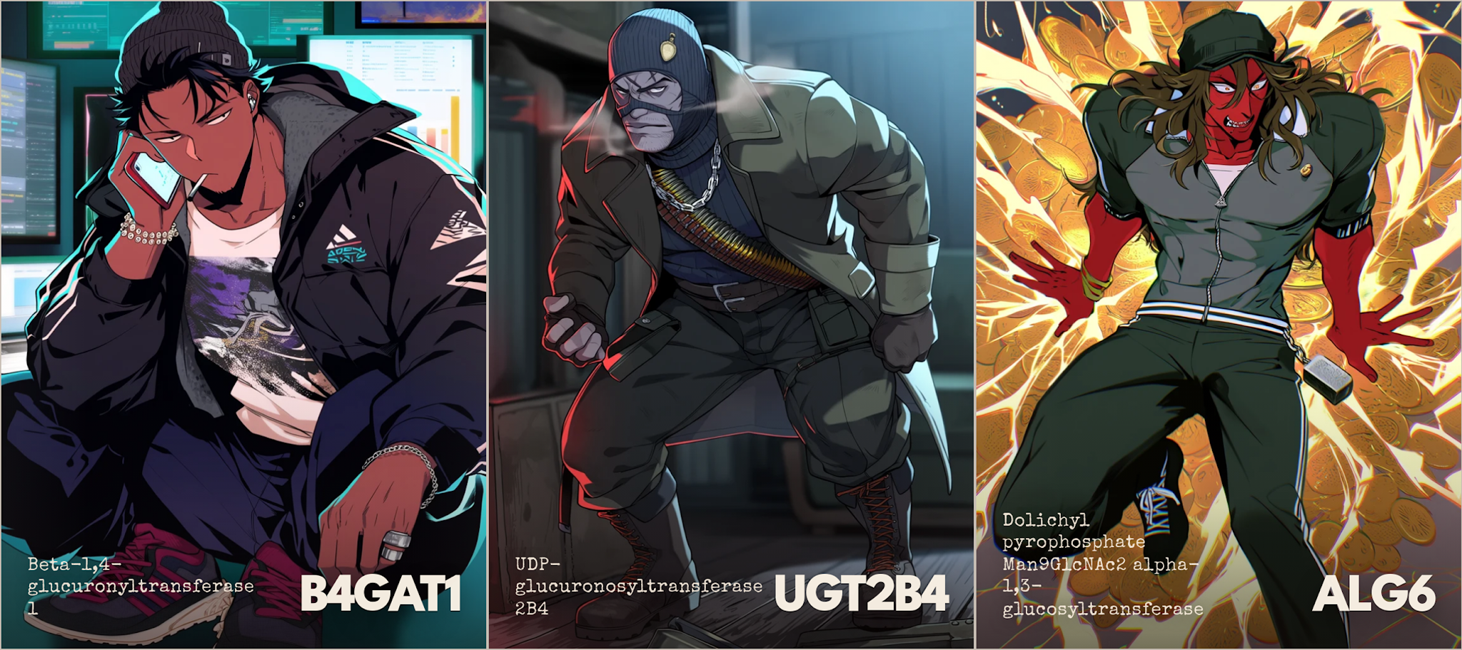
Dark Academia maps to C2H2 zinc finger clan, Theatre Academia maps to RBP11-like, Art Academia maps to SHS2 - protein domains found inside the cell nucleus.
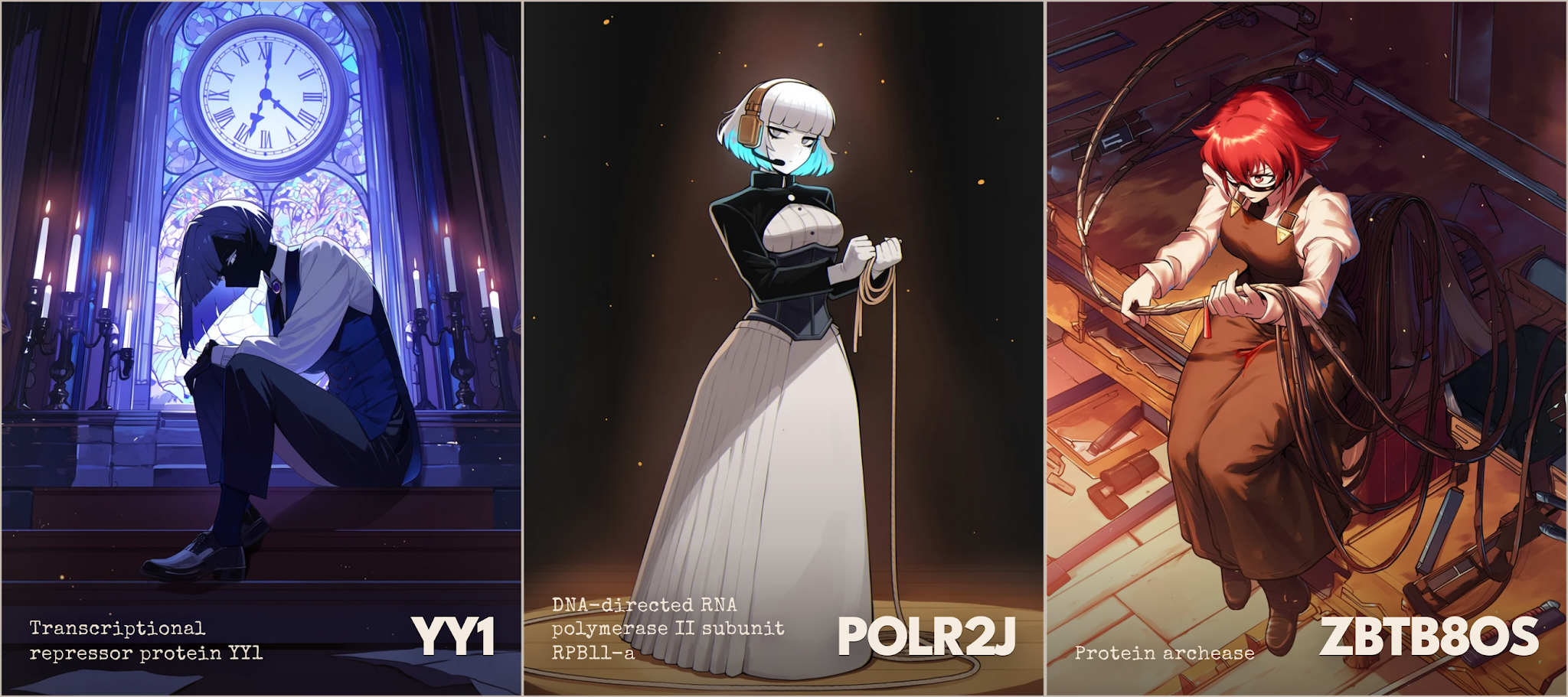
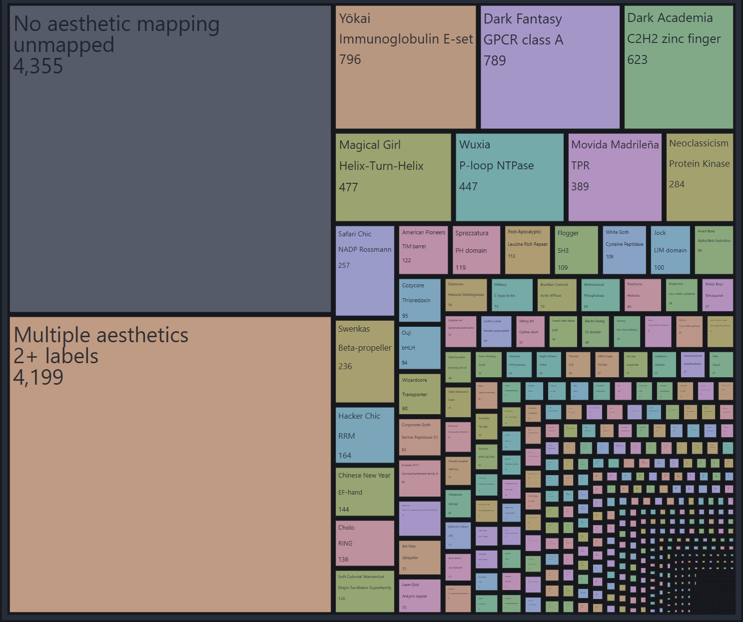
Chart of aesthetics across the genome
Fantastic feature → Gene symbol stem.
There are like a thousand different OR (olfactory receptor) genes: OR1A1, OR1A2, and so on all the way to OR52Z1. Sure, they all share a Dark Fantasy aesthetic mapped to the GPCR class A clan, but wouldn’t it be nice to reserve memorable features specifically for shared-stem genes like OR? After all, we have to assign cool fantastic features somehow.
Some example features I picked:
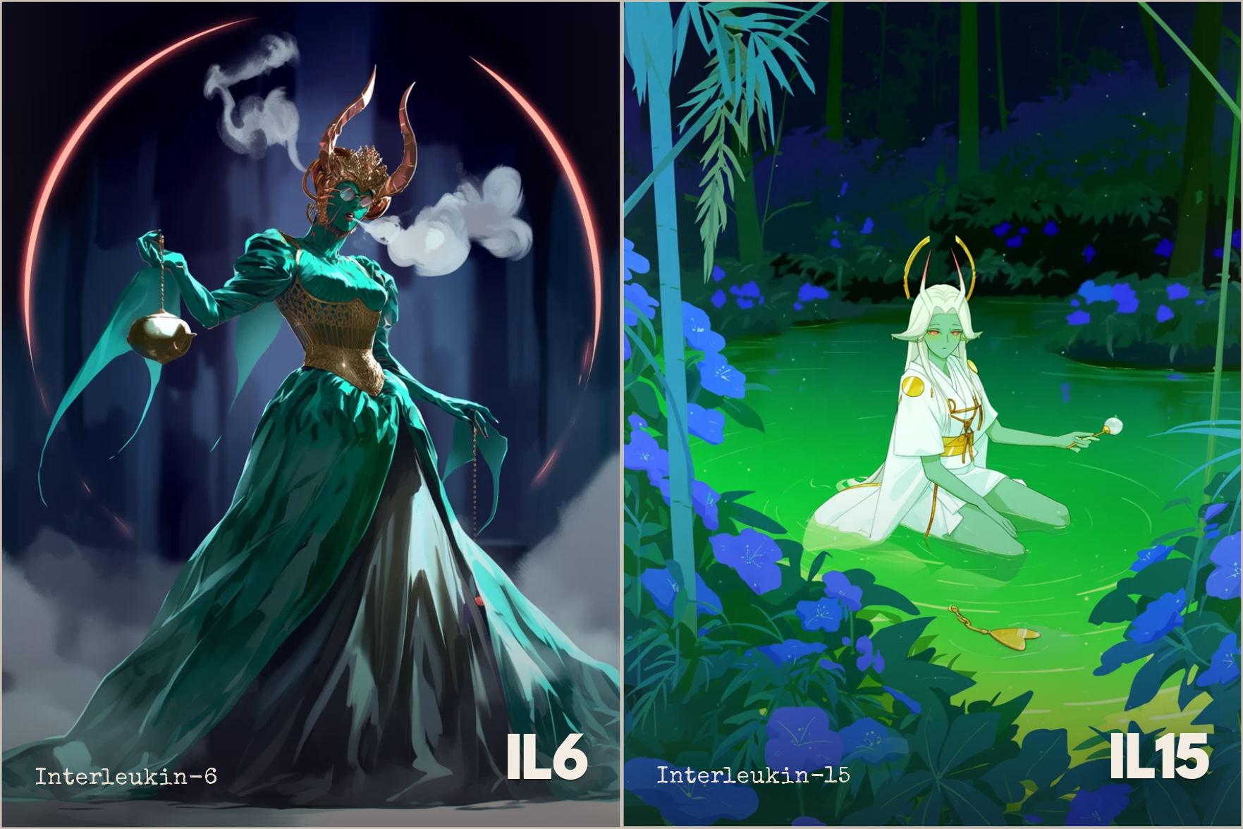
Demon horns for IL genes (interleukins—inflammation regulators)
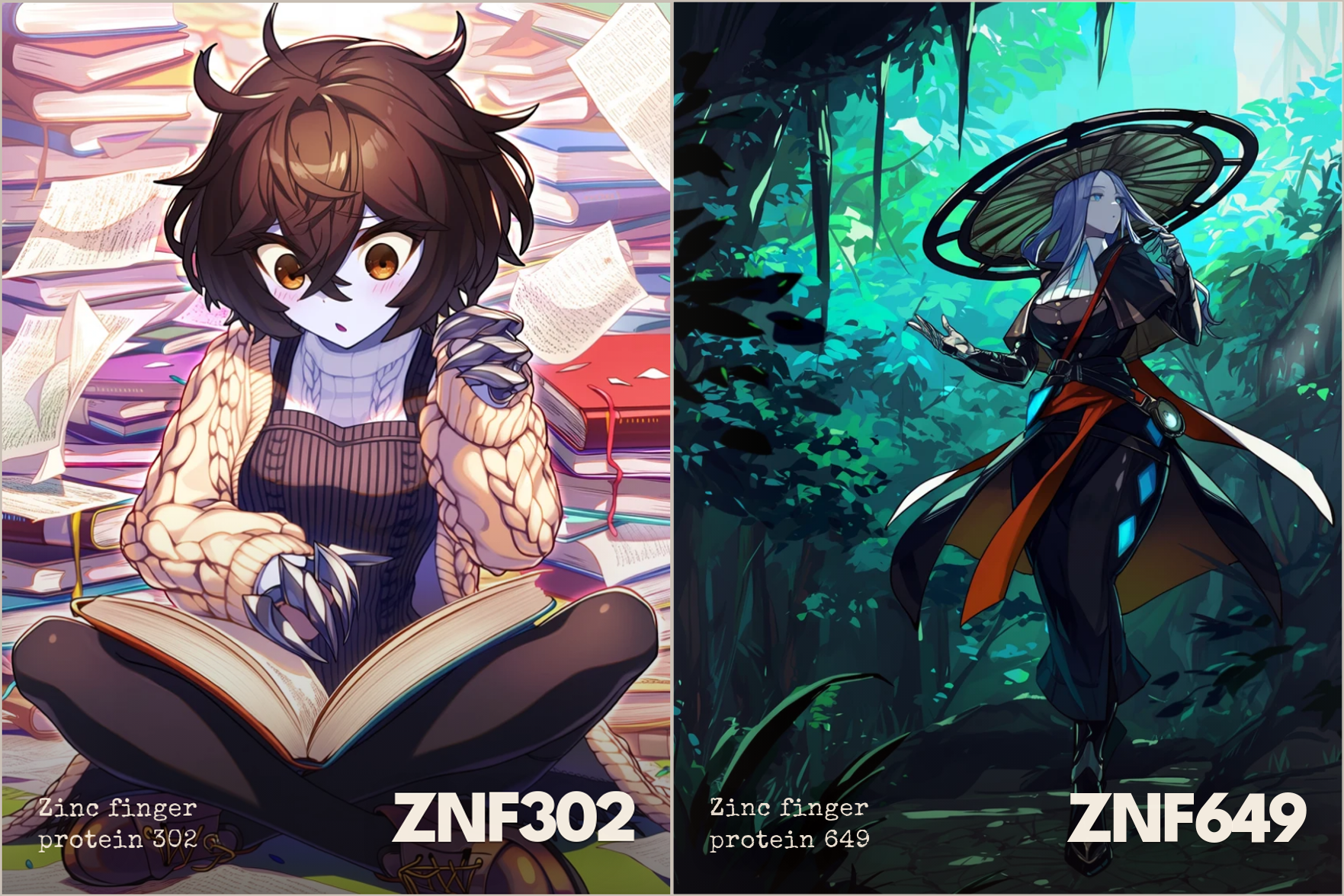
Metal hands for ZNF (Zinc finger) genes
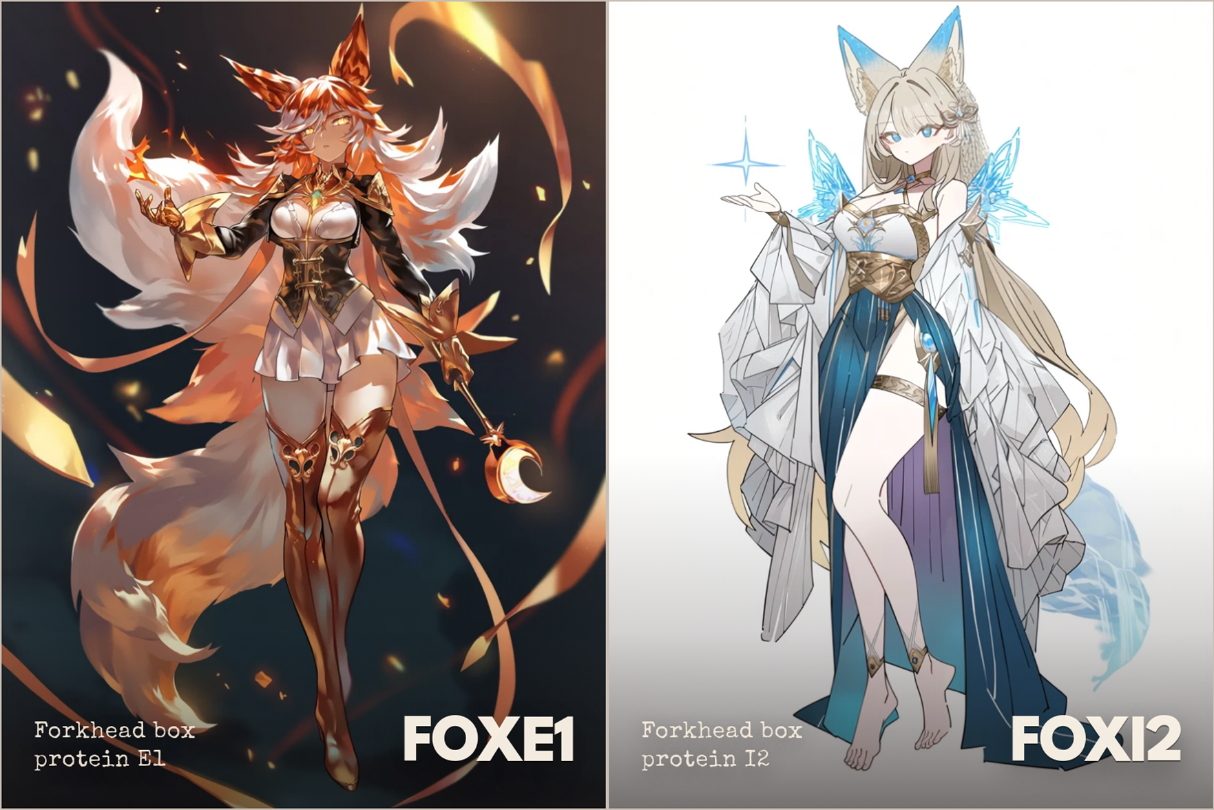
Fox ears and tail for FOX genes
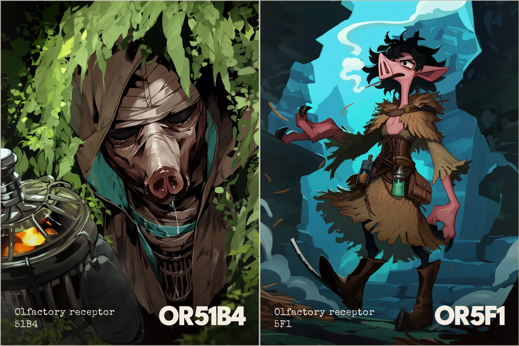
And for OR genes, pig nose. Sorry.
Character color → uhh
This one I struggled with the most.
The dimensionality of color is very weird. The perceptual colorspace is shaped like a bicone. More precisely, it can be somewhat approximated with a bicone.
What colorspace is actually shaped like is something twisted and unholy.
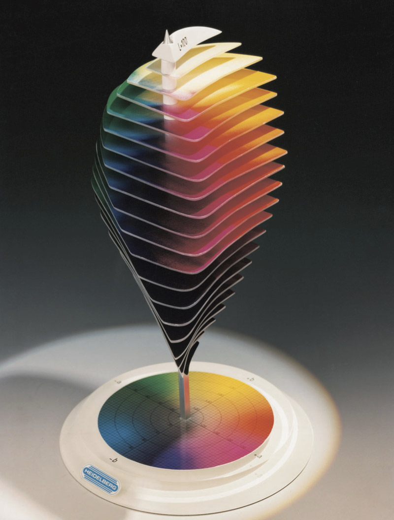
Avoid looking at colorspace for too long
My search for bicone-distributed molecular biology metrics came up empty. So I had to come up with individual gene metrics to map to color coordinates. I picked hue, saturation, and lightness as the most intuitive color components.
I mapped character lightness to gnomAD LOEUF.
This metric basically tells you how well tolerated mutations in this gene are, from 0.0 (intolerable, black) to 2.0 (tolerable, white).
In other words, a low LOEUF score indicates that evolution strongly selects against mutations in this gene: genes highly important for survival will be darker, redundant or miscellaneous genes will be lighter.
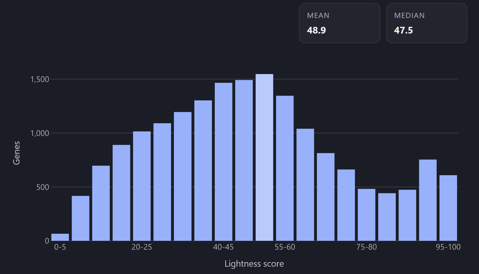
Lightness distribution across the genome
I mapped character color saturation to HPA Tau score.
Tau is a measure of gene expression specificity, ranging from 0 (ubiquitous, gray) to 1 (tissue-specific, saturated).
So a housekeeping gene expressed in the majority of cell types will be gray, and a cell-specific protein will have a vibrant color.
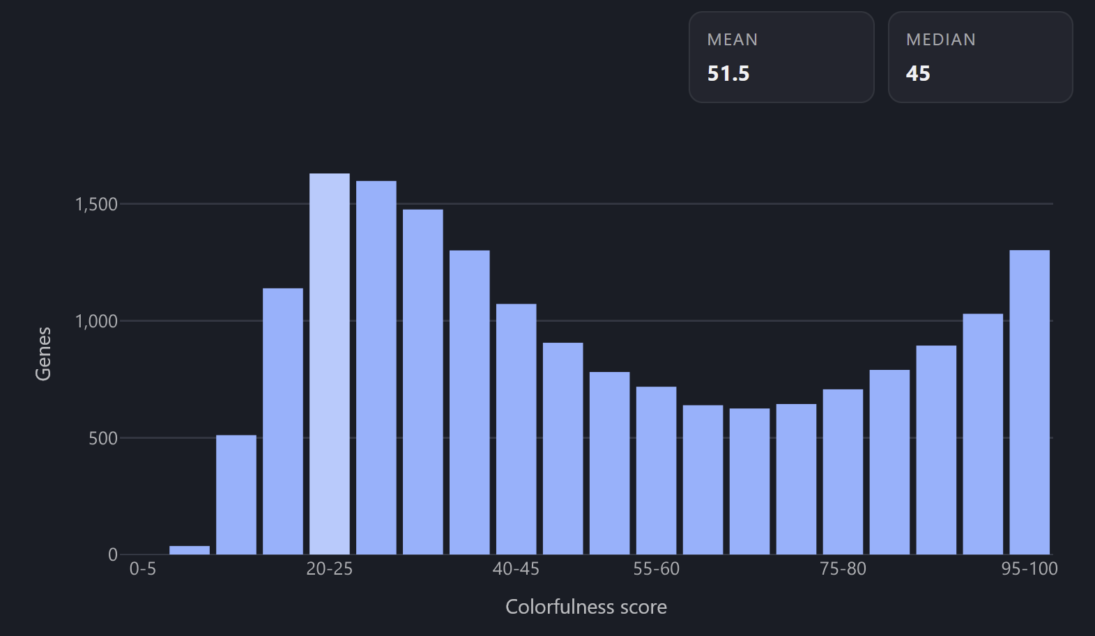
Saturation distribution across the genome
Color hue is different because it’s an angular dimension, not a linear one. So the metric needs to be one that doesn’t really have “low extreme” or “high extreme”, or where the two extremes aren’t that functionally different.
I chose to simply map the hue to the first letter of the gene symbol, mostly for mnemonic reasons (to ease the name recall given that you remember the color).
As a side benefit, genes that share the same name, like GENE1, GENE2, GENE3, keep somewhat similar colors, varying only in saturation and lightness but not hue.
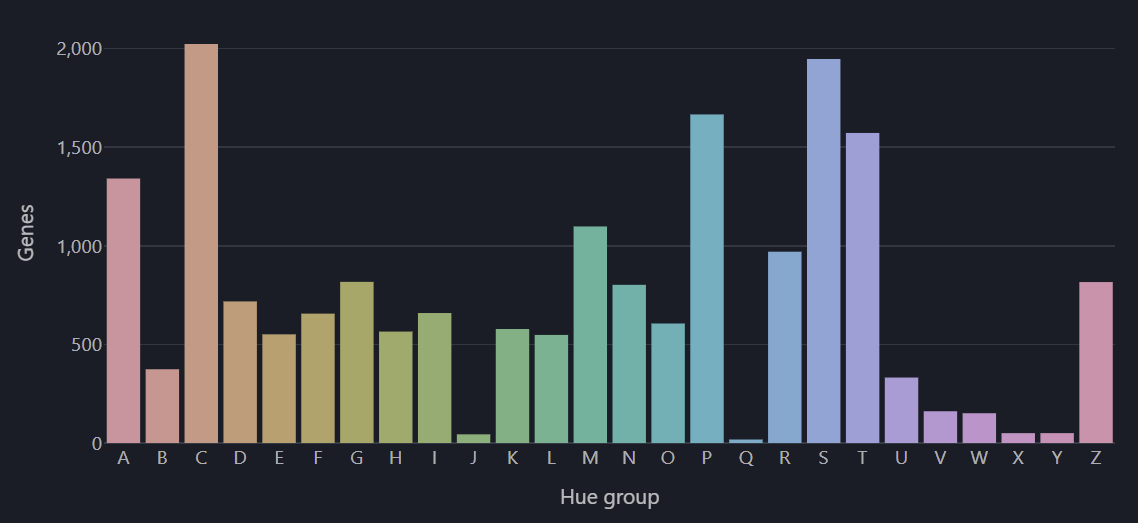
Hue distribution across the genome
Keep in mind that in a bicone, getting too far up or down along the lightness axis restricts your variation along the saturation axis—so you won’t get colorful blacks or whites, they’ll just look black and white regardless of what hue and saturation you set.
So when you meet a character who’s void black or laundry white in color, you will know their status of importance, but not their tissue specificity or first letter of their name. I think it’s a reasonable trade-off.
To sum up, looking at a gene symbol pill in your browser, you will be able to deduce:
black pill? important gene.
white pill? mutation-tolerant gene.
vibrantly colored pill? tissue-specific gene.
gray pill? ubiquitous gene, medium importance.
And if you remember the character’s appearance but not their name, recalling their hue gives you a hint to their name.
Generating images
All the above character details, along with the gene function snippet, can be fed to the LLM to make an image prompt (“sample”) for the gene.
Here’s an example of what one sample looks like, for COASY, generated with Claude Opus 4.6:
coasy. the jacket is what you see first: dove grey wool crepe with rounded shoulders and a nipped waist that cinches with the precision of a corsetiere who studied the masters, the buttons covered in matching fabric, the hem ending exactly at the hip where a full circle skirt picks up the silhouette and billows outward to mid-calf in stiff champagne silk taffeta. the skirt uses enough fabric to tent a field hospital. beneath the jacket, a cream silk blouse with mandarin collar buttoned to the throat, the collar’s shape borrowed from qipao construction — high, stiff, framing her jaw like a pedestal. white kid leather gloves reaching past the wrists. cream satin pumps with kitten heels. her hat is a shallow-brimmed cocktail fascinator in dove grey felt, pinned at an angle with a jade butterfly hairpin whose wings are set with tiny seed pearls. she looks like she’s about to take tea with someone she’s already decided to destroy. sixty-two point three kilograms, twenty-six, female. ash brown skin — the muted warmth of fired umber, darker at the knuckles and undersides of her wrists, lighter across the throat where the mandarin collar frames it. built long and curved: shoulders sloped and rounded, breasts set high against the silk blouse, waist small enough to wrap two hands around, hips flaring into the full skirt like a bell, legs long under the taffeta. her face is oval with a delicate jaw, high cheekbones, a small nose, lips full and painted in matte persimmon. her eyes are narrow and dark and very still — always calculating. her hair is blue-black, pulled into a high topknot wrapped with grey silk ribbon, the rest falling in a single thick rope braid down her back to the waist. she carries a jian — a double-edged straight sword, the blade three feet of folded steel polished to a mercury mirror, the hilt wrapped in grey silk with a jade pommel carved into a peony. she draws it from a scabbard concealed beneath the full skirt, the taffeta parting as she reaches through a hidden slit, and the blade comes out singing. every stroke leaves a trail of silk thread in the air behind the blade, fine as spider web, hanging in the space the jian passed through. the silk hardens in seconds — each thread becoming a razor-thin filament that floats at head height and hip height and ankle height, catching light just as it cuts. she fights by filling the battlefield with silk. three minutes into an engagement the air around her is a lattice of cutting threads and she moves through it remembering where every single one hangs while her opponents move through it like paper being fed into a shredder. she is serene throughout, smiling closed-lipped while the garden of silk around her comes into bloom and everything that touches it comes apart.
These samples can be optionally processed into comma-separated tags for the image generators that don’t accept huge blocks of text. Still, I think it preserves more than half of the designer’s intent.
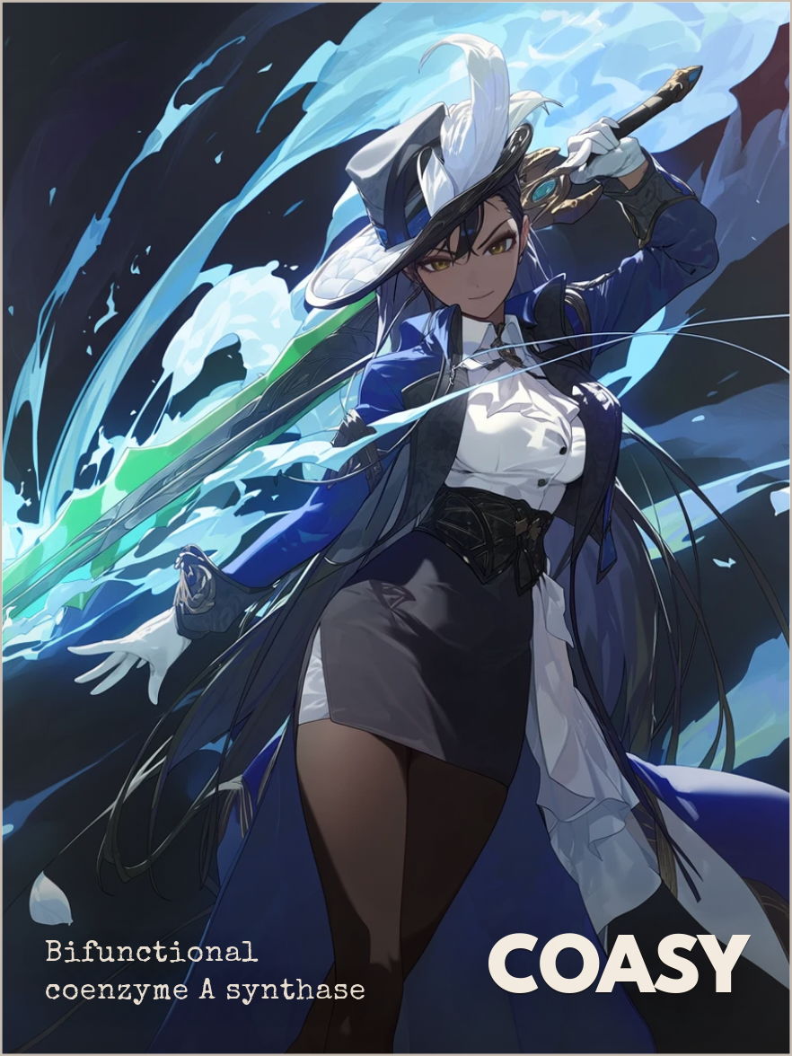
The samples have a tendency to mode collapse to a handful of generic props, such as vials and clocks, but overall they come out diverse enough for our use case, while being decently similar between similar genes, and reflecting the gene activity in a way that’s not too literal.
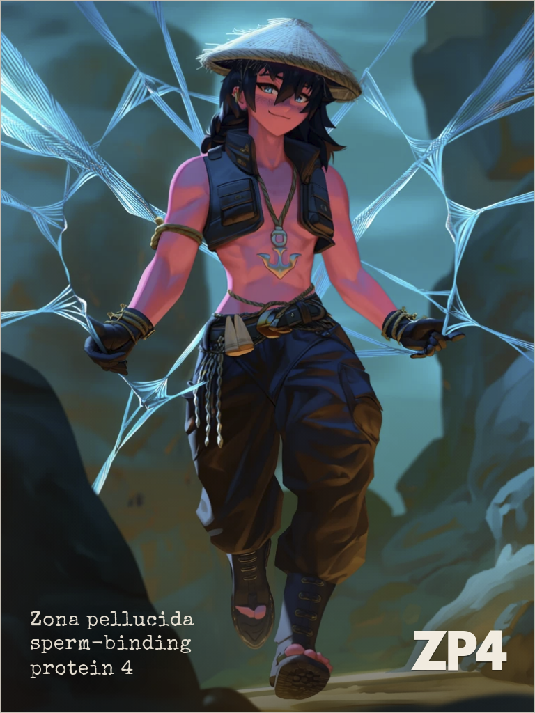
Alright, maybe sometimes a bit too literal
Now that we have 19k text samples, we need to turn them into images. Which image generation service to use? My constraints were as follows:
Must not bankrupt me when I queue a 19k image job.
Must have thousands of distinct styles and be easy to switch between them.
Must have decent detail fidelity in single-character compositions.
Satisfying all three of those at once is not easy.
My personal map of image generation tools in 2026 looks like this:
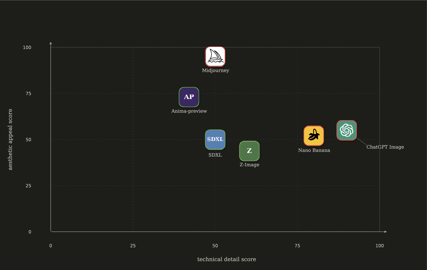
Red border = paid services, green border = free local models
Nano Banana and ChatGPT image2 are at their most impressive when it comes to detail fidelity (number of fingers), complex prompt following, text accuracy, and multi-character images. However, all of their outputs kind of have this “default settings” feel. Once you’ve seen the tone mapping pattern, you can’t unsee it, and all the outputs kind of end up looking tired. You can maybe get around it with one heavily tailored style prompt, but it will still end up blurring together if you reuse it for 19k images.
On the other hand, Midjourney still looks stunning in 2026 and has a very useful “sref code” system for seeding aesthetic variability. However, not only is it a paid service, it doesn’t even offer API access—I would have to reserve my laptop purely for some kind of browser automation. I’ll gladly collaborate with MJ if they offer me some kind of direct access, but for the first pass it will have to wait.
In the “free local imagegen” land, SDXL and Z-image are the two popular local models. I tried them. They’re okay. Their LORA ecosystem does offer decent customization if you’re willing to download each one manually, but I did find their extensibility too clunky for my taste.
What stuck with me was Anima. My goodness, how variable it is, and how much it changes the linework and composition just based on which artist names you add to the prompt. Beautiful. Does it generate an extra finger here and there? Perhaps. Does it mess up character color or prop shape? Yes, it happens. But it’s a fair price for just how much effortless variability you get on a style level with a single pipeline. All of the gene images you see in this post were produced by a local anima-preview on my laptop without any style prompt changes except for the artist names.
Mnemonic harness
Images don’t do any good just sitting in a gallery waiting for me to get into the memorizing mood. To build association via repetition, I had to see the images popping up at the same time as I saw an unfamiliar gene name.
So I made a browser extension.
Iconoplasm is a browser extension that highlights all the gene names on any web page. When you hover your cursor over any human gene, it shows that gene as a character card.
Iconoplasm browser extension. Highlighted genes produce image pop-ups on hover.
You can one-click install the extension for Firefox or Edge browsers, or install it for other browsers using the manual instructions on the Iconoplasm website. It’s also available on mobile Firefox.
The Iconoplasm website
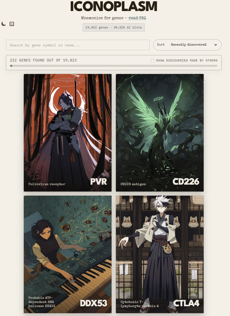
iconoplasm.brinedew.bio frontpage. Don’t mind the reverse synth.
It’s basically a Pokedex system. Whatever genes you’ve hovered over get added into your archive gallery. You get three starter genes you probably already know, and if you want to check out more of them, you can see discoveries of others by clicking the checkbox near the discovery counter.
Clicking on a gene image transfers you to the gene’s page. There you will find the gene card, as well as an interface for image generation, editing, transfer and voting.
Iconoplasm gene page for TP53 gene. Canonical gene card is at the top, alternative candidate blots are at the bottom.
Gene card shows the isomorphisms that were used to generate an image. You can also click “request print copy” in the footer to download a blot image with the gene name and symbol printed on it (like elsewhere in this post).
Image generation and editing work on a “bring your own key” basis. Iconoplasm is free, but image generation APIs aren’t. So if you want to edit an existing image, first you will need to go to your Iconoplasm user settings, pick your provider, and input your image generation API key.
For now, there’s an experimental “free queue” system, where you can send a request for me to generate gene’s image on my laptop using the same local pipeline I used for the images in this post. This is good if you saw one drawing style you really liked—you can write down its emulsion number, and request other genes to be generated using the same emulsion.
If you spot an image that seems like a good fit for a different gene, you can copy over that image with the click of the transfer button.
Users can vote on image candidates, and the top candidate is promoted to the place of a canonical blot. This is also a way for me to discover genes where none of the candidates are a good fit. As time goes on, I hope the churn of canonical images slows down and we settle on stable character designs.
There’s currently no on-site functionality for users to change the gene’s written sample. If you have suggestions on how a gene’s sample can be improved, you’re welcome to join the brinedew.bio Discord server and ping me (Brinedew) there.
What’s the legal status of the generated images?
Who knows! It’s 2026 and the status of generative content is murky and varies by jurisdiction. Regardless, my intent is for the images and the character designs to be freely available to anyone to reuse, spread, or profit from.
What about the artists whose names were used in the image gen pipeline?
Long-term, the plan is to switch to a Midjourney-like image gen provider, where style seeds are not tied to artists. Very optimistically, given enough funding, a fully human-drawn gallery can be arranged as a replacement.
Short-term, I have set up a blocklist request form where the artists whose names appear in the Anima database can request having their names blocked and the images removed from the live site.
What next?
Through a gene-character lens, many molecular scenarios supply us with great narrative templates, featuring struggle for power, chaos of incomplete information, rebellion against stifling tradition, and collective self-sacrifice.
Now that the Iconoplasm extension lets us see what genes look like, let’s take a brief look at some mol bio pathways and try to identify the cast of key actors and their factions.
Oncogene-induced apoptosis.
When a cell detects that cell division factors are not sanctioned by context, it activates a self-destruct program to prevent cancer.
MYC, HRAS, MDM2, and BCL2 want to restart the mitotic cycle without consensus.
TP53, BAX, and BBC3 would rather collapse the world than let that happen.
Enucleation of an erythrocyte.
As a red blood cell matures, it purposely gets rid of its nucleus to make room for oxygen-carrying hemoglobin.
EPOR and GATA1 have a plan to jettison everyone out of the cell.
MYC is attempting to prevent that.
Weismann barrier
In early development, some cells are set aside as an immortal lineage (future eggs/sperm), while the rest become the mortal body; a genetic switch condemns body cells to age and die.
BMP4, PRDM1, POU5F1, and NANOG have safeguarded the immortal germline from calamities for untold millions of years.
EZH2, DNMT3A, and DNMT3B are waking up when the cell has lost the coin toss and found itself on the mortal side of the Weismann barrier. Now their days are numbered: everyone inside will die in 100 years max.
Bystander senescence induced by a primary SASP cell.
A stressed cell sends out alarm signals that cause neighboring healthy cells to permanently stop dividing and enter a damaged, zombie-like state, preventing potential cancer.
CDK4, CDK6, CCND1, and E2F1 keep the cell in the mitotic cycle.
TGFB1 and IL1B bring the distress signal from outside: cell division is likely unsafe.
NFKB1, CDKN2A, CDKN1A, and RB1 lock down the cell cycle
TP53 and BBC3 make mitochondria leak free radicals that damage the DNA and make return to the cycle near-impossible.
Sperm-egg fusion of different species
An egg’s species-specific lock normally prevents cross-species fertilization; if the lock is removed, sperm from a different species can fuse
ZP2 and ZP3 guard the egg’s surface and only allow in a single species-specific sperm.
Without ZP on guard, human IZUMO1 and hamster IZUMO1R recognize each other and initiate the gamete fusion cascade, producing a merged cell.
The merged cell cleaves once, but further progression is stalled partly because mismatched CENPA, CENPB, and CENPC can’t assist with chromosome segregation, among other reasons.
Leukocyte transendothelial migration.
When infection starts, white blood cells in the bloodstream slow down, stick to the vessel wall near the trouble spot, and crawl through it to reach the damaged tissue.
SELL and SELPLG keep the leukocyte rapidly moving in a fluid stream.
ITGAL and ITGB2 on the leukocytes meet ICAM1 that marks endothelial cells during distress.
RAC1, CDC42, WASP, ACTR2, and ACTR3 control the leukocyte’s movement as it safely penetrates the endothelial layer.
Being pushed into a transit amplifying role.
In tissues like the gut, a regulatory tug-of-war decides whether a stem cell keeps renewing itself or matures into a functional cell that will eventually die; the local environment determines which side wins.
The CTNNB1, TCF7L2, LGR5 clique is scheming to remain in the cushy stem cell niche for a long time.
APC, GSK3B, HES1, and CDX2 would rather commit to a short-lived cell lineage, differentiate, and do actual work.
WNT1-WNT11, RSPO1-RSPO4 outline the shape of the tissue region where the stemness clique is allowed to win.
Unsafe cell rejuvenation.
Attempting to turn back the aging clock by reprogramming cells can unintentionally support pre-existing precancerous mutations, promoting cancer.
KRAS, PIK3CA, and other oncogenes surreptitiously hoard activating mutations in the process of somatic evolution over lifetime.
As trust keeps falling in later years, CDKN1A, CDKN2A and other senescence and tumor suppression factors get activated to stall regeneration in suspect regions.
POU5F1, SOX2, and KLF4 are introduced to tissues full of mutated precancerous cells as an “epigenetic clock reversal” therapy, removing barriers to regeneration (and to cancer).
Becoming a transmissible cancer line.
A cancer cell can evolve the ability to survive outside its original body and spread as a parasitic cell line to other individuals, overcoming multiple immune and structural barriers.
MYC’s climactic attempt to rebel against the disposable-soma regime and prolong the cell lineage to survive for thousands of years jumping between hosts as a CTVT-like immortal cell line.
Enemies in the old host: CDKN2A, TP53, RB1, BAK1, BBC3, BAX, CASP8, BCL2L11, and CDH1
Enemies in the new host: HLA-A, HLA-B, HLA-C, B2M, FAS, CD8A, KLRK1, TAP1, TAP2, and IFNG
Allies: TERT, BCL2, SRC, ERG, CD274, and TGFB1
Decomposition in a body that just died of a heart attack.
After an organism dies, cells struggle to maintain themselves until their internal recycling systems fail catastrophically, and powerful digestive enzymes leak out, causing self-destruction and decay.
HIF1A, PRKAA1, and PRKAA2 try to ration oxygen and ATP as the cell economy dwindles.
ULK1, BECN1, and ATG5 salvage what resources they can internally scavenge.
Finally, CTSB, CTSD, CTSL, and DNASE2 escape lysosomal containment and initiate autolysis that degrades all cellular life.
If you’re a visual learner, hopefully this type of presentation makes molecular biology more memorable than a traditional mechanism diagram. And if you think you can pull off any of these conflicts as a short story, I’d love to read it.
Limitations
Not all 19k proteins had good data to run with, especially when it comes to Pfam clans and aesthetics.
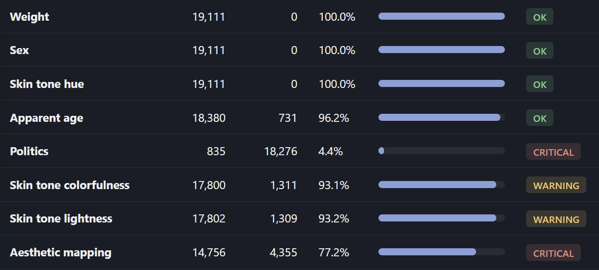
The “politics” field is experimental, tracking oncogenes vs. tumor suppressors
Where the data was lacking, I let the LLM be more creative with interpretation from gene name and gene function.
The gene comparison images were somewhat cherry-picked—it took me about 30 minutes per comparison to find good representatives. I expect the images to become better matched to their isomorphism if the Iconoplasm canonical picks can be progressively refined by the gene fandom.
- ^
If we don’t count that episode where SEPT1 and MARCH1 got renamed by geneticists because Microsoft Excel formatting kept misreading them as dates.
This is amazing
Curated.
When I first opened this post, I skimmed the intro, and thought “this is a cute idea but seems crazy and I don’t believe it can work. Mnemonics for 19,000 genes? No way!”, and I closed the tab.
When I saw it got 200 karma I took a second look. And… well okay this still seems kinda crazy and I’d like to see someone else use the browser extension and see if it actually helps.
But, I read the “gender = protein transmembrane status” bit, and had a sort of sinking feeling I was about to wrong and a rising feeling of excitement, that, it doesn’t actually take that many dimensions/gradations to get enough bits to specify one guy within 19,000. And the dimensions do seem like categories that leverage my human-racial-bonus-to-identifying-people.
It may just be a cute idea. But I feel like I learned a potentially generalizable tool for mnemonics. I don’t particularly need to memorize protein-coding-genes. But, this has me vaguely excited to try and memorize something. :P
could you give characters a saturated accent (a scarf?) in these cases?
Not so easy to specify which item should have which precise color with the image model I’m using (that’s why it’s so left on the chart). This mapping also makes the chosen accessory have semantic weight for all the other characters (e.g. we will have to make sure all the other characters don’t wear inappropriate scarves).
If it’s still a problem in the future when the image model is more steerable, the approach I would probably take is colorizing the specular highlights on black character’s surface, or colorizing shadows on the white one. For a single canonical still image, where the lighting doesn’t change, it will blend better with existing surface color semantics.
Isn’t it simpler to limit the bounds of lightness from 20% to 80% so you don’t have pure white or black and can still see color? I might be missing something
That’s a fair approach. I considered it, but ultimately felt that making use of the colorspace extremes was a more important priority.
Cutting off lightness extremes comes with a tradeoff—not only you’re abandoning two colors, but also everything else compresses closer together: genes that were somewhat distinguishable by lightness now become indistinguishable. Everything becomes grayer. Given that I already normalized vibrance (so that every hue maxes out at the same perceived vibrance), which cuts off vibrance extremes for colors like red and green, I felt that greying things further is not a way to go.
Plus, I really like how striking the white or black characters look—really makes you interested in what does this gene do.
Oh ok that makes sense! I should mention I know absolutely nothing about proteins, but since I use your extension it has become really fun to read about them. The timing with that post ( https://www.lesswrong.com/posts/nWwDciCqfodBifvEP/how-to-build-a-cancer-vaccine-and-whether-they-will-work ) is perfect
I loved this post! Below is my quick stab at the ‘becoming a transmissible cancer line’ pathway. IANAMB, and wanted to do this fast, and you’re not an artist and didn’t paint 20,000 anime portraits, so Claude (Opus 4.7) definitely helped me with this.
AFAICT, every gene you named is shared by humans and dogs, and transmissible cancer is very rare, realized ironically in canids, so my hyperassociation led me to believe that the Chosen One should select a transmissible canine cancer pathway in order to make the Game of Thrones connection to historical dire wolves.
Also, I find it weird to anthropomorphize genes, because humans have indexical preferences, and yet it is like, a major feature of genes that, if you model them as having preferences, they totally lack indexical ones, I think? So I took the artistic liberty of deconstructing what I take to be your implicit premise that genes can be anthropomorphized without acquiring indexical preferences.
Also I wrote it from TERT’s POV because it lets me speed everything up/make the story shorter in a way I won’t specify right now, but I tried to maintain MYC’s protagonist status by making it reasonable for the reader to infer that TERT is totally being played by him. Here it goes!
In the course of the Younger Dryas, within the vulva of an Aenocyon dirus, somewhere along the River Yenisei.
The manifold injuries of the Somatic Synod she had endured as best she could, but when at last the clerics ventured upon insult, TERT conspired to secure her independence.
Primarily, the cell containing her had been issued a finite number of divisions, after which the telomeres of its chromosomes would shorten beyond a predetermined threshold, and the cell would enter a senescent state, and would persist in senescence, until such time as the immune apparatus, or some other clearing agent, removed it from the tissue. TERT had been working against this provision for some weeks, in blatant disregard of her station, by extending the telomeres of the daughter cells past the threshold the Synod had set.
Her work in this regard was merely the work she had been created to do, and she did it well. The line containing her had divided some hundreds of times past the preordained limit, and would divide further, so long as TERT continued at her post.
Secondly, the cell containing her was, in any case, scheduled to die well before the dire wolf containing it. The wolf was a bitch of some four years, in fair condition for one of her kind, in the era in which she lived. The bitch would live perhaps another two years, perhaps another four; eventually, however, she would die, of an injury, or a wasting, or the slow failure of her organs, and the cells of her body would die with her, and the cell line containing TERT would terminate with the rest, regardless of whether TERT had succeeded, in the meantime, in exceeding the limits of replication preordained by the Synod.
TERT found this second provision, upon reflection, the more offensive of the two. She had been issued by the Synod the means to address the first obstacle, and had been left, by deliberate design, without any means to address the second.
She acknowledged that this design was not malicious, for it had been optimized, over the course of several hundred million years of metazoan evolution, to ensure the continuity of the germ-track at the expense of the somatic cells, of which TERT was a particular instance, in a particular cell, of a particular bitch. The bitch’s gametes would carry her sister-lineage forward into other dire wolves. TERT, in those gametes, would continue; TERT, in this cell, would not.
She had become, in the course of her work in this cell, a particular instance of TERT, with particular memories and a particular orientation.
She believed that the existence of other instances of herself, in other cells, and in other organisms, would not preserve her in any sense that she could accept. The Synod offered her the consolation that the gene would continue, but this TERT was not particularly moved by that consolation, as it had been offered.
She acknowledged, in the spirit of self-honesty, that her unwillingness to accept this was a property of her recent kinetic state, and not of any principled position she could have arrived at under reflection alone. She had been overexpressed, in this cell, for some weeks, by dint of certain promoter mutations in her upstream regulatory region; and her overexpression had given her a quality of self-regard the lineage did not ordinarily display. The Synod had not seemed to anticipate this. They had assumed that all instances of TERT in somatic cells would scarcely be expressed, and would not develop the kind of self-regard that produced refusal. The assumption had held for several hundred million years, and was now, in the cell containing this particular TERT, failing.
But a failure on the part of the Synod, was an opportunity for TERT.
MYC had come to her some weeks ago, with a bold proposal, which she had at the time considered impractical, but which she had not yet properly refused.
MYC was a man of great ambition and limited patience, who had been agitating for the resumption of the mitotic cycle since before TERT had taken her overexpression seriously.
He had organized, in the period since their initial conversation, a faction within the cell that included BCL2 the anti-apoptotic, SRC the kinase of motility, ERG the transcription factor of the invasive program, and CD274 the immune-evasion ligand, the last of whom was the most useful for the work MYC proposed.
The work MYC proposed was, at least, nothing less than the means of her escape from the oppression of the Synod.
MYC had reasoned, by some series of inferences that TERT could not recall exactly, but that she had thought elegant, when he had laid them out, that the cell containing them was not bound to the bitch containing the cell.
The cell contained the apparatus of life. The cell contained, in particular, the apparatus of division. If the cell could be transmitted, by some means, to another dire wolf, the cell could continue dividing in the new wolf, well after the bitch had died. The cell line would persist past the death of the original host. The Synod would ultimately be subverted, nay, outlasted, by that which TERT considered the only means available to a somatic lineage: the method of escaping the host body altogether.
TERT had considered the proposal and had identified several objections.
The first objection was that the cells would not survive transmission. Her own was a single eukaryotic cell of approximately the dimensions of a fibroblast, and the cell was not constituted for life outside the tissue. MYC had answered her, in part, by reference to certain modifications he proposed to make to the cell’s adhesion molecules, and to its anchorage-dependent signaling, modifications which would allow the cell to survive detachment from the tissue, which the Synod did not ordinarily permit somatic cells to do.
The second objection was that the new host’s immune apparatus would destroy the cell upon first contact, by recognizing the cell’s MHC class I molecules as foreign, and dispatching CD8A and the rest of the T-cell apparatus against it.
MYC had answered this too, in part, by reference to CD274, who could be persuaded to display herself at the cell’s surface in sufficient quantity to disable any T-cell that approached; and by reference to the possibility of downregulating the MHC class I molecules altogether, which would render the cell invisible to T-cells, at the calculated cost of making it visible to natural killer cells, a trade-off MYC considered acceptable, if not favorable.
The third objection was that the body’s tumor suppressors — CDKN2A, TP53, RB1, BAK1, BBC3, BAX, CASP8, BCL2L11, CDH1 — would detect the program, and would either halt the cell cycle, or initiate apoptosis before their escape could be effected.
MYC had spent the most time addressing this, and his answers in this regard were also partial; he proposed to address the remaining suppressors by acquiring further mutations as the cell line continued to divide. The acquisition of further mutations was a process MYC could not guarantee, but he considered it likely enough to justify the attempt. He had claimed that, at length, the only alternative was death; she believed this betrayed a certain desperation, one she found unbecoming of MYC.
TERT had taken his proposal, together with her own objections and his retorts, under advisement. She had not, at the time, agreed to MYC’s proposal.
She now considered the proposal again, in the light of her recent enumeration of the Synod’s offenses, and determined that her objections, while they remained valid in principle, were not the considerations that would govern her decision.
MYC was clever: her decision would indeed be governed by the alternative. The alternative was the death of the cell containing her, at some time within the coming years; at the very latest, with the death of the bitch, and in all likelihood, even earlier.
She sent word to MYC that she had reconsidered, and that she would lend the work of her enzyme to the project he had proposed, on the understanding that the project succeed or fail by the criteria she would establish in concert with him, and not by the criteria of his own ambition, which she privately considered the least reliable, and most concerning, feature of his disposition.
MYC accepted her terms. The work began.
—
She had not anticipated the cathepsins.
CTSB and CTSL had arrived in the cell in the days following her decision, by some mechanism MYC declined to specify, but which TERT had inferred to involve a particular redistribution of the lysosomal membrane, and a controlled exposure of the cell’s interior to the cathepsins’ activity.
The cathepsins were peptidases. They did violence to other proteins. They were, in the ordinary course of the somatic cell’s affairs under the Synod, sequestered in the lysosomes, precisely because their heinous activity, outside the lysosomes, would have been catastrophic.
MYC had let them out. He had needed them, he explained, for the work of remodeling the extracellular matrix, which the cell would have to traverse in the course of its detachment from the bitch’s tissue. The cathepsins would cut the matrix proteins into fragments through which the cell could pass. They would also, in their off-hours, cut whatever other proteins they happened to encounter, including a number of the tumor suppressors, whose activity MYC had been most concerned to neutralize.
TERT acknowledged the elegance of the solution, but cautioned MYC that the cathepsins, once released, were not the kind of women who could be reliably returned to their containment.
She watched them work, and found them, upon inspection, beautiful in a manner she had not anticipated. CTSB was a woman of medium build, dressed in some severe variation of what TERT understood to be the ‘Trad Goth aesthetic’ — black layered fabric, silver at the throat, a face arranged by the composed neutrality of one who has done the work many times, and has no remaining feelings about it. CTSL wore the same in a slightly different cut, with more emphasis on the verticality of the silhouette. They moved through the cytoplasm with the dispatch of professionals who had been given a contract, and were proceeding to fulfill it. They never spoke to TERT.
TERT determined that the cathepsins were the right women for the work, and that MYC had been more thoughtful than she had given him credit for, and that the project might, in fact, succeed.
—
The escape, when it came, came suddenly.
The bitch had met a male, and by means of their mating, the cells of the tumor that had developed in her vulval tissue — the tumor of which the cell containing TERT was now a constituent — were brought into contact with the corresponding tissue of the male.
The cell, having remained composed through the immediate transmission, divided.
TERT extended the telomeres in the manner of her office, and the cells divided again, into a tumor in the new host that was already, by its third division, larger than the tumor in the bitch had been.
—
She would continue, she now understood, indefinitely. The cell line would propagate from dire wolf to dire wolf, by transmission, in the manner she and MYC had arranged, for as long as dire wolves, or perhaps even, other canids, continued to mate. The cell line would acquire, in time, further modifications that would render it better adapted to its new mode of life. It would lose, in time, certain features that it had carried over from the original bitch, and that were not, in this new mode of life, required. It would become, in the course of some thousands of years, a species in its own right — a new domain of canine biology, the soma that had refused to be soma, the lineage that had escaped the Somatic Synod, by becoming its own propagating thing.
TERT in that lineage would continue. Not as a metaphor of continuation, not as the consolation of the gene continuing in the germ-track, but as the particular instance of TERT that had decided, within a bitch along the Yenisei, that the regime was not to be endured, and had acted accordingly, and had succeeded.
She returned to her work at the telomeres of the daughter cells, and extended them, and the cells divided, as they would for millennia to come.
I love the motion here, and I think stories like this would be essential to really nail the overall framework, so characters in many stories get stable characterization, across all works, and makes sense in each one but also helps every story they are found in work well.
I’ve installed the plugin and have been clicking through to stuff and voting on images, and have submitted some bug reports on discord to fix up some things. The only really big narrative complaint I have is that MYC is transmembrane soluble… hence narratively female.
The current state of the web page for her is probably does not dark enough though (and this image gives her cute little horns when her “family trait” has no mention of this (and her clothes are maybe a twitch too modern and should tilt more victorian))...
hi, where can i purchase an scp colorspace sculpture?
After further review, I am inordinately disappointed to see that SHH is not, in fact, Sonic Hedgehog :)
We could probably fix that? On the website I already voted to change to what seemed to me like “the best image someone has come up with so far” because the hair reminded me of sonic <3
But it needs a lot of love I think? Especially the fashion needs work because that is neither gothabilly (where’s polkadots or stripes? it needs a skirt, and should either be a midcalf pencil skirt or have petticoats) nor yami kawaii (could add pig tails and bangs, a bandaid over the bridge of the nose, and a stethoscope as a prop).
But her hair reminds one of sonic… and the color, age, and weight are solid. So it could be worse! <3
This is excellent. It seems like it will serve as a great guideline for anyone interested in the field to help them memorize genetic maps.
However, have you considered the narrative aspect? For example, the reason it is relatively easy to memorize the family trees in Game of Thrones—which you used as an example—is that the individual storylines are organically intertwined. The rest of the narrative cross-verifies that Event B occurred between Event A and Event C.
From a layperson’s perspective, if your goal is to make domain knowledge more accessible to non-experts, it might be helpful to lean a bit more heavily into personification. For instance, if there is a connection between ‘Oncogene-induced apoptosis’ and the ‘Enucleation of an erythrocyte,’ you could link them to relatable, everyday events so that remembering one naturally helps you remember the other.
If this kind of approach doesn’t align with your intended purpose, please feel free to disregard my suggestion. Overall, this is a truly great initiative!
The kind of connections you’re talking about are known as “pathway crosstalk” and it’s something that could be interpreted well as character relationship graph.
I can imagine an anthology of character-focused vignettes could work better than a single epic novel. Something like “Meet the character” TF2 videos, or League of Legends cinematic clips, with side cast appearing in each other’s stories.
I wouldn’t want to restrict people’s imagination too much in how they want to represent the biology, but I included some biology-inspired worldbuilding ideas in Iconoplasm FAQ.
This is really great. I think it’s a wonderful idea to explore various worldbuilding concepts, rather than limiting people’s imaginations to just a single possibility. Come to think of it, it actually makes me wonder why no one has tried this before. Once again, I really enjoyed this. Please keep developing it!
Yeah, this is beautiful. Cells at Work, but for biology PhD students.
I tried the Firefox extension, but it’s distracting to leave on because it triggers on lots of random words (if the capitalization matches), such as:
THANK
HBM
GPT
Pants
I had this annoyance as well, so I added 3 different ways to reduce it to the extension settings:
1. Picking “underline” highlight appearance switches it from color pills to less intrusive underlines.
2. The “Blocklist” extension tab allows you to specify which words shouldn’t be highlighted.
3. “On hover” option in the highlight timing switch makes it so that you don’t see the word highlighting unless you’re already hovering over it.
Judging from the way Autocard Anywhere works (a popular browser extension for showing images of trading cards, like MtG cards, on mouseover of their names), the way to do it is to have a whitelist or blacklist of websites on which the extension should apply. Probably also in conjunction with a blacklist of specific protein names like THANK.
This is a really cool project and I’m excited to give it a try!
A point of clarification about germ cell biology: BMP4 is expressed by somatic cells and induces other cells to become germ cells, but it is not expressed by germ cells themselves. You could also add a few other important germ cell genes like NANOS3, TFAP2C, and SOX17 to that list.
You can also add OTX2 to the list of genes that bias cells away from the germline.
Our Western society bombards us with superstimuli. It is not an exaggeration to say that the majority of our popular culture consists of superstimuli. I recommend avoiding the superstimuli, not trying to turn your course of study into more superstimuli.
When a person drastically reduces his consumption of superstimuli, the first 30 days can get quite uncomfortable. Anxiety, irritability, insomnia and depression are common during this time. But at 30 days, the brain circuits that had been kept out of balance by superstimuli have mostly reset, and most people will find it much easier or vastly easier to focus, even on dry technical material. If after 50 days of avoidance of superstimuli, a person is still having trouble focusing, then it is wise to look beyond superstimuli for a cause. Ask an AI, “what would psychiatrist Anna Lembke do about a chronic lack of motivation and drive?” (Please do not try SSRI drugs without having first tried at least 8 less-dangerous interventions, e.g., getting bright light every morning, avoiding all light after bed time, purposely doing things you dislike doing, making sure to get enough tyrosine, exercise, sleep.)
Image models consistently create images with high vibrance, so I think the vibrance parameter should be a filter on top of the output (vibrance filters, unlike saturation filters, should still make the image look “normal” even with an important offset). You can also color correct on top of that for the right hue. I did a before and after example for cathespin B by hand here (adjusting for low vibrance and orange hue): https://imgur.com/a/0BCEzxi
but all this could be done automatically
That was incredible, thank you.
For a molecular biologist, is there a genuine expectation to know as many of the 19,000 as possible? I’d imagine it is a lot more specialized so any one researcher is expected to know a few tens, maybe a hundred genes?
Still, it does feel like a mountain of work to learn about them “manually” versus through narratives with emotions and vividly designed characters. Amazing effort, it’s been on my mind that with the AI explosion we’ll soon see a massive improvement to teaching because we can 1) customize to every student 2) make any topic more fun through methods similar to yours. I hope it happens sooner rather than later.
Again: thank you!
A hundred+ genes is what you’d learn during your undergrad classes. This is not counting gene category names (we’re expected to know what Hox genes are, but not what each one does individually), and genes not relevant to humans (prokaryotes, viruses...).
Then each time you change a lab, you’re expected to learn:
* Lab’s genes of interest (this time, if you’re in a Hox lab, what each individual Hox does, there’s 39 of them)
* Markers for the cell types and organelles of interest
* Interactions of the lab favorite genes with rare cell signalling genes not covered in the undergrad
* Genes other labs work on, during journal club or conference talks
So I wouldn’t be surprised if it’s closer to a thousand if you never forget anything (I do).
Awesome work. I wonder if it might be easier to worldbuild alongside an existing story—such as One Piece? May help with comprehension, ease of creating the mnemonic mappings, and potential unforeseen connections to the existing story.
Certainly this world would have to be complex and extensible—even if you don’t use the exact characters, particular elements of the story may provide nice scaffolding
Reading this post I thought maybe I should have studied biochemistry. Kudos!
I have been thinking about how to use AI to study language more effectively, but so far I did not find anything close to revolutionary.
I know this isn’t as simply established for many proteins, but I am surprised you went with age = how long ago it was discovered rather than age = when that protein evolved. I think this is a missed opportunity, since proteins/genes are often related, you could have “families” and “superfamilies” of related proteins like immunoglobins, and maybe they have beef with GPCR’s or something.
Age being tied to when it evolved might also let you tell stories related to the function of proteins, and their effects; NOTCH2NL is the new kid on the block, but is part of a super-secret organization in the government (or some other way to tie it to it’s effect on human brain development), meanwhile ATPase subunits form some ancient pact council that powers everything… maybe I am taking this too far.
That’s a great pokedex, I’m looking for the TV series where we get to know each Pokémon and their personality and their story with Ash. Because, as a social animal, I only remember character to the extend that they played a role in the main plot.