All images from the WaitButWhy sequence on AI
Lots of people seem to like visual learning. I don’t see much of an issue with that. People who have fun with thinking tend to get more bang for their buck.
It seems reasonable to think that that Janus’s image of neural network shoggoths makes it substantially easier for a lot of people to fully operationalize the concept that RLHF could steer humanity off of a cliff:
Lots of people I’ve met said that they were really glad that they encountered Tim Urban’s WaitButWhy blog post on AI back in 2015, which was largely just a really good distillation of Nick Bostrom’s Superintelligence (2014). It’s a rather long (but well-written) post, so what impressed me was not the distillation, but the images.
The images in the post were very vivid, especially in the middle. It seems to me like images can work as a significant thought aid, by leaning on visual memory to aid recall, and/or to make core concepts more cognitively available during the thought process in general.
But also, almost by themselves, the images do a pretty great job describing the core concepts of AI risk, as well as the general gist of the entirety of Tim Urban’s sequence. Considering that he managed to get that result, even though the post itself is >22,000 words (around as long as the entire CFAR handbook), maybe Tim Urban was simultaneously doing something very wrong and very right with writing the distillation; could he have turned a 2-hour post into a 2-minute post by just doubling the number of images?
If there was a true-optimal blog post to explain AI safety for the first time, to an otherwise-uninterested layperson (a very serious matter in AI governance), it wouldn’t be surprising to me if that true-optimal blog post contained a lot of images. Walls of text are inevitable at some point or another, but there’s the old saying that a picture’s worth a thousand words. Under current circumstances, it makes sense for critical AI safety concepts to be easier and less burdensome to think and learn about for the first time, rather than harder and more burdensome to think about for the first time.
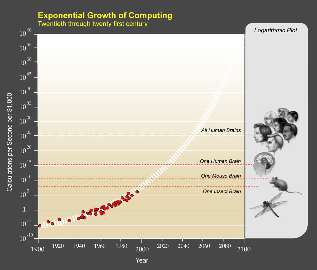
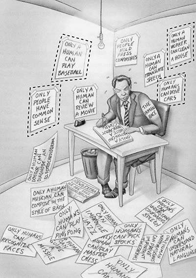
I’ve found the above two pictures particularly helpful, for doing an excellent job depicting the scope. Out of all the images that could be used to help describe AGI to someone for the first time, I would pick those two.
These two images are pretty good as well, as a primer for the current state of affairs. Obviously, they were drawn in 2015 and need to be redrawn.
This image puts the significance of the situation into context.
I strongly endorse this line of thinking. The current moment is strongly confirming my position that we should invest more dedicated effort to finding the simplest, easiest to digest ways to communicate all these details.
I don’t agree with “simplest”, I think that simpleness might often be instrumental for “easy to digest” but isn’t helpful in and of itself. You can’t, and shouldn’t, treat writing like computer code, where you simplify it to as few words as possible, while keeping the logic theoretically intact.
When you look at Yudkowsky’s writing, you often see him explaining something 2-4 different ways instead of just once. It’s extremely helpful to give tons of unique examples of a concept, that sets up the reader to integrate the concept into their mind in multiple different ways, which prepares them to operationalize the concept for real in the real world.
Upvoted.
It appears we are working with different intuitions about simplicity. I claim that simplicity is helpful in and of itself, but is also orthogonal to correctness, so we do run the risk of simplifying into uselessness.
I don’t associate simple with short, instinctively. While short is also a goal, I claim that an explanation that relies on multiple concrete examples is a much simpler explanation than a dense, abstract explanation even if the latter is shorter.
What I want from simplicity is things like:
Direct: as few inferential steps as possible, with the ideal being 0.
Atomic: I don’t want the simple explanation to rely on other pre-existing concepts.
Plain: avoid stuff like memes from the rationalsphere (even useful ones, like names for concepts).
The reason I want simplicity, by which I mean things like the above, is because there is an urgent need to reduce the attention and effort thresholds for understanding that there is even an issue to be considered. This is especially true if we do not reject Eliezer’s AI ban treaty proposal out of hand, because that requires congress people, their staffers, and midlevel functionaries in the State Department being able to wedge the AI doom arguments into their heads while lacking any prior motivation to know about them.
Another way to say what I want is distillation of the AI doom perspective. Well-distilled ideas have the trait of being simpler than undistilled ones, and while we don’t have enough causal information to match well-distilled scientific theories I think we should have enough to produce simpler correct arguments for why doom specifically is an issue.
I agree wholeheartedly. The current situation with AI safety seems to be in a very unusual state; AI risk is a very simple and easy thing to understand, and yet so few people succeed at explaining it properly.
People even end up becoming afraid to even try explaining it to someone for the first time, for fear of giving a bad first impression. If there was a clear-cut path do doing it right, everything could be different.
I have been using the same images from Tim’s post for years (literally since it first came out) to explain the basics of AI alignment to the uninitiated. It has worked wonders. On the other hand, I have shared the entire post many times and no one has ever read it.
I would imagine that a collaboration between Eliezer and Tim explaining the basics of alignment would strike a chord with many people out there. People are generally more open to discussing this kind of graphical explanation than reading a random post for 2 hours.