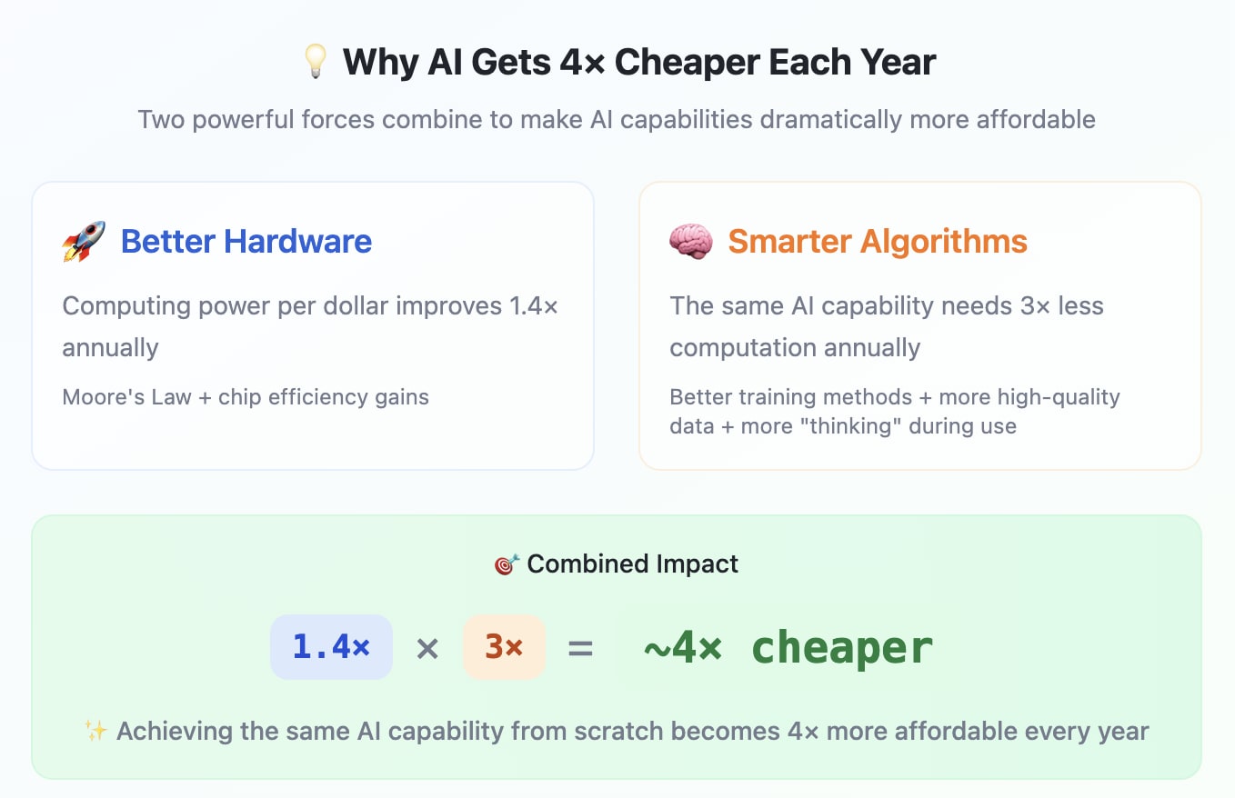
Selected Graphics Showing Progress towards AGI
Except from the upcoming post: Beyond Human Wisdom: Can We Survive the Rise of AGI? Coming soon 😊(PM me if you’d be keen to provide feedback on the draft). |
Motivation
View on Life Itself | The 🅂🅄🅅 Triad (the challenge) |
| 🅂peed—in absolute terms and relative to the speed of governance 🅄ncertainty—regarding the situation and strategy 🅅ulnerability—many catastrophic threats that are hard or costly to defend against |
Feel reply to this comment with any suggestions about other graphs that I should consider including.
I liked:
GDPval! I am interested in how this relates to the METR timehorizon study
Wisdom graph
Consider including:
Graphs on power consumption
and historical scaling laws
If you care about ordering:
Assuming that the wisdom gap is the hook then this image should come first
The transition from 4x cheaper to time-horizon test might be more obvious given the full blog post context. Out-of-context I fail to see a clear story-telling transition
Thanks for the suggestions. I reordered the graphs to tell a clearer narrative.
Not other graphs, but with Metaculus estimates it might make sense to emphasize that the mode of that distribution is much closer to us compared to the average estimate there.
That black dot (the estimate) is considerably to the right of the peak.
Is there any way to view the mode?
Oops, this looks to me like a degradation of their interface :-(
It used to be possible to move a slider and by setting it on the curve peak to see the month corresponding to the mode, I think, and one could at least screenshot that (the scale of that image was larger too), but not anymore...
Yeah, Figure 4 in https://www.lesswrong.com/posts/kygEPBDrGGoM8rz9a/conjecture-internal-survey-agi-timelines-and-probability-of shows how it used to look in 2023. I wonder, if one signs in, could one still get something reasonable?