Whiteboard Pen Magazines are Useful
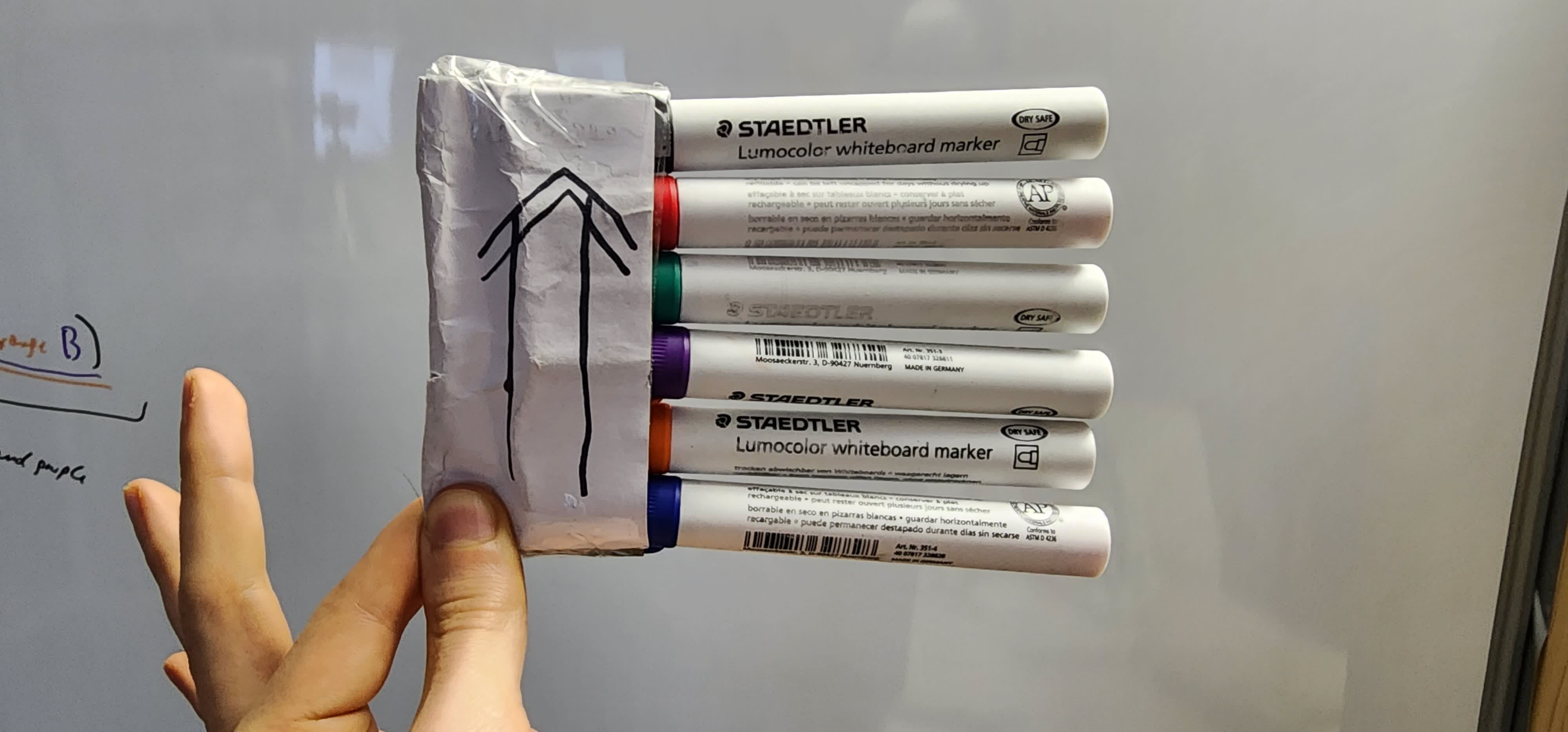
Glue your colored whiteboard makers together with duck tape to create a whiteboard pen magazine. If required glue a paper layer around the duck tape to make it non-sticky to the touch. Mark which side is up with an arrow, such that you can always <hold it/pick it up> in the same way.
This more than doubled my color-switching speed, fits in my pocket, and takes <5m to make.
It lasts: When a pen is empty just insert a new one. No need to create another magazine. No signs of degradation after multiple hundred unholstering-holstering cycles in total.
FUUU 754 Standard: I am using RFC2119. The magazine MUST be vertically stacked (like shown in the pictures). The magazine SCHOULD have a visual mark, that is clearly visible when the magazine lays on a flat surface, to indicate the top side of the magazine (like shown in the first picture). There MUST NOT be two or more pens of the same color. It MUST have at least the following colored pens: Black, Red, Green, Blue. Imagine you hold the magazine, top side up, in your left hand in front (like in the below picture). Now from top to bottom the first 4 color pens MUST be: Black, Red, Green, Blue, and the remaining color pens SCHOULD be ordered after hue in HSL and HSV. This ensures that you can index into the magazine blindfolded. For example:
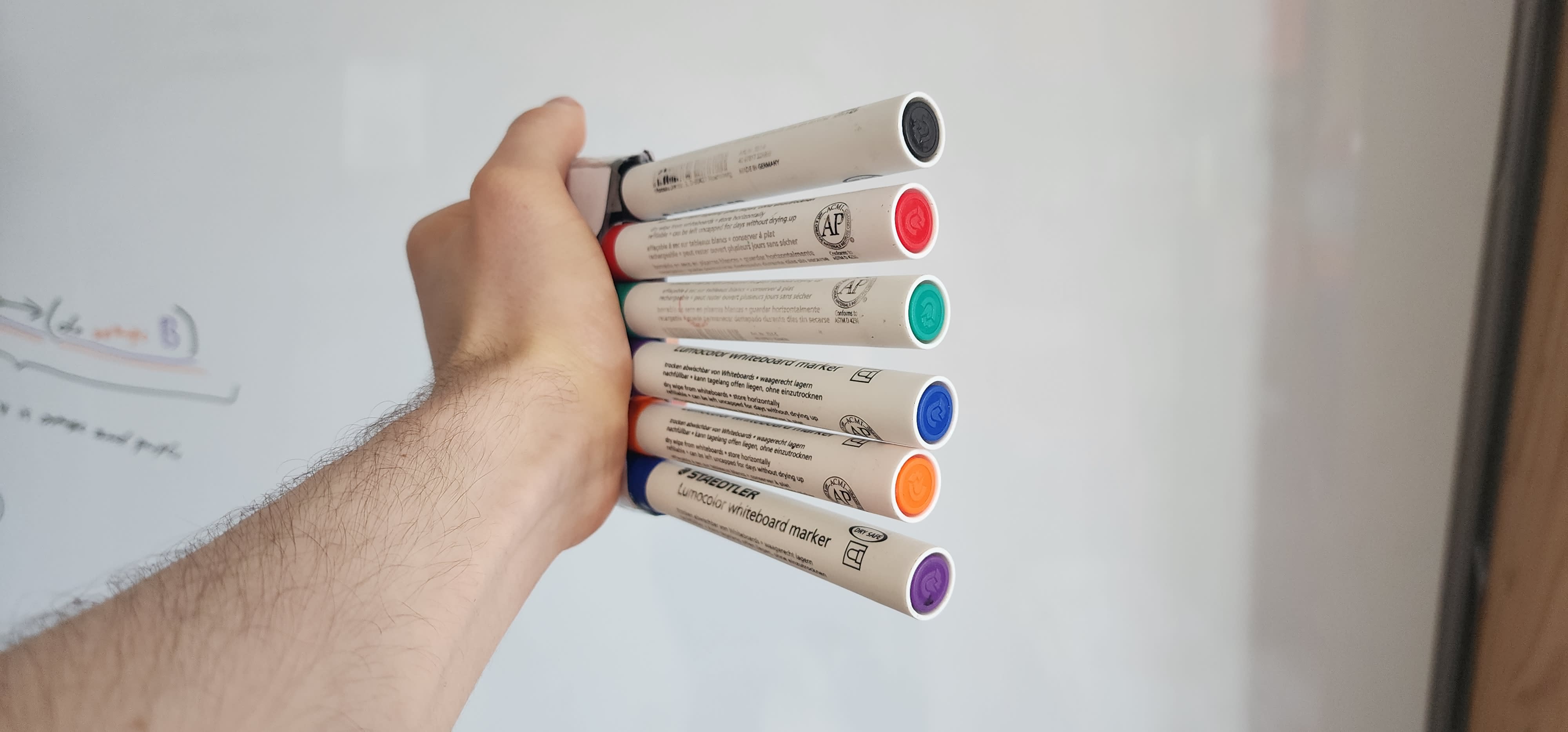
In this case I have orange and purple as additional color pens. The magazine SCHOULD not exceed 13cm (~5″) in length along the stacking dimension, such that it still fits in a large pocket.
Note how any magazine with at least four pen caps can be converted to conform to FUUU 754, as the colors of the caps is irrelevant to this standard.
FUUU 754 extensions M and S:
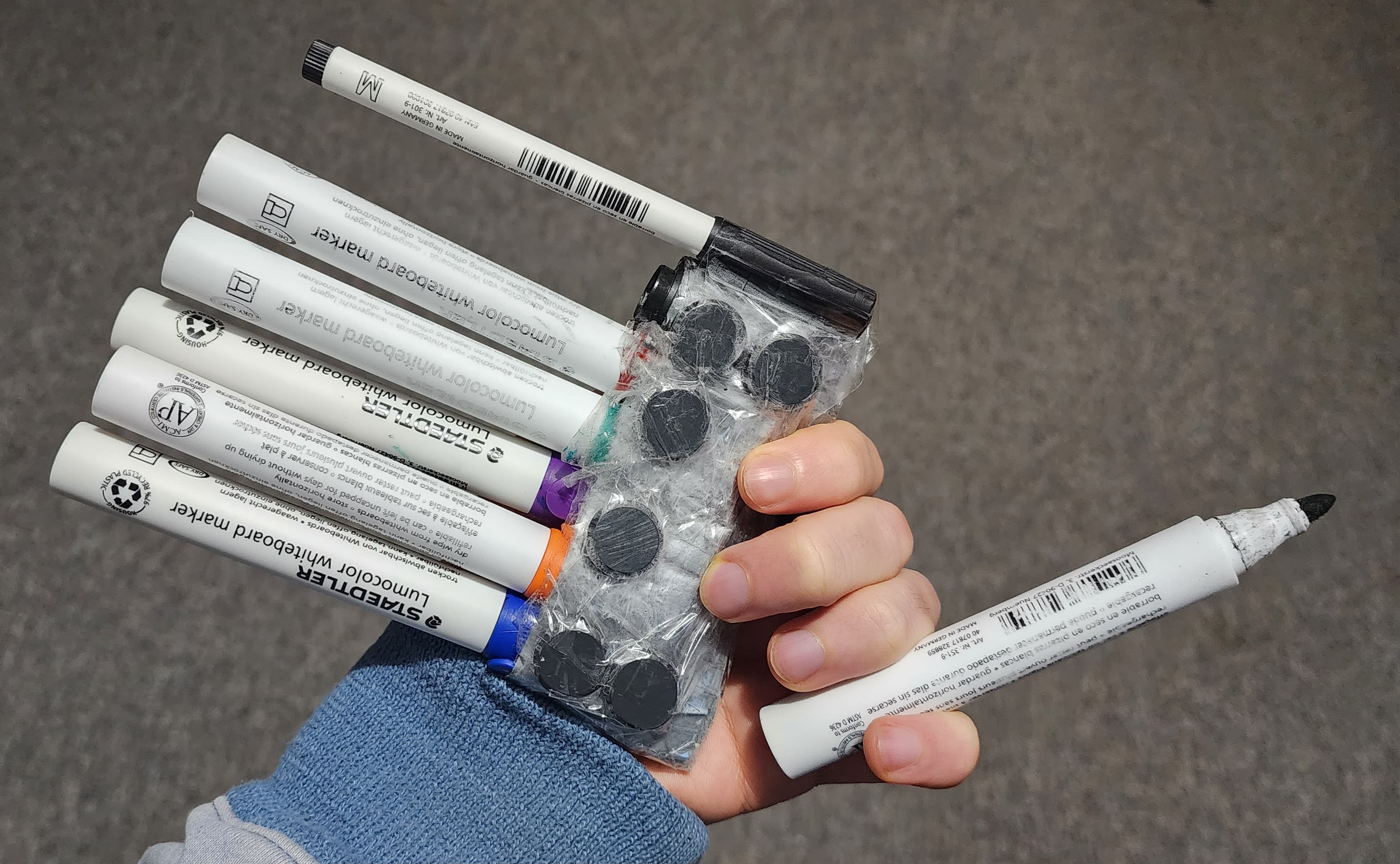
Additionally the highly recommended M extension requires the magazine to have enough magets attached to the backside such that the magazine can be securely attached upright (pen tips facing down):
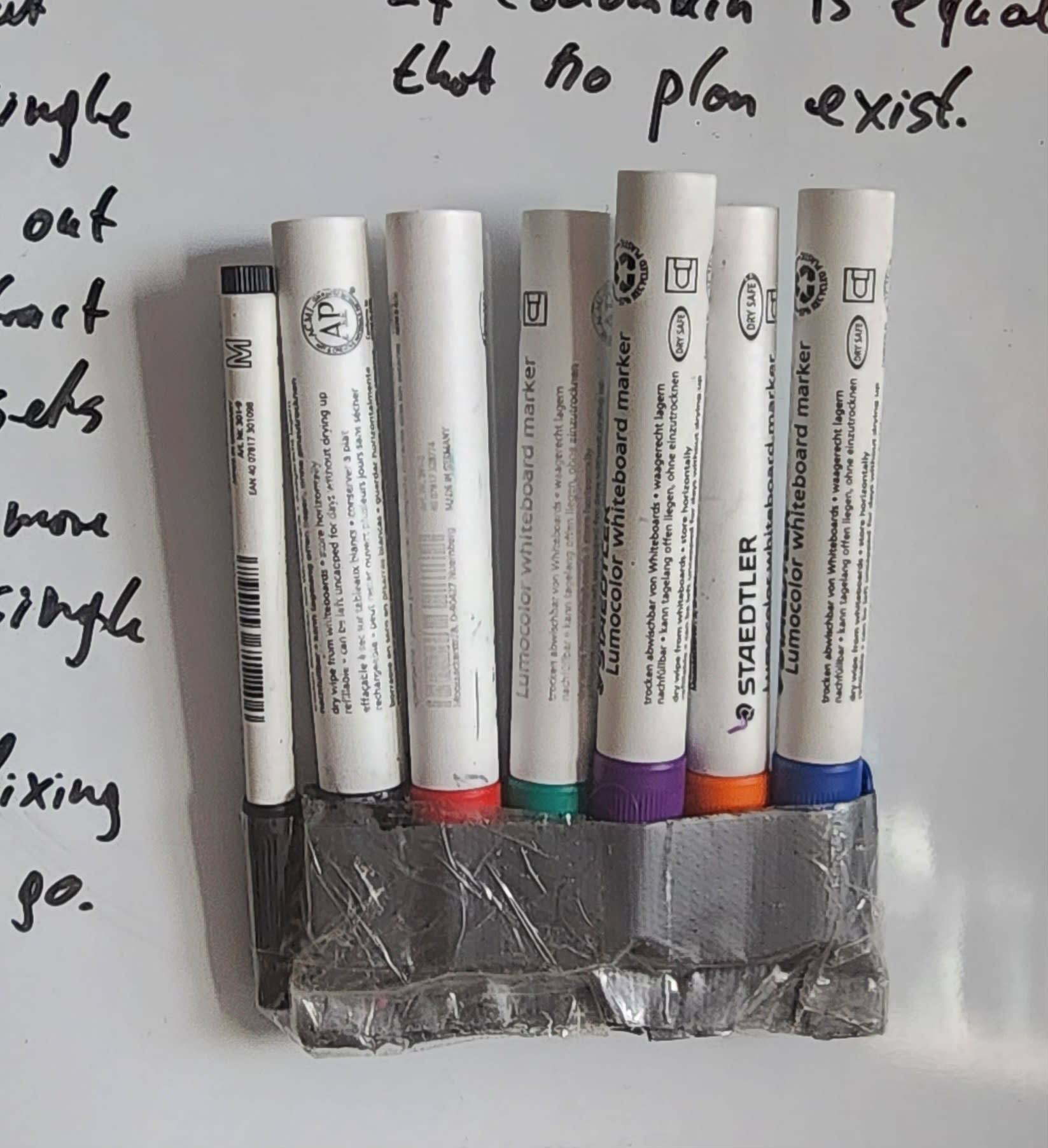
It is strongly reccomended to store the magazine upright such that ink flows to the tip, ensuring the pens are ready to write immediately, even when the pen is almost emtpy.
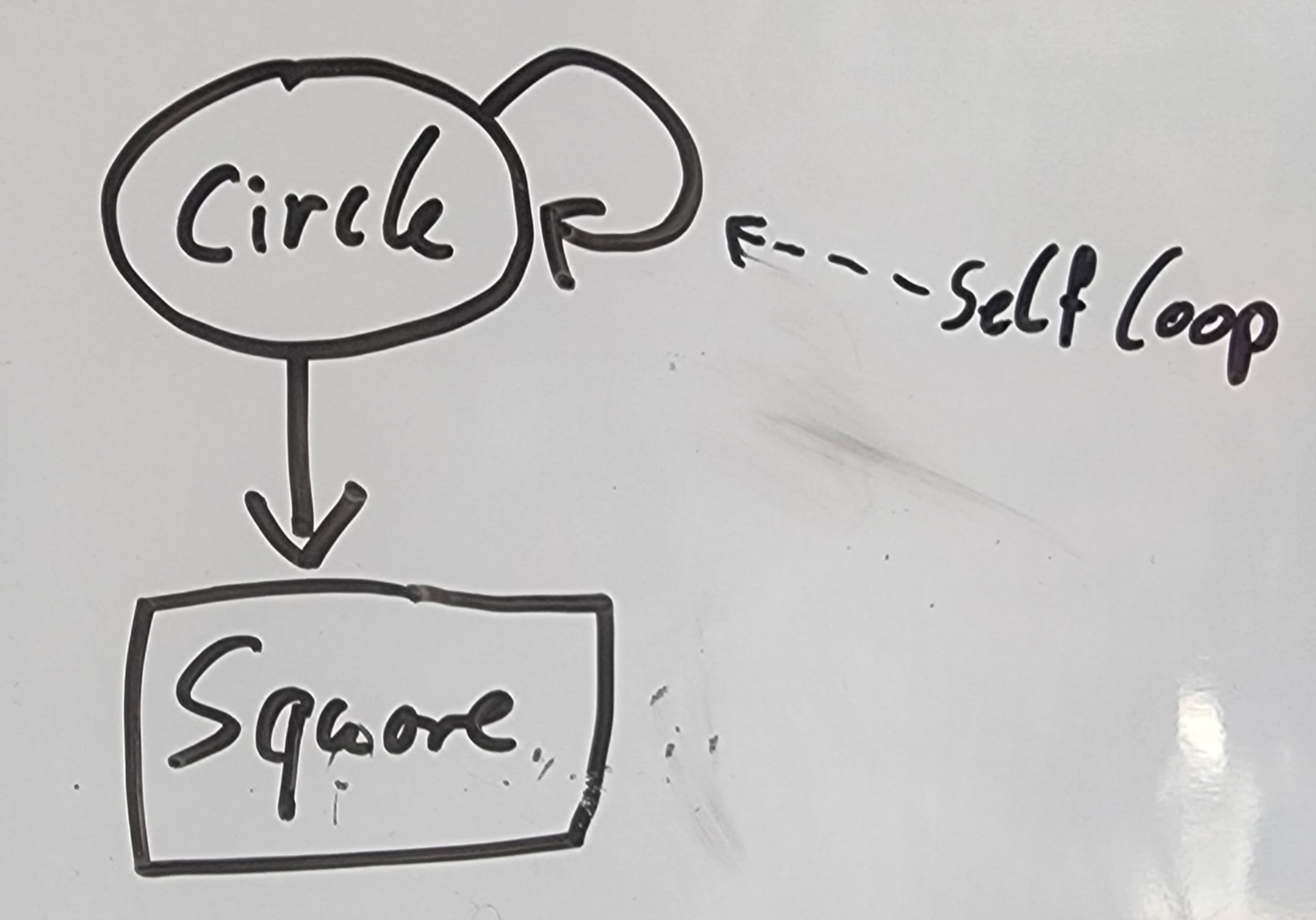
The S extension requires that a single small whiteboard marker is attached to the side. This makes it easy to draw small lines, e.g. for annotations:
Pigment liners: Do it with them too:
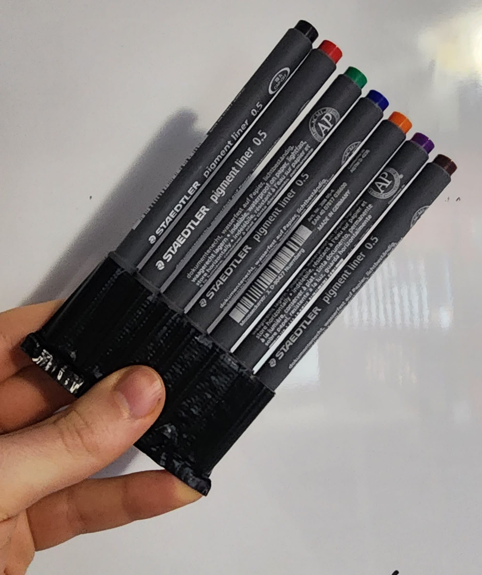
These are the best pens for writing on paper I know of. I use 0.3 for writing text. Easily fits in a pocket.
True, useful, and inspiring. It led me to make my own variation on them, made me realize a way that my brief teaching career might have been more comfortable, and ultimately led me to write up a brief post. I still carry one around. I’d hoped other people might also start making these for themselves, and improving on the technology, but that largely hasn’t happened.