Thoughts about the Mechanistic Interpretability Challenge #2 (EIS VII #2)
1) Introduction
In February, Stephen Casper posted two Mechanistic Interpretability challenges. The first of these challenges asks participants to uncover a secret labeling function from a trained CNN and was solved by Stefan Heimersheim and Marius Hobbhahn.
The second of these challenges, which will be the focus of this post, asks participants to uncover a different secret labeling function from a trained transformer and was solved* by the same individuals. Stephen marked this second problem as “solved*” (with an asterisk) since “[this solution] did not find pseudocode for the labeling function, but instead made a strong case that it would not be tractable to find this. In this case, the network seemed to learn to label points by interpolating from nearby ones rather than developing an interesting, coherent internal algorithm.”

However, I believe that there is “an interesting, coherent internal algorithm” inside of the network. Additionally, there is at least one interesting mechanic in the attention mechanism, even though the the authors of the solution didn’t expect there to be any.
Specifically, I argue that the network appears to learn patterns in its extended embeddings (an Anthropic-style circuit of 5 matrices, defined later). Extended embeddings of the input’s first term (X) dictate high-level patterns for each row. We see increasing/decreasing patterns in the extended embeddings for the X dimension and Y (second) dimension. Additionally, we observe interpretable clusters of MLPin neurons (using an Anthropic-style circuit of 3 matrices).
In this post, I present my current understanding of the internal workings of this model. I begin by presenting the mechanism in detail. I next demonstrate how four specific MLPin neurons support this mechanism and argue how these make up larger interpretable clusters of MLPin neurons. I present several interpretable patterns in the attention mechanism. Next, I argue that the model is learning interpretable extended embeddings of input terms X and Y. I conclude by discussing potential short-comings of my and other such interpretability analyses.
My code has been uploaded on Github. Work was conducted on a Dell (Windows) XPS17 laptop with an NVIDIA GeForce RTX4080 with 12 GB GDDR6 GPU. Bugs, errors, and omissions are possible (if you spot something, please ask here!). Additionally, this is my first technical LW post, so all feedback is appreciated.
For Apart Research’s recent Interpretability 3.0 Hackathon, I synthesized (programmatically set) transformer weights to perfectly match the original labeling function based on my understanding of this network’s internal algorithm. I have not conducted other analyses to independently validate my hypotheses about this network. As such, I cannot say for certain that my proposed mechanism is correct; I discuss this more in the conclusion.
2) Mechanism
In this section, I present some background, provide a description of a human interpretable algorithm, and then describe how the network implements this human interpretable algorithm.
2.1) Background
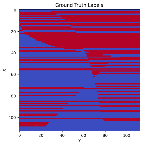
Before jumping into the mechanism, I want to mention that there are six color patterns for individual rows inside of the original labeling function. There are rows that are all red (all true), all blue (all false), red then blue, blue then red, red then blue then red, and blue then red then blue. All rows follow one of these six patterns. As one example, when moving from left to right, rows 25 and 30 both are blue then red. Note however that the point at which the rows switch from blue to red are different for the two rows. Below is the original labeling function, both visually and programmatically.
p = 113
def label_fn(x, y):
z = 0
if x ** 2 < np.sqrt(y) * 200:
    z += 3
if y ** 2 < np.sqrt(x) * 600:
    z -= 2
z += int(x ** 1.5) % 8 - 5
if y < (p - x + 20) and z < -3:
    z += 5.5
if z < 0:
    return 0
else:
    return 1
2.2) Human Interpretable Algorithm
The human interpretable algorithm that I believe inspires the network works as follows: we label each row as having one of these six color patterns. If a row is all red or all blue, that’s all we need to know about the row. If a row is red then blue or blue then red, then we also learn a single crossover point where the row switches. If the row is red then blue then red or blue then red then blue, then we learn two crossover points. This algorithm (with the crossover points) is sufficient to reproduce the desired labeling function.
Consider the below example of this algorithm. Suppose our algorithm knows the following (for 3 specific rows):
Row 111: all blue
Row 30: blue then red, cutoff point 20.5
Row 16: blue then red then blue, cutoff points 1.5, 48.5
If I ask this algorithm for the color of (111,0), (111, 30), or (111, 99), it simply looks up the rule for this row (111) and ignores the y-value and returns blue for each of these.
If I ask this algorithm for the color of (30,0) or (30, 40), it looks up the rule for this row (30) and then considers whether the y-value is below or above the cutoff point. Since 0 is below 20.5, (30, 0) is blue; since 40 is above 20.5, (30, 40) is red.
If I ask this algorithm for the color of (16, 0) or (16, 40) or (16, 90), it looks up the rule for this row (16) and then considers whether the y-value is below the first cutoff point or above the second cutoff point. Since 0 is below the first cutoff point and 90 is above the second, (16, 0) and (16, 90) are blue. Since 40 is in between, (16, 40) is red.
An analogous argument applies for the three types of rows that begin red.
2.3) Network Algorithm
I now tie this human interpretable algorithm back to the trained transformer network. I claim that the network specifically learns four primitives that it can combine to mostly create these six patterns. (There is also a fifth, less-important, primitive we will discuss later). The four primitives are:
paint some right portion of a row red
paint the row all red
paint some left portion of a row blue
paint some right portion of a row blue
I will explain the below plots in detail in the following section, but as a short teaser, we can see that there are MLPin neurons that implement each of the rules.
Note that I use the word “some” to allow for flexibility with how far from the left/right side the red/blue contribution should emanate.
The six row patterns from the above subsection can each be created with each of these four rules. For each of the 6 row patterns, I present 1-2 simple combinations of these primitives:
all red:
paint the row all red
all blue:
paint some left portion of a row blue + paint some right portion of a row blue
red then blue:
paint the row all red + 2 * paint some right portion of a row blue
(Note I use “2 *” to indicate that the second primitive should receive a higher weight).
blue then red: either of:
paint some left portion of a row blue + paint some right portion of a row red
or
2 * paint some left portion of a row blue + paint the row all red
red then blue then red:
paint the row all red + 2 * paint some right portion of a row blue + 2 * paint some right portion of a row red (here the red right portion is shorter than the blue right portion)
blue then red then blue:
2 * paint some left portion of a row blue + paint the row all red + 2 * paint some right portion of a row blue
One more important thing to callout is that if for a given row, the network knows both the cutoff point(s) and the value of Y, there are MLPs that can enact the desired row behavior. For example, consider the example for Row 30: blue then red, cutoff point 20.5
The network can have one MLP that is roughly (Y − 20.5), so that the MLP is active for Y >= 21 to handle red cases and then a second MLP that is roughly (20.5 - Y) to be active for Y ⇐ 20 to handle blue cases. This behavior will cause points along the sides to have higher activation magnitudes than points near the cutoff point of 20.5.
In addition to this mechanism, I will also argue that the network seems to learn these X rules reasonably well, and to some extent, learns to increasing/decreasing patterns in both X and Y that it combines to learn rough cutoff points. In the following sections, I will present evidence supporting these claims about the network’s mechanism.
3) Interpretable MLP neurons
In this section, I present four MLPin neurons and argue that they are interpretable. Then, I demonstrate how these neurons make up larger collections of interpretable neurons. I finish this section with a quick note about how neurons work together for the rows with two color swaps.
3.1) Four Interpretable MLP-in Neurons
The network’s MLP-in layer has 1024 neurons. 4 of these neurons (deliberately chosen) can be added to match the overall model’s prediction in 98.7% of cases (the other 1020 neurons in this layer are zero-ablated, the residual stream is zero-ablated, MLPout’s bias is also zero-ablated).
Each of these four graphs can be interpreted if you know what you are looking for. At a high-level, I call these neurons red-right, red-all, blue-left, blue-right. These neurons might appear somewhat arbitrary, but there are patterns in these neurons; The graphs are best introduced one at a time, and I will explain the annotations I added to the graphs.
Let me first explain what a single neuron represents. I take the post-RELU activation of a specific neuron in the MLPin layer and then scale it by its impact on the final unembedding weights. The following lines of code represent a small circuit that describes how much each MLPin neuron impacts the selection between 1(true/red) and 0 (false/blue).
unembed_favoring_1 = model.unembed.W_U[:,1]-model.unembed.W_U[:,0] MLPin_neuron_to_unembed = torch.einsum('ab,a>b', model.blocks[0].mlp.W_out,unembed_favoring_1)This impact can be multiplied by the MLPin neuron’s post-RELU activation to calculate how much the neuron votes for true or false at each point. For MLPin neuron 877, this impact is a negative value and when we multiply by the activation at every point, we see a set of blue (negative) lines emanating for the right side of the graph. (For these plots, blue is negative, red is positive, and gray is 0).
Some other callouts about this graph, the vertical axis is X and thus each row across is tied to a specific X value. The horizontal axis is Y.
There are three inequalities from the initial labeling function, they are plotted on the graph with green, purple, and orange curves/lines.
On both sides of the graph, I added a ternary labeling system to help me visualize what is going on (both the left and right side are identical). The first two columns in this labeling system indicate if the row of the labeling function is all blue or all red. If the row is all blue, then both columns are blue. If the row is all red, then both columns are red. The columns are gray otherwise.
The next two columns deal with the green curve. If the original labeling function is red to the left of the green curve and blue to the right of it, the columns are marked red then blue. And vice versa - if the original labeling function is blue to the left of the green curve and red to the right of it, the columns are marked blue then red. In all other cases, the columns are gray. The next two columns are the same but for the purple curve. The final two columns are the same but for the orange line.
Now that I’ve explained these labels, we can see them in action. I’ve reproduced the chart with just some rows visible. Take a look at the bottom rows. The red/blue keys in the final two columns indicate that the function should be red to the left of the orange line and blue to the right of it. We can see the horizontal blue lines noisily approximating the blue part of this rule, although these blue lines somewhat overshoot the orange line.
Now consider the four highest rows that aren’t all gray. These rows should be blue to the left of the green curve and blue to the right of the purple curve. We observe that blue lines approach the purple curve from the right and slightly overshoot. I specifically selected these rows for explanation, but encourage you to return to the original graph and note how these rows stand out from rows with other labelings.
We observe similar patterns in other charts as well. Below I present the blue left neuron (left graph) and call out two types of patterns in the graph on the right. For the bottom pattern, we see blue lines approach the purple curve from the left (as desired). Again it mostly overshoots. The top lines I’ve called out are interesting. The model is meant to be blue to the left of the green curve (not the purple curve). We will later see the red curves correct this overshoot.
Now we consider the red right curve. The most interesting portion is red to the right of the green curve which roughly equalizes the overshoot from the previous curve. This curve gets the shape of the green curve mostly correct.
And finally a graph that is all red. Note that this chart has lower maximum magnitude than the previous three charts. Rows that are supposed to be all red are in fact all red. (Additionally, this red contribution helps red overpower blue to the right of the green curve that we saw the previous two curves addressing).
I have presented the most salient (to me) patterns from these graphs, but this is not to say there aren’t other interesting rows along these graphs.
Adding these four curves (each with a weight of 1) and comparing against 0 provides a 98.7% match to the original model’s binary output. This isn’t quite an apples to apples comparison because the full model has terms from the residual stream (resid_mid) as well as biases from MLPout that I am ignoring; however, it is interesting that these 4 charts recreate the final labeling function so well.
3.2) (Mostly) Interpretable MLP-in Neuron Families
These four neurons are fairly representative; I grouped all MLPin neurons with a maximum magnitude greater than 0.5 into five similar buckets (four of which I discussed above). Note how these buckets contain many neurons and they generally appear quite similar.
Red Right
Red All
Blue Left
Blue Right
There is also a small set of red left neurons. My best guess is that they are useful for the rows with two color swaps.
Interestingly—they seem to be operating in the opposite direction of what we’d expect in many spots; other than the fact that they are red, they appear quite similar to the blue left neurons. I’m curious how the blue and red left neurons evolved over training. Did they both start existing at the same time? Do they look at most of the same portions of the embedding? Would further training allow them to diverge?
3.3) Rows with Two Color Changes
I also want to touch on the rows that have two color swaps. We can see that when using just the earlier four neurons, these rows are quite a mess.
Though rows 36 and 50 look pretty reasonable. We see the all red neurons (top right) spans across both rows and then the blue neurons (bottom left and bottom right) overpower it along the sides to create the blue then red then blue patterns as desired. Note that the cutoff points are not quite correct.
4) Interesting Patterns in Attention
My hope is that after reading the above section, you have a reasonable sense of how neurons in the network work together to create the output we are observing, but may want more evidence. In this section, I present some interesting evidence about attention and argue that the network is treating its X and Y inputs differently and that attention head 2 (out of the 8) is the most important for Y. (X is the first term of the input sequence; Y is the second. Both of these terms are immediately embedded as though they were tokens).
4.1) Note about Row Complexity
First, a note about row complexity. The network never makes mistakes on rows with one color (0 changes), makes some mistakes on rows with a single color change, and tends to make more mistakes on rows with two changes.
4.2) Linear Probe after Attention
The second interesting note is that the network seems to be highly asymmetric between X and Y. I run multinomial logistic regressions with resid_mid as the independent variable (the residual stream after attention) and the X or Y inputs as dependent variables. I get a 100% accuracy when reconstructing X (the row variable) and a 78% accuracy when reconstructing Y. (100% for X is higher than expected but I haven’t found any issues with my code).
4.3) Attention Head 2 is Special
Other evidence similarly points to this asymmetry. For example, I calculate a QK-circuit on the positional embeddings. 7 of the 8 attention heads pay more attention to X’s position over Y’s position, with three of these heads (0, 1, 5) having a delta with magnitude greater than 11!
| Head | Positional Embedding Delta |
| 0 | -11.039421 |
| 1 | -11.861618 |
| 2 | 4.234958 |
| 3 | -2.9315739 |
| 4 | -3.7969134 |
| 5 | -11.75295 |
| 6 | -2.0377593 |
| 7 | -6.1885424 |
Plotting a QK-circuit on our numerical embeddings demonstrates that these three heads (0, 1, 5) are quite similar to each other. Similarly, attention heads 2 & 4 are quite different from those heads but similar to each other. There is somewhat of an increasing attention pattern for these two heads (whereas other heads appear more jagged).
Plotting activations of all of our heads at each of X, Y, and Z (the third term), we see that attention heads 2 and 4 are more differentiated than the other heads. Additionally, head 2 assigns more attention to the Y term than other heads.
In their solution, Stefan Heimersheim and Marius Hobbhahn noted that when attention is mean-ablated, the ablated model matches the original transformer in 92.9% of cases. I also obtained this value, and then also noticed that these two heads are more important for reproducing the model. If we mean-ablate all heads except for 2, we match the original model in 97.1% of cases. If we mean-ablate all heads except for 2 and 4, we match the original model in 98.9% of cases.
| Mean Ablation Strategy | Match between original model and ablated model |
| Don’t ablate (Baseline) | 100.0% |
| Ablate all heads (matches SH&MH) | 92.9% |
| Ablate all heads except 0 | 93.0% |
| Ablate all heads except 1 | 93.0% |
| Ablate all heads except 2 | 97.1% |
| Ablate all heads except 3 | 92.9% |
| Ablate all heads except 4 | 95.4% |
| Ablate all heads except 5 | 93.0% |
| Ablate all heads except 6 | 92.9% |
| Ablate all heads except 7 | 93.3% |
| Ablate all heads except 2 & 4 | 98.9% |
My working hypothesis is that these heads (mostly head 2) are responsible for pushing a noisy value of Y through to resid_mid’s third term (which is the only term that matters for our final prediction after applying attention). On the left is a graph with all attention heads ablated. For most rows, we observe horizontal lines through them that disrupt the row’s continuity (color smoothness). Adding back attention heads 2 & 4 makes this smoother (though it is not perfect).
Taken together, my working model of our network is that it uses attention to fully pass X through to the third term of the residual stream but fails to fully pass Y through and as a result, fails to fully learn the boundary points for each row.
5) Extended Embeddings of X and Y
The final set of evidence I present is that there seem to be interpretable patterns in an extended embedding circuit based on average attention. There are separate patterns for X and Y. I begin by explaining my extended embedding formulation. Then, I present patterns in the extended embedding for X, patterns in the extended embedding for Y, and how these patterns generally seem reasonable in the context of the high-level mechanism.
5.1) Extended Embedding Definition
First off, I define what I mean by extended embeddings: I take the embeddings for the input tokens (0-112), multiply those by V, weight by mean-attention (using different mean-attentions for X, Y, and Z), multiply by O, then multiply by MLPin. I do not apply the RELU non-linearity that occurs after the MLPin in the original model. This gives us an extended embedding for each of X, Y and Z. A rough formula is below; it shows the multiplications, but omits the specific dimensions and reshapes. For the exact einsum computations and reshapes, please see section 7 of my notebook.
Extended Embedding = embed.W_E * attn.W_V * attn.W_O * mlp.W_in * average_attn
This extended embedding calculation gives 3*1024 vectors of 113 weights. (3 is for the X, Y, and Z dimensions; 1024 is one per MLPin neuron; I will only consider X and Y here).
Note that this extended embedding is privileged—which is to say a positive extended embedding means that the final sum of X, Y, and Z’s extended embeddings is more likely to make it through the RELU of the MLPin layer unchanged while a negative value means that RELU is likely to override this final sum to 0. (To be clear, the actual sums in forward passes of the network don’t use mean-attention which I am using here).
5.2) Analyzing Extended X Embeddings for Individual Neurons
In this subsection, we will examine the extended X embeddings for the four individual neurons discussed in section 3.
Here is the extended embedding of X (0-112) for neuron 877.
While the above graph looks quite hectic, we will see that there is an interpretable structure.
I create masks where I highlight points based on the ternary labeling system I discussed earlier. For example, mask 9 tags points (as red) if the row on the ground truth function is red to left of the orange line, blue to the right of the line, and unchanged around the other curves. The left graph corresponds to these rows from the neuron activations, while the right graph is the extended embedding with these points highlighted.
We see these highlighted points all have positive scores—some of the highest extended embedding scores. Additionally, with the highlighted points, we roughly see an increasing function.
Here is a different mask for the same neuron; this time, we highlight points that are blue to the left of the purple curve, red to the right of it, and unchanged elsewhere.
These points all receive negative extended embedding scores. This makes sense because this neuron (877) is not responsible for rows that are blue on the left and red on the right. A negative extended embedding score makes the RELU more likely to set the sum of our extended embeddings to 0 at these points.
We see an approximately reversed effect for the blue left neuron (397) - mask 6 has points with positive extended embeddings.
While mask 9 gives points that are blue to the right of the orange line a negative score.
Similar patterns exist for the red neurons. For the red all neuron (78), we see that points highlighted by the all blue mask (mask 0) have a negative score and that points highlighted by the all red mask (mask 1) provide a positive score.
The pattern is not as strong for the red right neuron (632), but, for the highlighted points on the line graph between 20 and 40, I see a roughly decreasing function.
To recap, I argued that there are interpretable patterns in X’s extended embedding. I also made the argument that for selected points, we saw an increasing function in the extended embedding for the blue right neuron and a decreasing function for the red right neuron.
5.3) Extended Y Embeddings for Individual Neurons
Now, I argue that the network is trying to learn similar increasing/decreasing patterns in the Y dimension. This is not true of the red all neuron (78), which is red the full way across and thus doesn’t really need information about Y. On the plot below—in the top right graph—we see a presumably hectic function which also has a relatively low magnitude. For the red right and blue right neurons (top left and bottom right graphs), we see a roughly increasing extended embedding for Y. For blue left neuron (bottom left), a roughly decreasing extended embedding for Y.
5.4) Combining Extended Embeddings
The below table summarizes whether X and Y embeddings are increasing or decreasing.
| Y extended embedding | X extended embedding | |
| blue right (877) | + | + |
| blue left (397) | - | ??? |
| red right (632) | + | - |
These changes in extended embeddings seem to make sense.
Neuron 877
Let us begin by re-examining neuron 877, which we recall has both an increasing X extended embedding and an increasing Y extended embedding along selected points.
For a given row (a given X value), there is a Y value such to the left of this, we want the RELU to be false and to the right of it, we want the RELU to be true. If Y’s extended embedding is roughly increasing, then for the given row, we roughly achieve this desired pattern. (If on the other hand, Y’s extended embedding were roughly decreasing, we’d have points on the left active, the 0 point in the middle, and points on the right below zero, which we don’t want). (Said another way, higher values of Y mean higher extended embeddings, meaning higher activations as we move right, which is what we observe on the graph).
A similar argument can be applied to X’s extended embedding for this neuron, for selected rows. For a given column (a given Y value), there is an X value such that above this, we want the RELU to be false and below this, we want the RELU to be true. If X’s extended embedding is (roughly) increasing, then for the given column, we (roughly) achieve this desired pattern.
I am also curious what happens when we combine the X and Y extended embeddings along the inequalities of the labeling function. The orange line in the above plot (from the labeling function) is defined by X+Y = 133. When we add X’s extended embedding to the appropriate Y extended embedding (133 - X), we obtain the orange plot in the below image. The red points in this plot are flatter than in the blue plot. (Note—I actually plot (X + appropriate Y + 1) so it is easier to differentiate the orange plot from the blue plot of just X).
If we believe that the network is trying to implement the mechanism described in section 2, the fact that these boundary points have similar extended embedding sums to each other makes sense as we’d expect points along the boundary function to approximately be zero points for a RELU (note that we are assuming the impact of Z’s extended embedding is minimal; the neuron’s bias term translates this value to be a constant other than 0).
My interpretation of this graph is that our roughly increasing extended embeddings for X and our roughly increasing extended embeddings for Y work together to roughly approximate the boundary of X+Y = 133.
(I’m not sure if I am cheating/overfitting here or if there’s an off-by-one error I couldn’t detect in using 133, but using the Y embedding at (134-X) looks even flatter/better.)
Neuron 397
Now, let us re-examine neuron 397, which recall has a decreasing Y extended embedding and I didn’t comment on the X extended embedding.
For a given row (a given X value), there is a value Y value such to the left of this, we want the RELU to be true and to the right of it, we want the RELU to be false. If Y is (roughly) decreasing, then for the given row, we achieve this desired pattern. (This matches what we noted above).
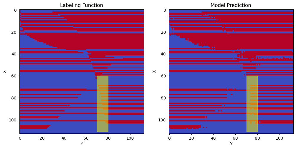
Looking at the above graph with mask 6, I am unsure if the red points are increasing, decreasing, or flat. (I’d expect it to be increasing but the graph of mask 6 actually looks like it’s vaguely decreasing to me). From the below graphs of the labeling function and trained model, we observe that the model doesn’t learn this segment of the curve very well (it looks more like a vertical line than a curve). For this reason, I think it is hard to determine whether X’s extended embedding for this neuron (for these selected points) is roughly increasing, decreasing, or flat.
Neuron 632
Finally, we re-examine neuron 632, which we recall has a decreasing X extended embedding and an increasing Y extended embedding along selected points.
Since we want rows to be active to the right of the curve, we desire an increasing Y extended embedding, which is in fact the case.
A similar argument can be applied to X’s extended embedding. For a given column (a given Y value), there is an X value such that above this, we want the RELU to be true and below this, we want the RELU to be false. If X’s extended embedding is (roughly) decreasing for these selected points, then for the given column, we achieve this desired pattern and this is in fact what we observe for the highlighted points.
As with the first neuron, I am curious whether these extended embeddings can be combined using one of the inequalities from the original labeling function.
The green curve is defined by X2 = 200*Y.5. I add the corresponding Y extended embedding at Y=ceil(X4/2002) to X’s extended embedding to obtain the orange plot in the below image. The highlighted points in this curve appear flatter than those in the blue curve. My interpretation is that the roughly decreasing extended embeddings for X and our roughly increasing extended embeddings for Y work together to very roughly approximate the boundary of this inequality from our labeling function.
My motivation for combining X and Y extended embeddings is based on my hypothesis that with additional training time and training data, we’d observe monotonically increasing and decreasing extended embeddings that would fit together like puzzle pieces to reconstruct the inequalities from the original labeling function. Since I have observed some success with obtaining roughly flat curves for the orange line and green curve, I suspect this could be true, but at this point in time, this hypothesis has not been fully explored.
5.5) Extended Embeddings Conclusions
In this section, I have proposed that the extended embeddings encode important information about X and Y. X’s extended embedding is positive or negative based the color patterns of rows of the labeling function. X and Y also have roughly increasing or decreasing extended embeddings that make sense given properties of the curves that are part of the labeling function.
6) Conclusion
In this post, I presented a mechanism describing our trained deep learning model. I presented a human interpretable mechanism that learns rules for each row and argued that MLPin neurons enable this behavior. I also presented patterns in attention and argued that extended embeddings were interpretable.
I used Anthropic-style circuits and found creating graphs with multiple annotations to be quite helpful. torch.einsum (and torch.shape) were extremely powerful for this analysis.
One thing I find interesting is that there are now (at least) two attempts to explain the same trained model. I have my hypotheses which are mostly distinct from those of the original solution. There’s no solution manual for MI. When looking at an explanation, it’s hard to know if it is correct.
I can’t say I am certain that the explanation presented here is completely (or even partially) correct. Though I’ve painted a plausible story and separately built a similar transformer model to reconstruct this labeling function, there’s no guarantee that I’m thinking about this in the proper manner.
Similarly, there’s not a clear path to checking a solution. In the past, I’ve seen causal scrubbing suggested as the gold-standard to check model interpretations. If you accept that my proposed mechanism is correct and the previous solution is wrong, then causal scrubbing seems to have failed as a validation on the previous solution.
My independent validation was to implement this labeling function by programmatically setting weights using a similar mechanism to what was described here (not by using backprop/training). (I used red left instead of red all; Hackathon quality, might rewrite for LW). This also seems imperfect. I could have come up with a plausible algorithm that wasn’t actually correct.
My synthetic construction does have value though in that I imagine a world where we could replace backprop-trained model components with handcrafted components that provide the same output. Even if we find a somewhat different mechanism, as long as the mechanism works, we can still replace components in the original models. (Though there are certainly questions that haven’t been resolved—for example, what if the replaced component was actually implementing multiple behaviors and only one of the behaviors was replicated?).
I don’t intend to answer these questions today, but if you have any thoughts about how to better assess model interpretations, I will engage with them in the comments.
Going forward, I hope to conduct similar MI analyses on small language models (such as the Tiny Stories models); as a longer-term goal—I hope to develop code to automate mechanistic interpretability and the selection of model weights without backprop.
7) Funding Note
I am currently on a 3-month Mechanistic Interpretability Research grant that ends in September. This work took roughly 1 month of focused work conducted under the grant. (Prior to receiving the grant, I spent roughly 1 month exploring a variety of MI ideas, including a few days exploring this network and not getting anywhere).
If you found this research interesting and are potentially interested in funding additional mechanistic interpretability research time for me, please reach out. Likewise, if you work for an AI research lab and would be interested in me performing a similar flavor of research where I at least partially create my own agenda (and optionally, some high-level strategy for others), please reach out.
- 's comment on There should be more AI safety orgs by (22 Sep 2023 0:48 UTC; 10 points)
- Seeking Feedback on My Mechanistic Interpretability Research Agenda by (12 Sep 2023 18:45 UTC; 5 points)
- 's comment on Why Is No One Trying To Align Profit Incentives With Alignment Research? by (24 Aug 2023 22:19 UTC; 5 points)
This is exciting to see. I think this solution is impressive, and I think the case for the structure you find is compelling. It’s also nice that this solution goes a little further in one aspect than the previous one. The analysis with bars seems to get a little closer to a question I have still had since the last solution:
I think this work gives a bit more of a granular idea of what might be happening. And I think it’s an interesting foil to the other one. Both came up with some fairly different pictures for the same process. The differences between these two projects seem like an interesting case study in MI. I’ll probably refer to this a lot in the future.
Overall, I think this is great, and although the challenge is over, I’m adding this to the github readme. And If you let me know a high-impact charity you’d like to support, I’ll send $500 to it as a similar prize for the challenge :)
Thank you for the kind words and the offer to donate (not necessary but very much appreciated). Please donate to https://strongminds.org/ which is listed on Charity Navigator’s list of high impact charities ( https://www.charitynavigator.org/discover-charities/best-charities/effective-altruism/ )
I will respond to the technical parts of this comment tomorrow or Tuesday.
Excited to see case studies comparing and contrasting our works. Not that you need my permission, but feel free to refer to this post (and if it’s interesting, this comment) as much or as little as desired.
One thing that I don’t think came out in my post is that my initial reaction to the previous solution was that it was missing some things and might even have been mostly wrong. (I’m still not certain that it’s not at least partially wrong, but this is harder to defend and I suspect might be a minority opinion).
Contrast this to your first interp challenge—I had a hypothesis of “slightly slant-y (top left to bottom right)” images for one of the classes. After reading the first paragraph of the tl;dr of their written solution to the first challenge - I was extremely confident they were correct.
One thought I’ve had, inspired by discussion (explained more later), is whether:
“label[ing] points by interpolating” is not the opposite of “developing an interesting, coherent internal algorithm.” (This is based on a quote from Stephen Casper’s retrospective that I also quoted in my post).
It could be the case that the network might have “develop[ed] an interesting, coherent algorithm”, namely the row coloring primitives discussed in this post, but uses “interpolation/pattern matching” to approximately detect the cutoff points.
When I started this work, I hoped to find more clearly increasing or decreasing embedding circuits dictating the cutoff points, which would be interpretable without falling back to “pattern matching”. (This was the inspiration for adding X and Y embeddings in Section 5. Resulting curves are not as smooth as I’d hoped). I think the next step (not sure if I will do this) might be to continue training this network, either simply for longer, with smaller batches, or with the entire input set (not holding about half out for testing) to see if resulting curves become smoother.
--
This thought was inspired by a short email discussion I had with Marius Hobbhahn, one of the authors of the original solution. I have his permission to share content from our email exchange here. Marius wants me to “caveat that [he, Marius] didn’t spend a lot of time thinking about [my original post], so [any of his thoughts from our email thread] may well be wrong and not particularly helpful for people reading [this comment]”. I’m not sure this caveat just adds noise since this thought is mine (he has not commented on this thought) and I don’t currently think it is worthwhile to summarize the entire thread (and the caveat was requested when I initially asked if I could summarize our entire thread), so not sharing any of his thoughts here, but I want to respect his wishes even if this caveat mostly (or solely) adds noise.